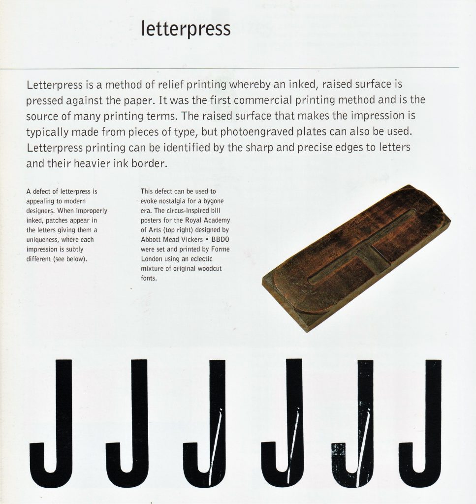
(below) ‘Nineteenth-century advertising typography, in stark contrast to book design, featured all the display types at a printer’s disposal.’ Type & Typography by Phil Baines & Andrew Haslam
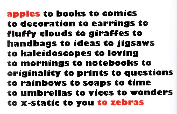
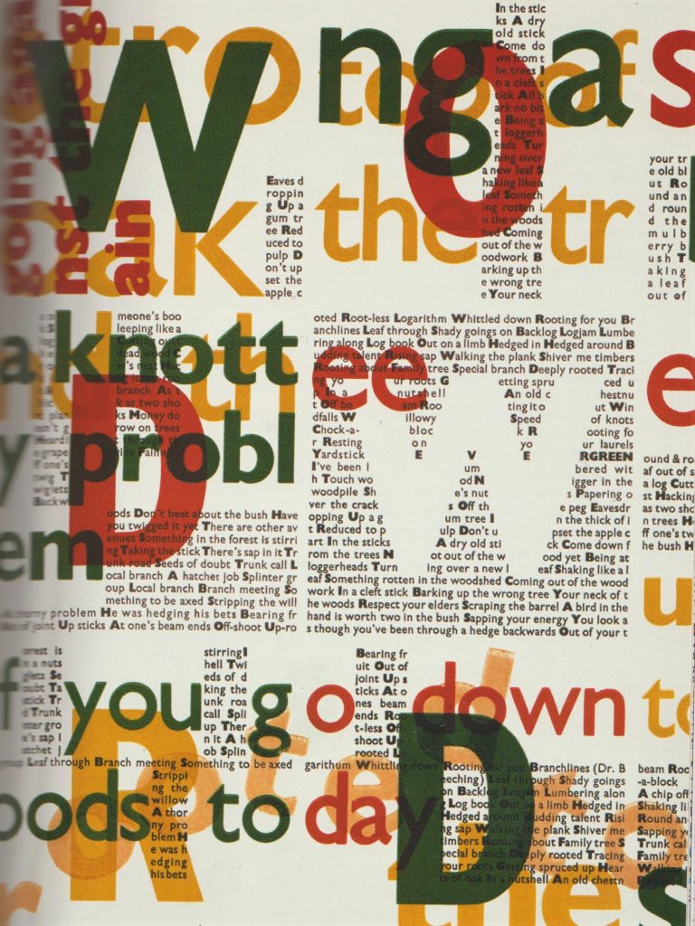
‘In this poster by English designer Phil Baines, printed using letterpress type, the relationships and patterns that typography creates are laid bare. It is easy to see how the grid- central to most graphic design- is a natural outcome of modular typography.’ What is Graphic Design? RotoVision
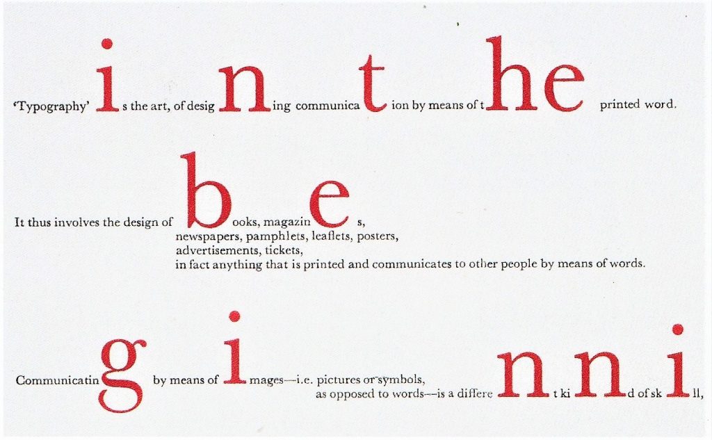
Cards to promote an art club, Rabia Gupta
By placing the text in a chaotic way, the designer is able to express the company’s taste in art.
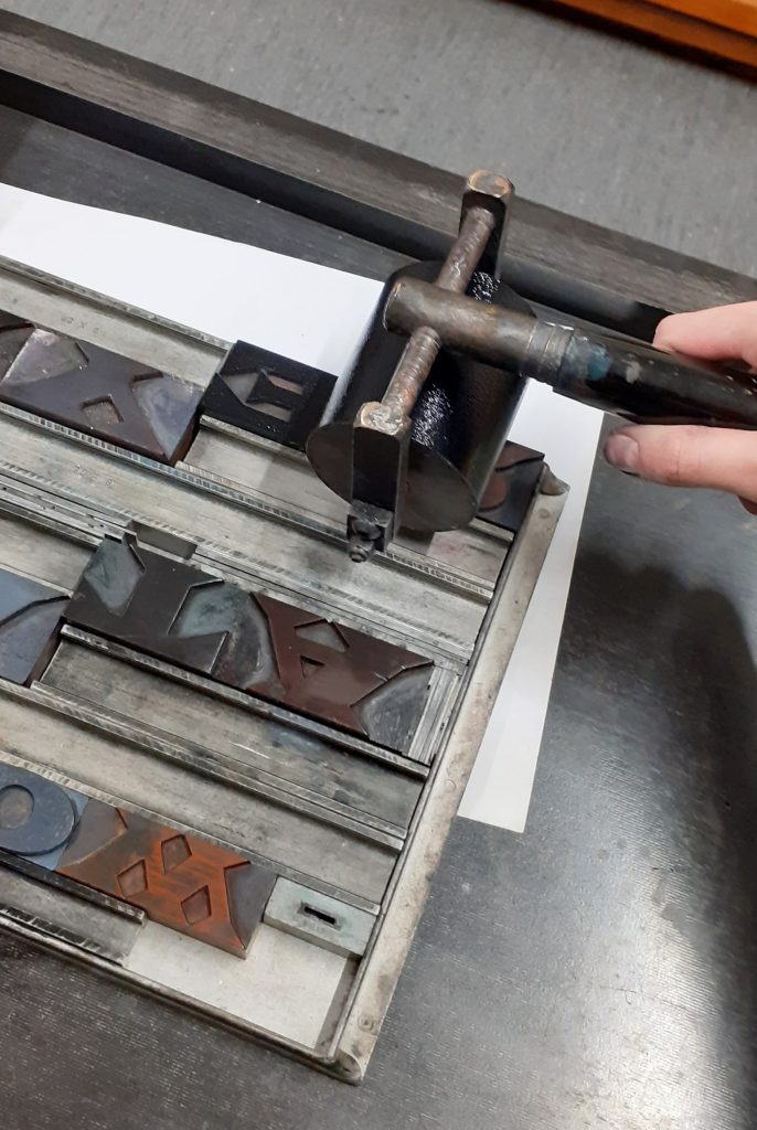
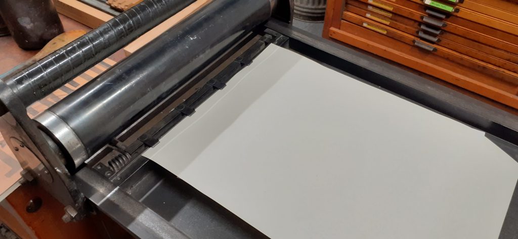
The letterpress workshop in week 1 introduced us to the printing press.
The aim of the workshop was to work with woodblock type to explore composition and the potential of uncreative writing. We were instructed to reflect the meanings of the phrases in these prints.
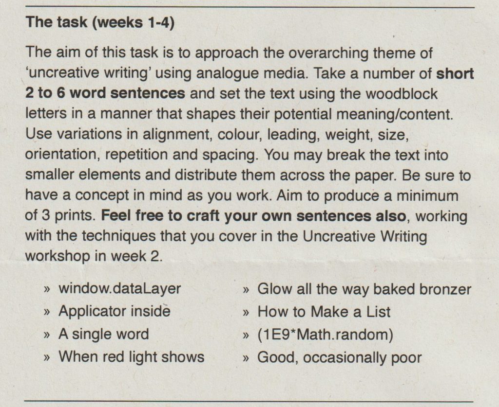
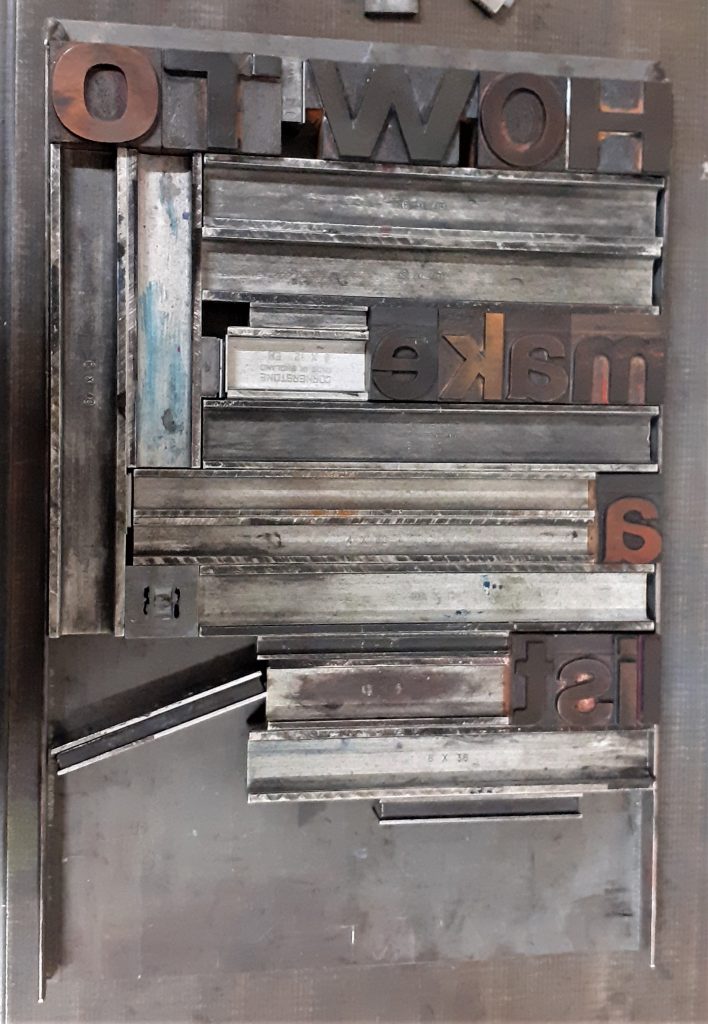
I selected the phrase ‘How to Make a List’ from the workshop brief. This first made me think of the typical list format that you might use for a shopping list. Vertically aligned left down the page. I selected the letter blocks from a sans-serif font. I chose the ‘How to’ in larger, capital letters to suggest an instructing voice.
I placed the metal furniture to place gaps between the words. The spacing highlights the separate words. I used magnets to hold the metal in place so that it would not slip when printing.
I then applied the ink onto edges of the metal. I placed the paper onto the letters and press the paper down to transfer the ink. I paid attention to the individual letters and to the horizontal lines. When I lifted the paper off, I had created parallel lines. These lines suggest to me, the lines found on note paper.
I used the roller to evenly spread the printing ink on the flat surface. Since the ink is oil based, I needed to use white spirit to remove the ink when cleaning up the roller. Applying ink too thickly onto the letters could result in imperfect edges.
I printed the first print by hand (without using the press).
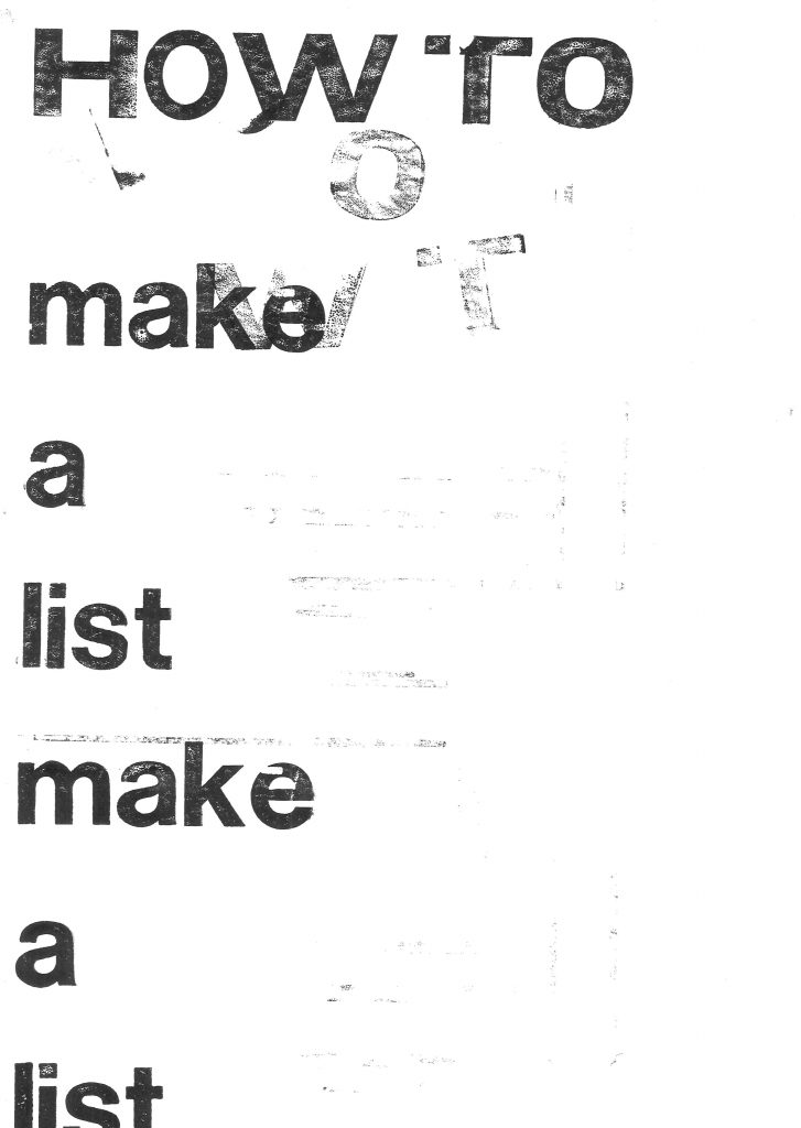
I used repetition with the left alignment to exaggerate the classic list format. There is also a hint of sarcasm to the message by repeating the words. ‘How to make a list: make a list.’ I accidently printed the extra letters at the top of the page. They look faded and although this was accidental, I like the effect. The letters spell ‘WOT’, which when sounded out, sounds like ‘What?’ The paler markings appear to be from a second voice.
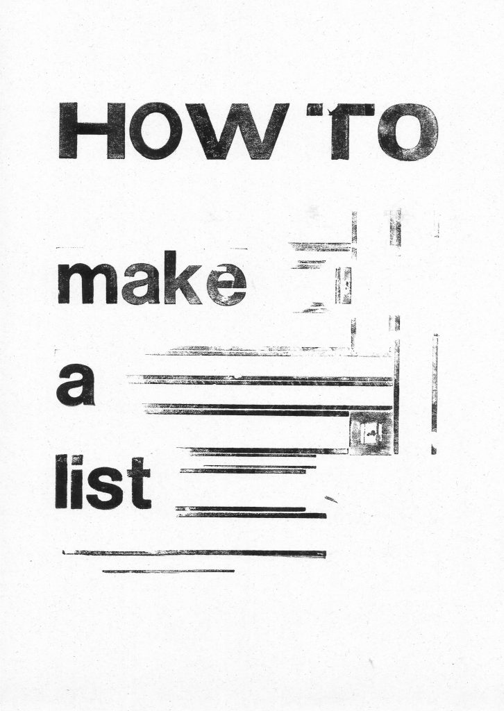
I used the lines of the metal furniture. The square was accidental and I don’t think it adds anything to the composition.
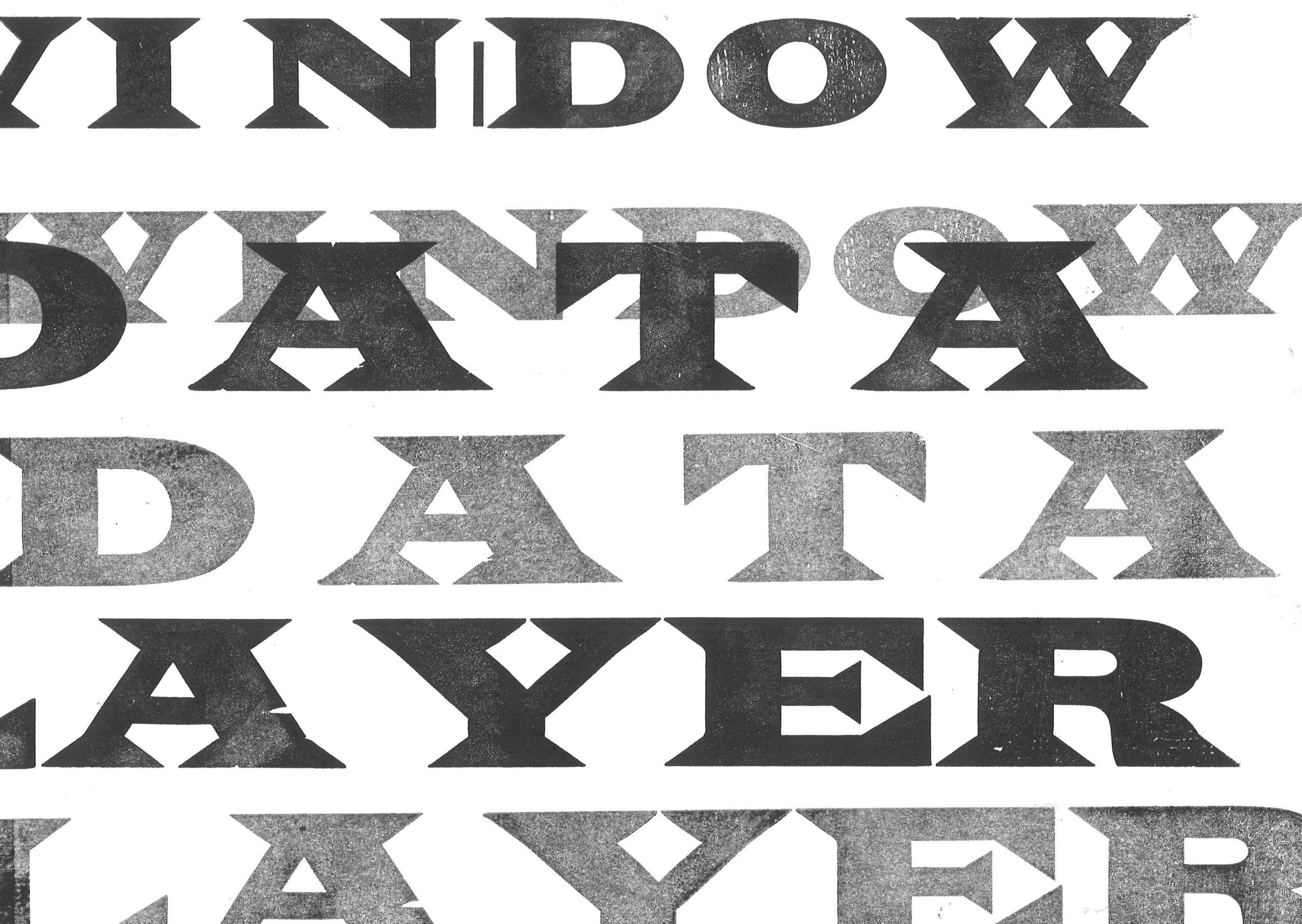
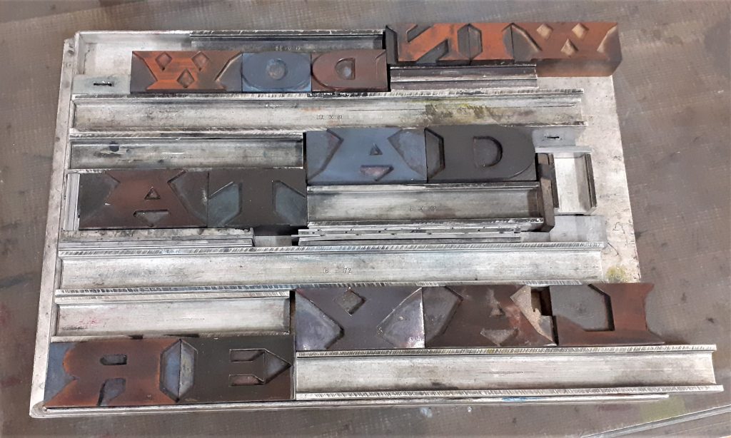
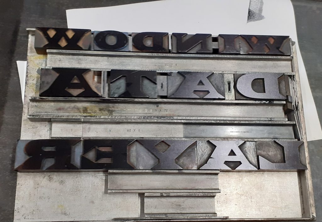
I used the printing press to print these letters:
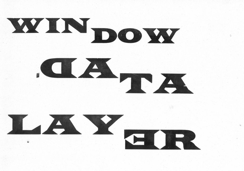
I broke the words into 2’s, as I noticed the words are similar in length. I wanted to highlight the fact that some words are made up of smaller words. For example in this print, ‘(Lay)er’, ‘(Win)dow’, ‘Da(ta)’. I used the same typeface across the print to make the words blend visually and therefore layer effectively.
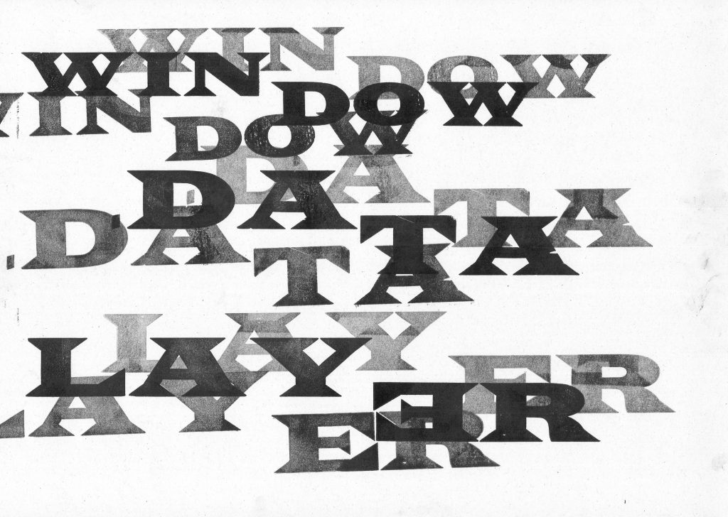
By making several prints from one ink application, I was able to achieve different weights, some more transparent than others. This gives the letters shadow and depth across the print.

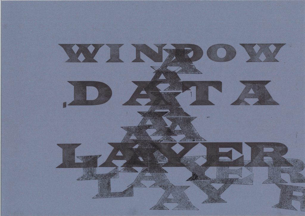
I noticed the ‘A’ in ‘Layer’ and ‘Data’ and connected them visually across the page. The words become slightly hidden, particularly ‘Layer’ which helps to illustrate the meaning of the word ‘layer’.