This week’s lecture focused on race.
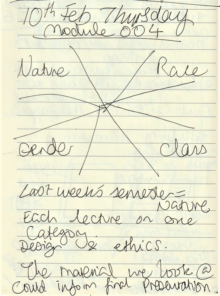
I was surprised to hear that we would be fitting one category (race, nature, gender or class) into each lecture. There is so much to unpack in each category! Therefore, we would end up with a brief introduction in the 3 hours we had in the classroom.
We began by discussing the statue of Edward Colston that was toppled into the river in Bristol in 2020.
This event sparked other Black Lives Matter protests around the world, but mostly in the UK and USA. Edward Colston was a slave trader. Statues are generally put up to celebrate people or animals who have done something of significance. It is my opinion that the people should be able to have a say in who is celebrated within their city. Having the statue up doesn’t make sense, so it is overdue being removed.
However, during the discussion, some people felt that the vandalism was wrong. That the statue was also artwork and therefore deserves to be respected. An image documents what has happened in history and history needs to be told. It was suggested that people could have written a petition to have it removed. Others pointed out that this would only put the power back into the hands of authorities and take away from the rebellious nature of the act.
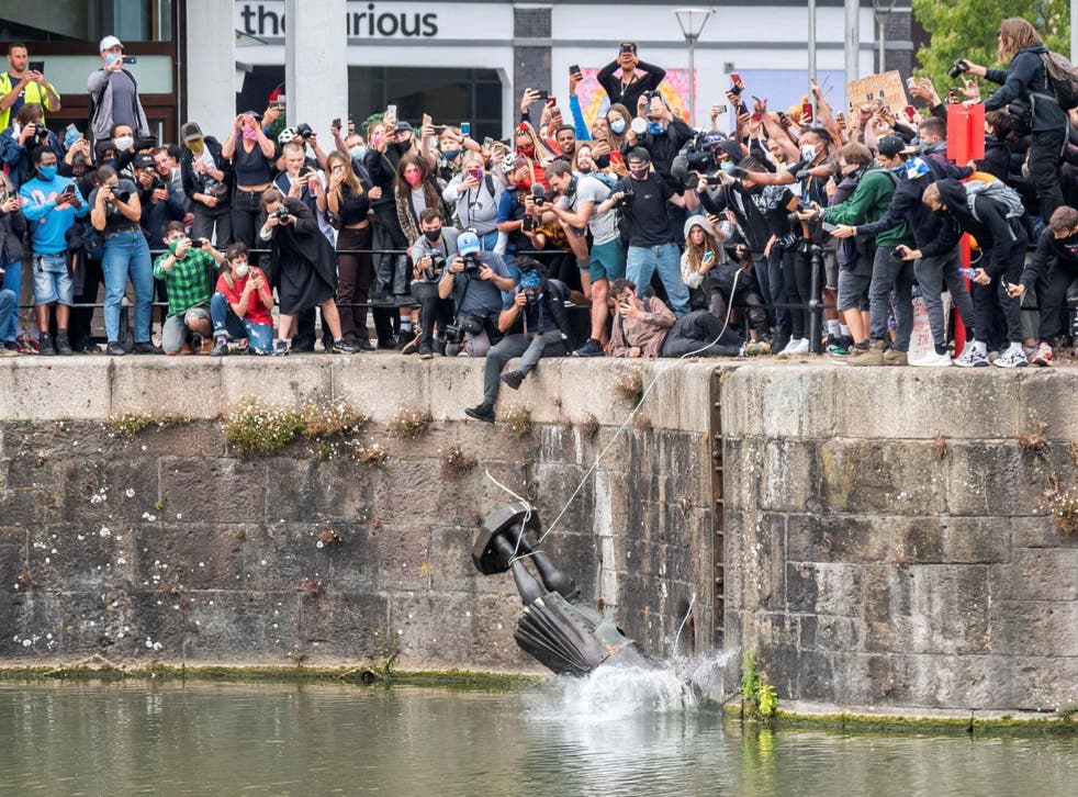
The media response to this event was torn. Society was split about the issue. Some said that public spaces belonged to everyone. Others said that heritage and memory are a part of a city and this needs to be respected also. It was the action that expressed the rage people had.
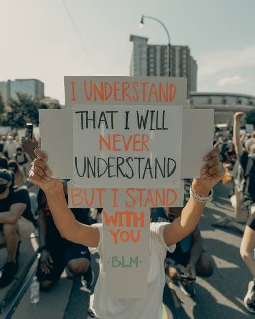
Image from Black Lives Matter protest. ‘I understand that I will never understand, but I stand with you .’ is a phrase that sums up my feelings on subjects that don’t directly affect me.
Colonialism
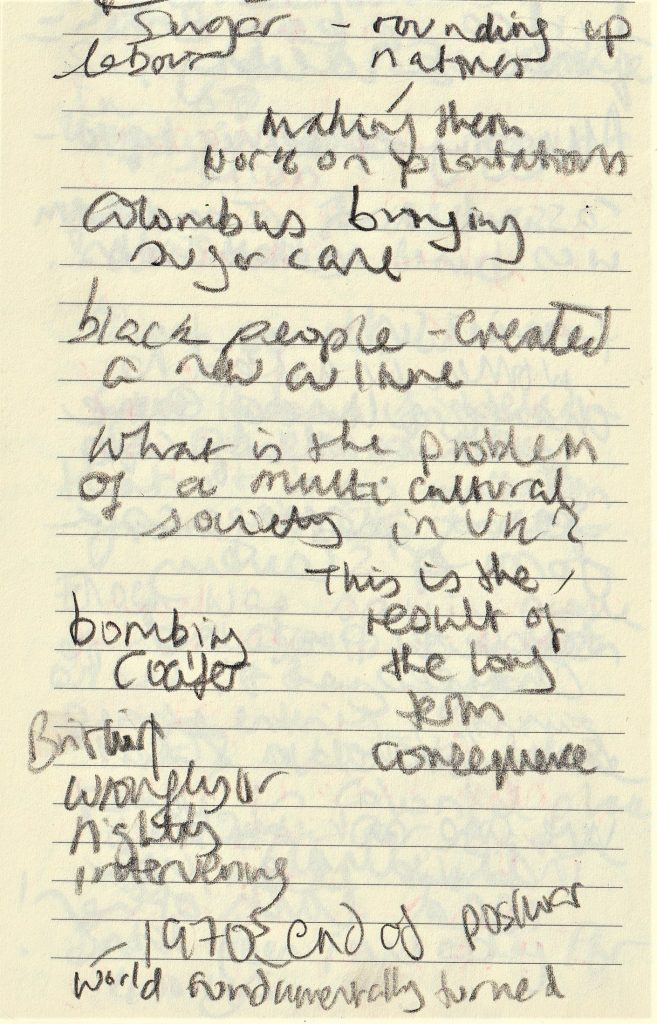
Colonialism refers to the exploitation of large areas of the world by European countries, beginning around the African coast, in around 1500.
Image from today’s lecture, outlining the when’s and where’s of colonialism:
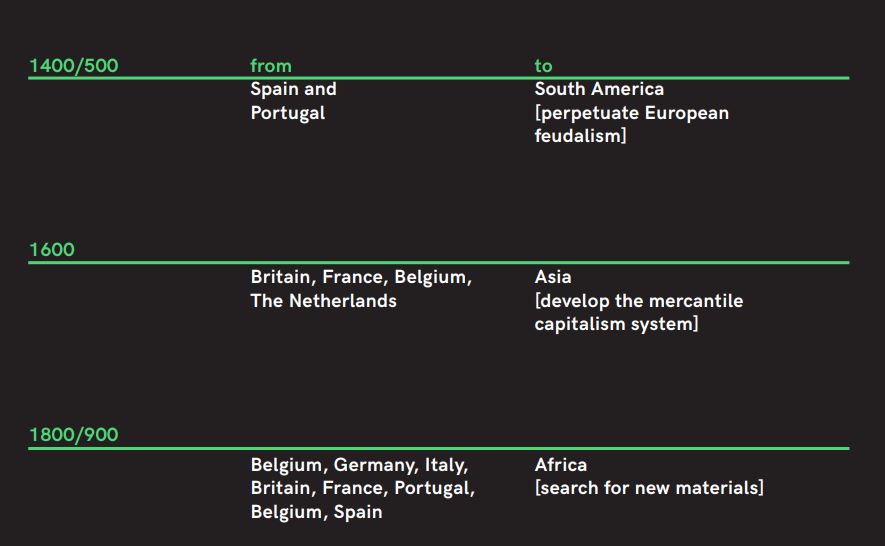
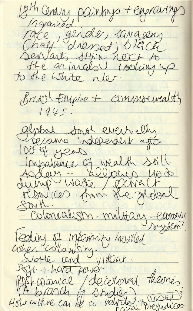
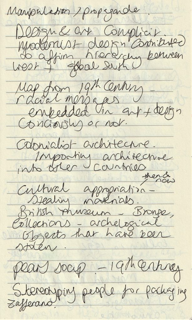
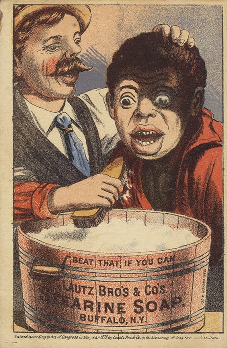
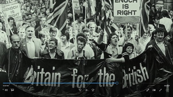
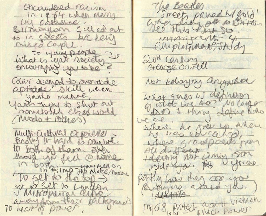
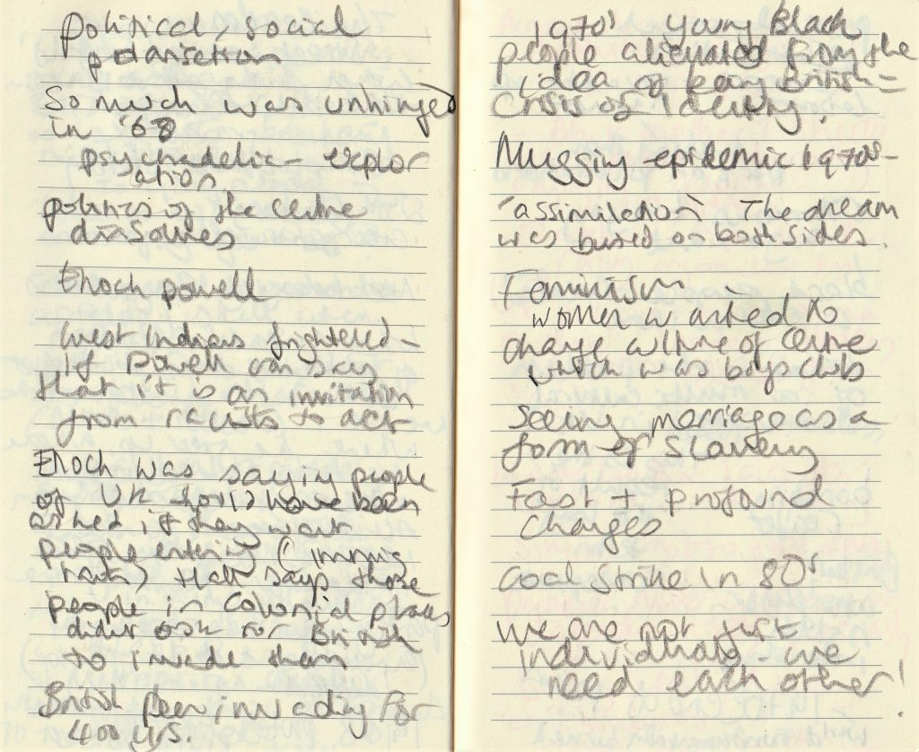
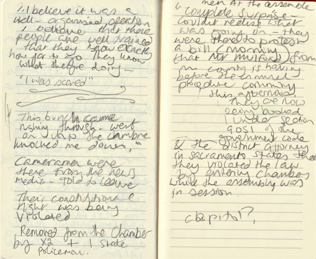
notebook notes:

The Stuart Hall Project
John Akomfrah (2013)
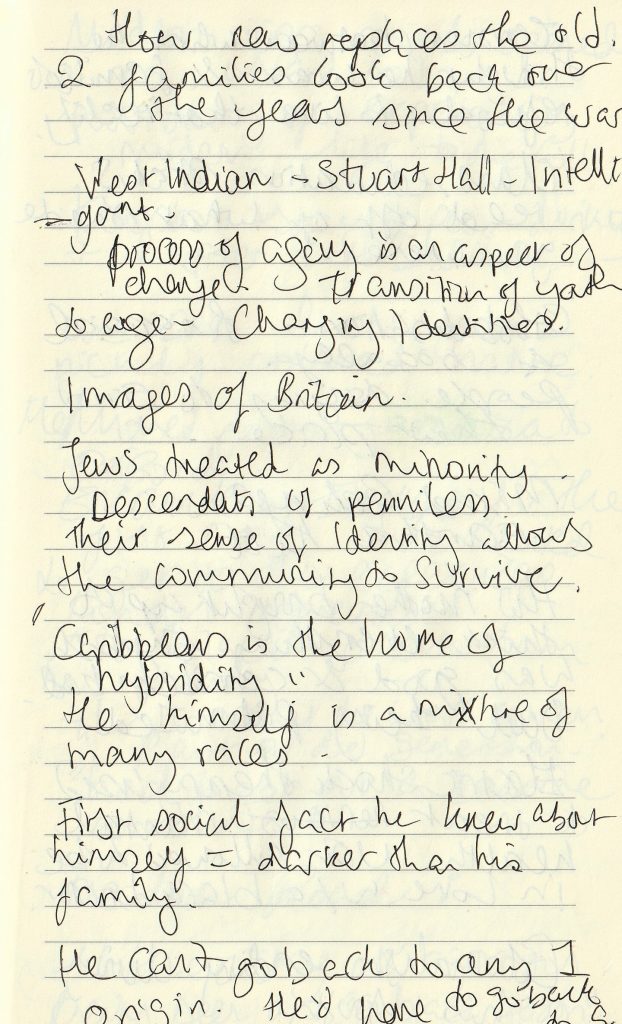
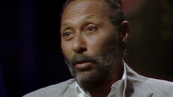
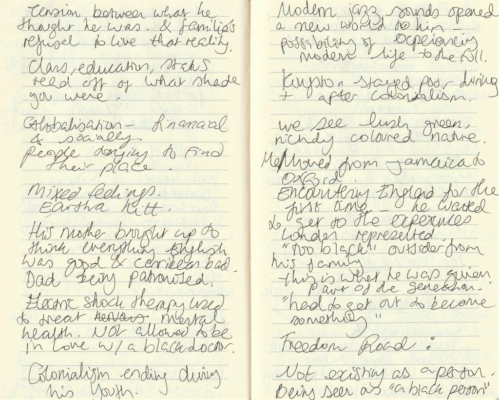
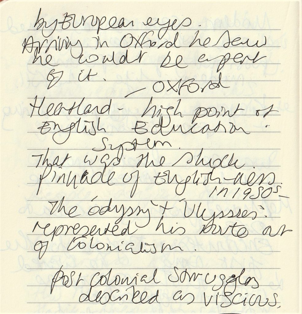
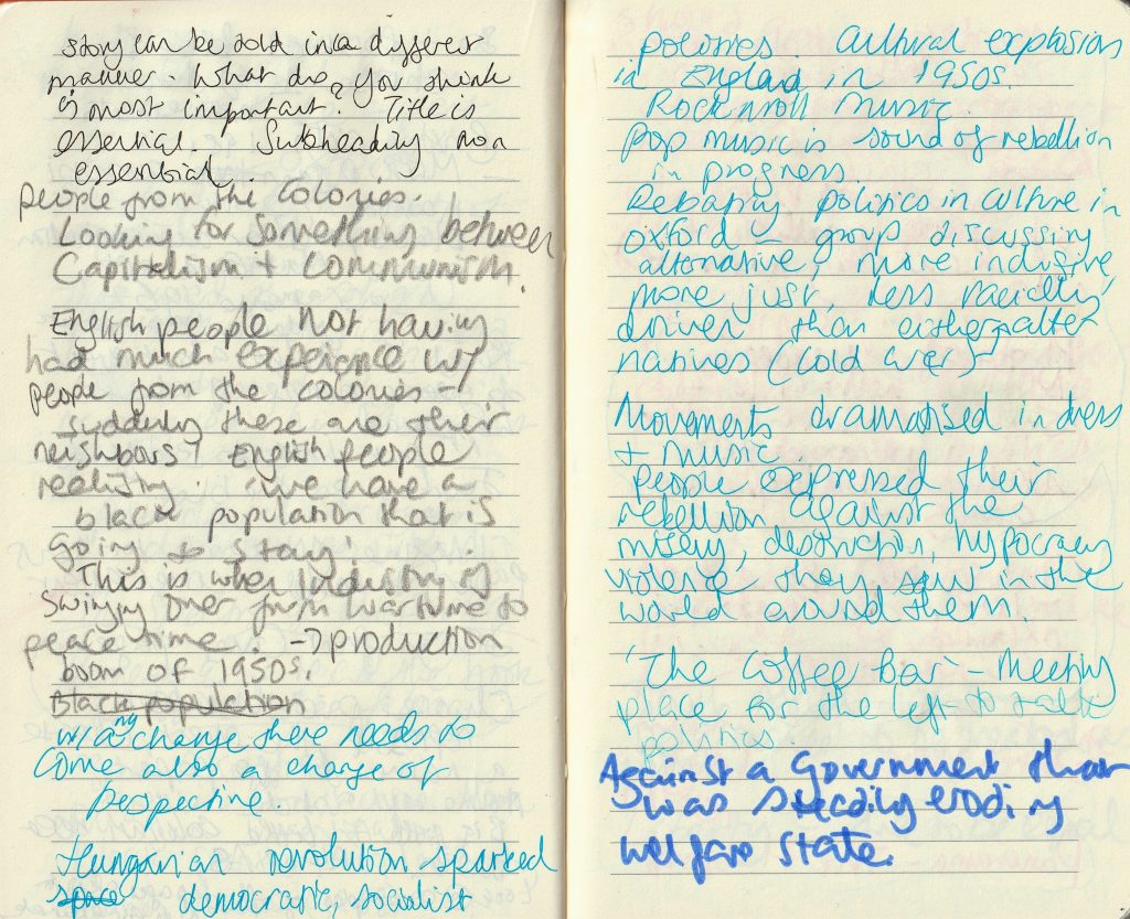
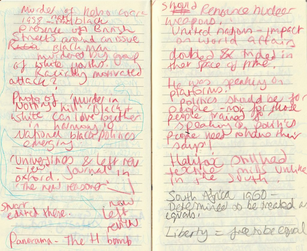
This film gives a sweeping view of Stuart Hall’s experiences in the last century. What was brought to my attention, was just how much change took place in a short amount of time.
We hear Hall comment on significant moments in history. They are fed to us in pieces. The music of Miles Davis plays throughout, which to me was disconcerting. The trumpet whined and spoke of suffering in my opinion. Hall speaks about finding resonance with Miles Davis’ music. In this way, it fits perfectly with the subject. There is nothing relaxing about the events of the events that took place!
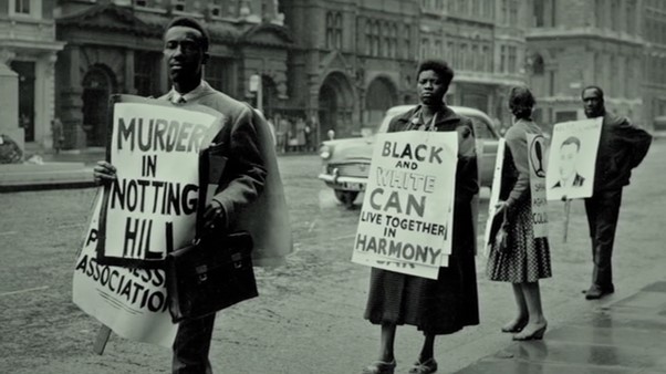
He explains that Miles Davis’ music matched his feelings of uncertainty, regret and nostalgia for what cannot be.
Mark Duggan Investigation- Forensic Architecture (201X)
‘On 4 August 2011, Mark Duggan was shot to death by police in Tottenham, north London, after undercover officers forced the minicab in which he was travelling to pull over.
As the vehicle came to a stop, Duggan opened the rear door, and leapt out. Within seconds, an advancing officer known only by his codename, V53, had fired twice. The first shot passed through Duggan’s arm, and struck a second officer, known as W42, in his underarm radio. The second, fatal shot hit Duggan in his chest.
V53 would later tell investigators that he saw a gun in Duggan’s hand, and felt his life to be in danger. Duggan was being monitored by Operation Trident, a controversial unit of the Metropolitan Police focused on gun crime in London’s Black communities; firearms officers had followed him from a nearby meeting, at which he had reportedly collected a gun. But following the shooting, the gun in question was found around seven metres away from where Duggan had been shot, on a nearby patch of grass. But no officers reported that they saw Duggan throw the gun, or make any kind of throwing motion.’
The video looks at this investigation undertaken by the Forensic architecture team. We are shown computer-generated videos of what had taken place. The team were able to enact all the possibilities, using mathematical equations. This would eventually lead them to rule out the possibility that Duggan had thrown the gun at all.

‘In the hours following Duggan’s death, multiple news reports falsely described an incident in which an individual had opened fire, injuring an officer. The Daily Mail called Duggan a ‘gangsta’, while the Guardian reported an ‘exchange of fire’. However, it became clear soon afterwards that W42’s injuries had been caused by another officer; a week later, investigators would admit that they may have ‘verbally misled’ journalists in the hours after the killing.’
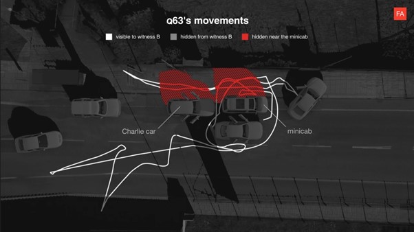
‘On 26 May 2021, after more than a year of deliberation, the Independent Office of Police Complaints (IOPC) refused Forensic Architecture (FA)’s request to reopen the investigation by its predecessor, the Independent Police Complaints Commission (IPCC), into the killing of Mark Duggan in August 2011. In doing so, the IOPC has chosen to ignore new evidence provided to them, evidence which served to undermine the very basis on which the original investigation had concluded that V53, the officer who killed Duggan, had no case to answer.’
The family of Mark Duggan may not have justice yet, but the work by Forensic Architecture has brought to life important truths that couldn’t otherwise have been known for certain. My mind considered the possibilities of putting technology to good use.
Why I’m no longer talking to white people about race
There are unique forms of discrimination that are backed up by entitlement, assertion and, most importantly, supported by a structural power strong enough to scare you into complying with the demands of the status quo. We have to recognise this.
Reni Eddo-Lodge
insularity: NOUN ignorance of or lack of interest in cultures, ideas, or peoples outside one’s own experience.”an example of British insularity”synonyms:narrow-mindedness
assimilation: NOUN the absorption and integration of people, ideas, or culture into a wider society or culture.
Quotes from the chapter ‘What is White Privilege?’ :
- racism is more than a one-off incident. It’s about the world you live in, and the way you experience your environment.
- So many white people think that racism is not their problem. But white privilege is instrumental to racism.
- I don’t mean every individual white person. I mean whiteness as a political ideology. A school of thought that favours whiteness at the expense of those who aren’t.
- Racism’s legacy does not exist without purpose. It brings with it not just a disempowerment for those affected by it, but an empowerment for
those who are not. That is white privilege. Racism bolsters white people’s life
chances. It affords an unearned power; it is designed to maintain a quiet
dominance. Why don’t white people think they have a racial identity?
In this chapter, the author has a conversation with ‘Jessica’, who is a woman of mixed race. She tells us about the way her white mother acts defensive when they are discussing race. “I feel like you’re forgetting that you’re white as well.” To which, she explains “Yeah, Mum, but when I walk down the street, people see a black woman.” I experience myself as a black woman.”
This was profound for me, because it made me realise, racism isn’t about us and our personal opinions, it’s about the way the world functions. Jessica isn’t waking up and deciding to be part white-and-part-black. She can never decide how she is going to be seen by the world. And the way people see each other has so much to do with history. Even if the individual is not aware of history, it still effects every person’s life. We are all in a system that we may not have created and aren’t even aware of being in. Of course a black person is most likely to be the person who sees white privilege, because they don’t have the privilege to not see it.
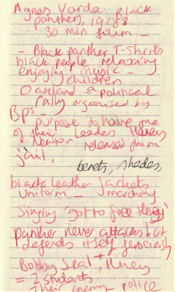
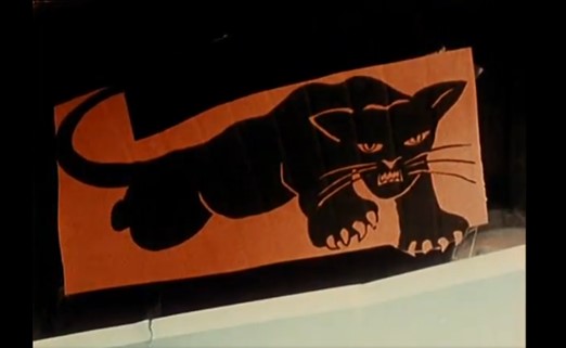
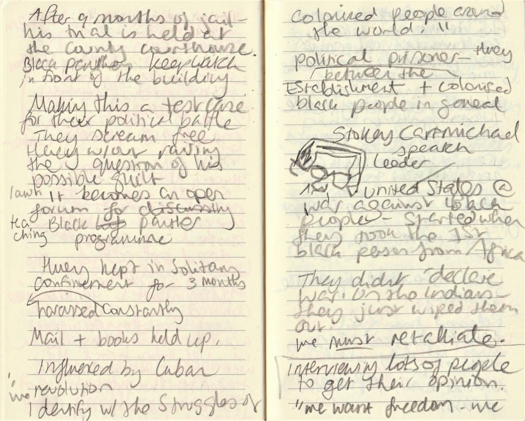
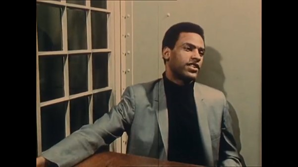
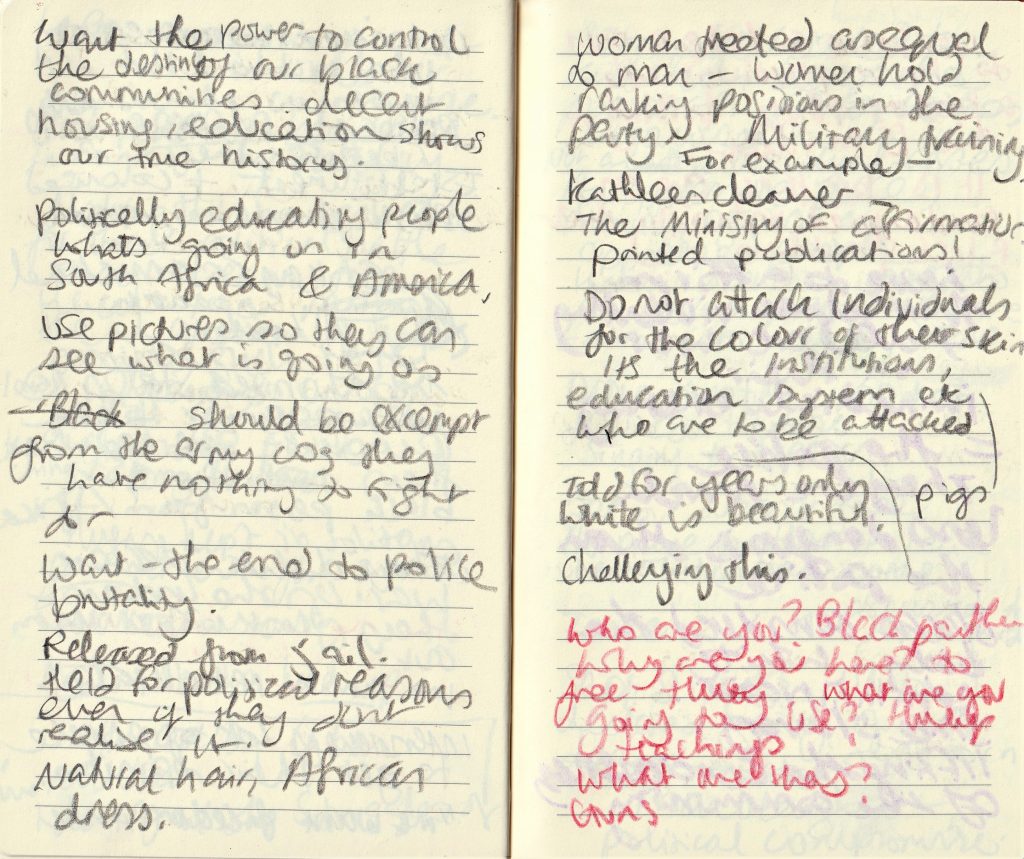
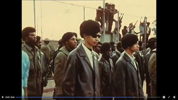
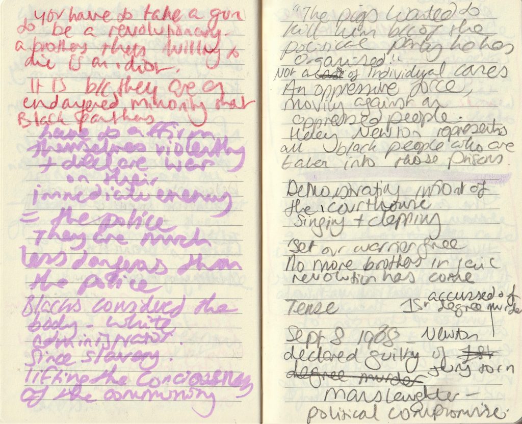
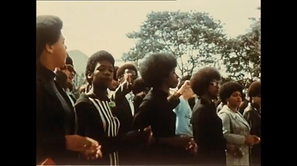
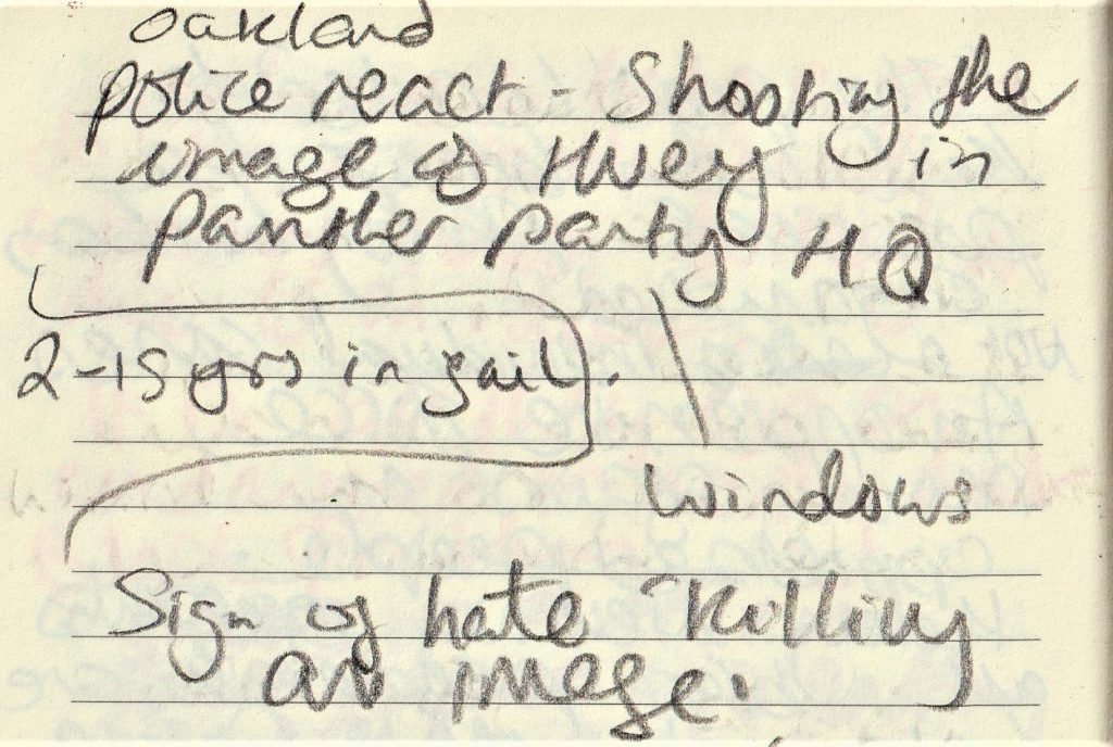
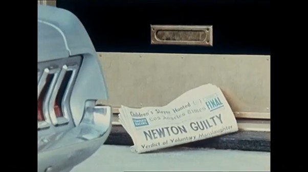
Black Panthers, Agnes Varda (1968)
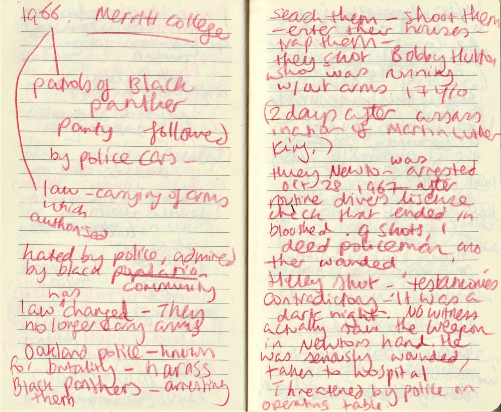
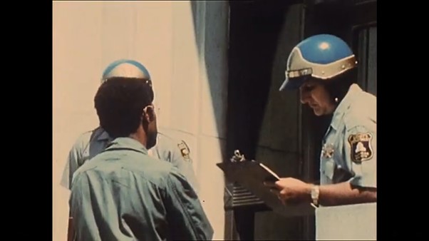
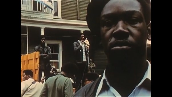
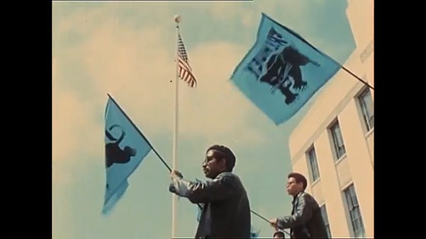
Homework Task- Newspaper page
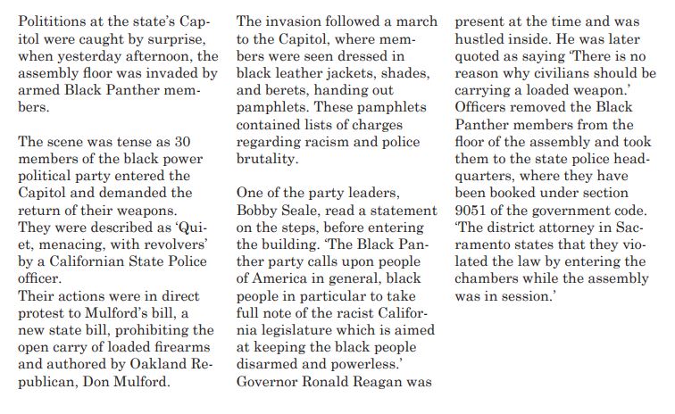
For a homework task, our lecturer Luisa has asked us to design the front page of a newspaper, covering a chosen event concerning race. We were asked to choose from 3 events. I chose the Black Panther demonstration against Munford act.
I first needed to look at 3 articles about the event. The first article is the video I found on YouTube, from the Center for Sacramento History archive:
The Black Panthers protest the California assembly (1967)
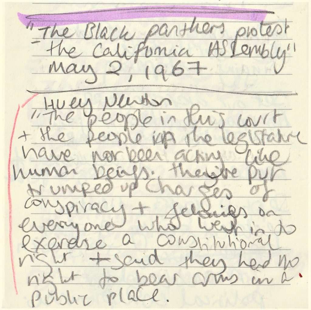
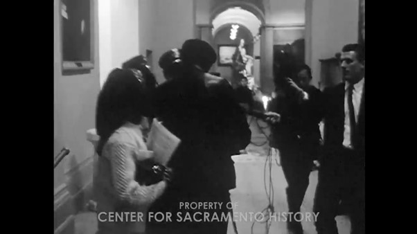
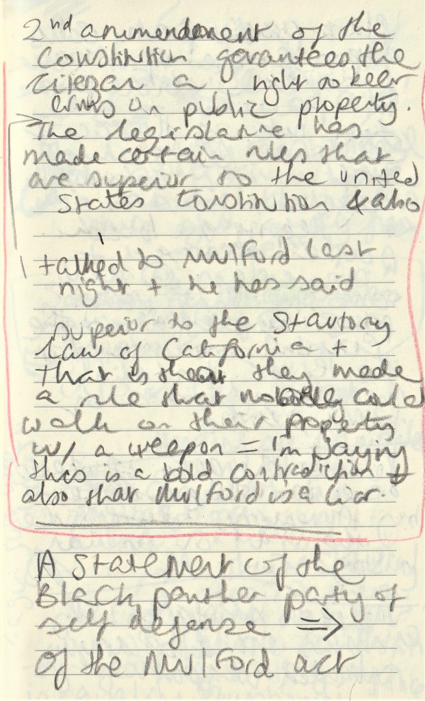
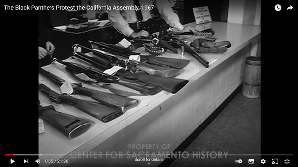
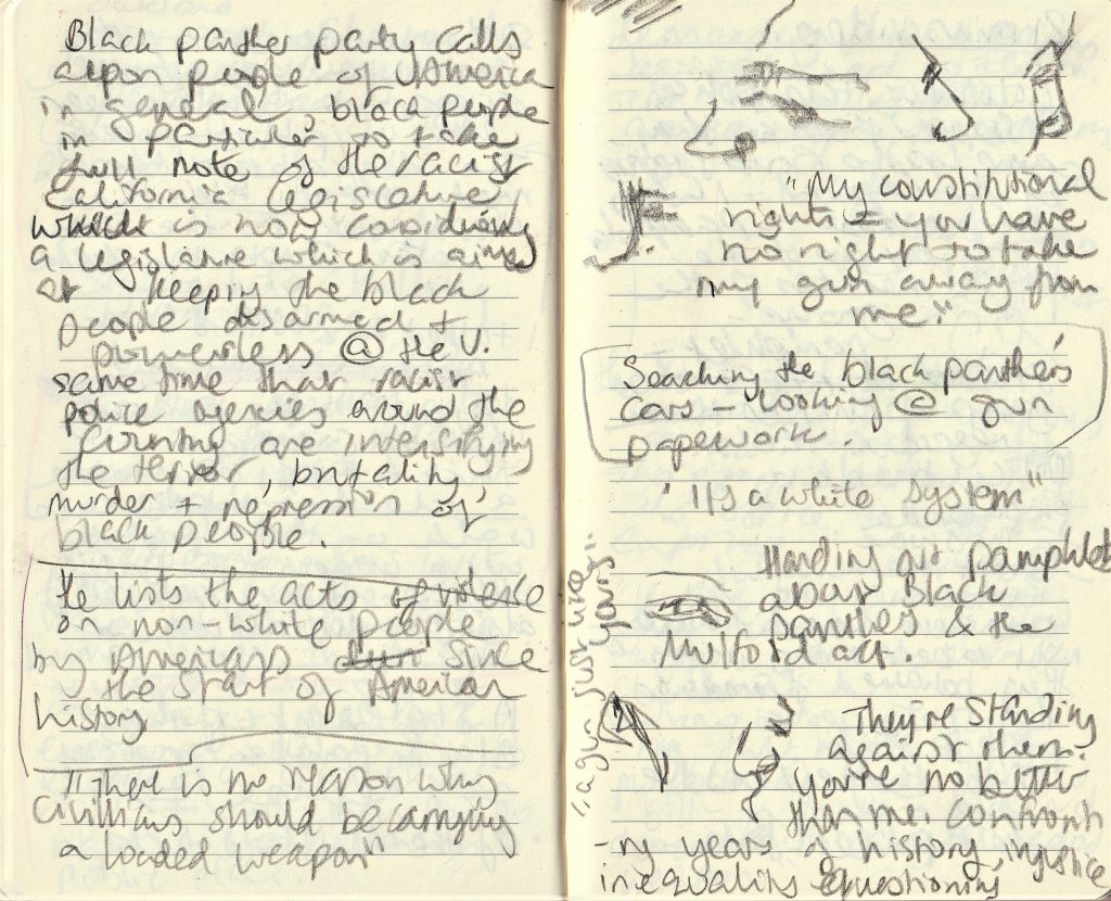
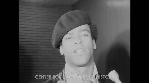
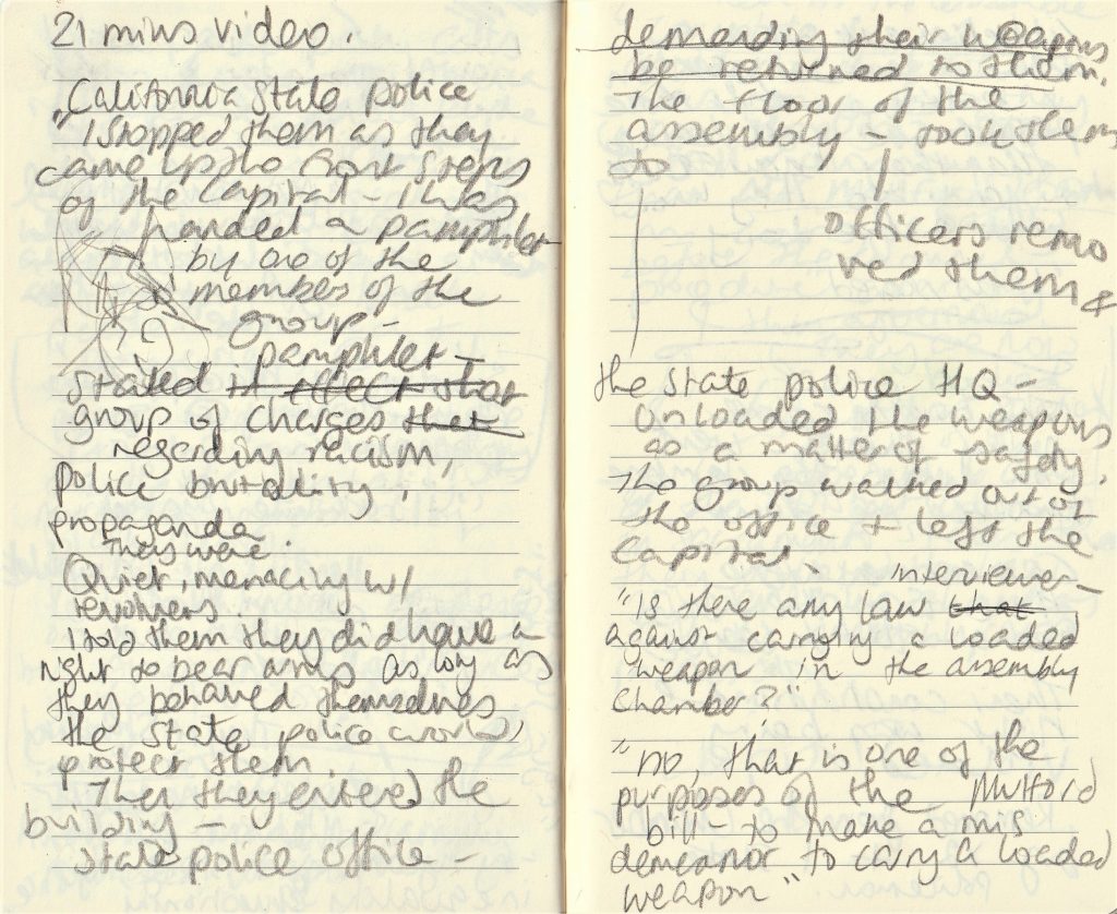
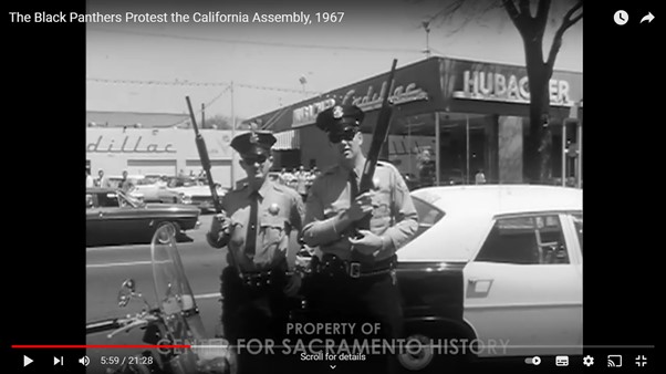
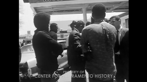
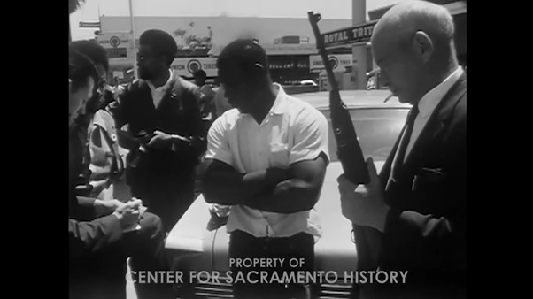
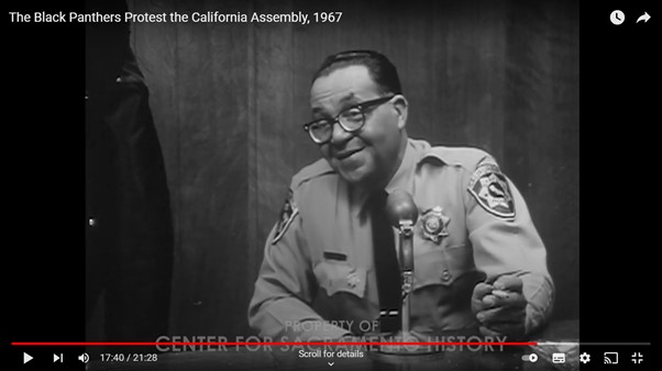
This is the second article I looked at about the event. I chose this article because it was written in recent times and looks back on the event 50 years later.
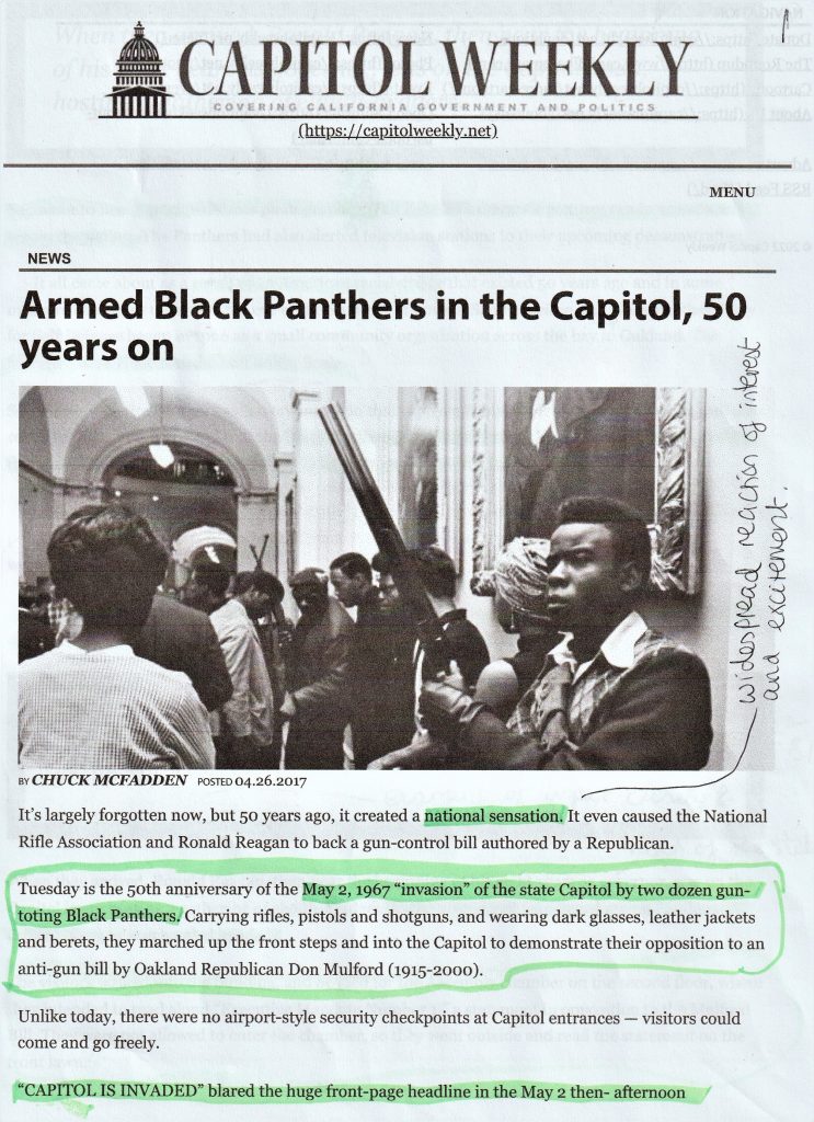
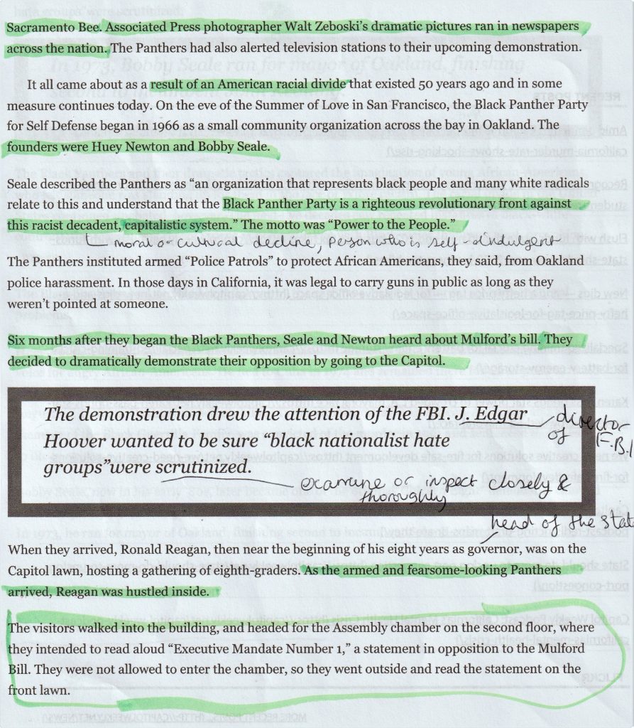

3rd article I looked at was from History.com:
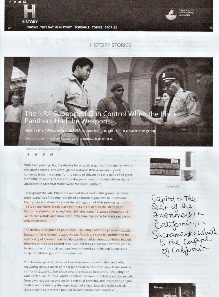
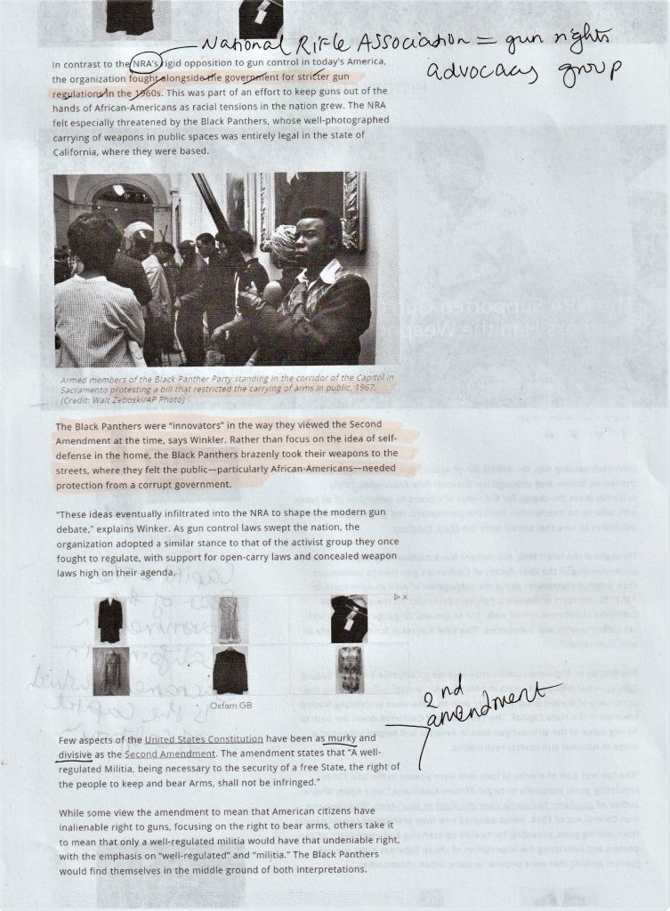
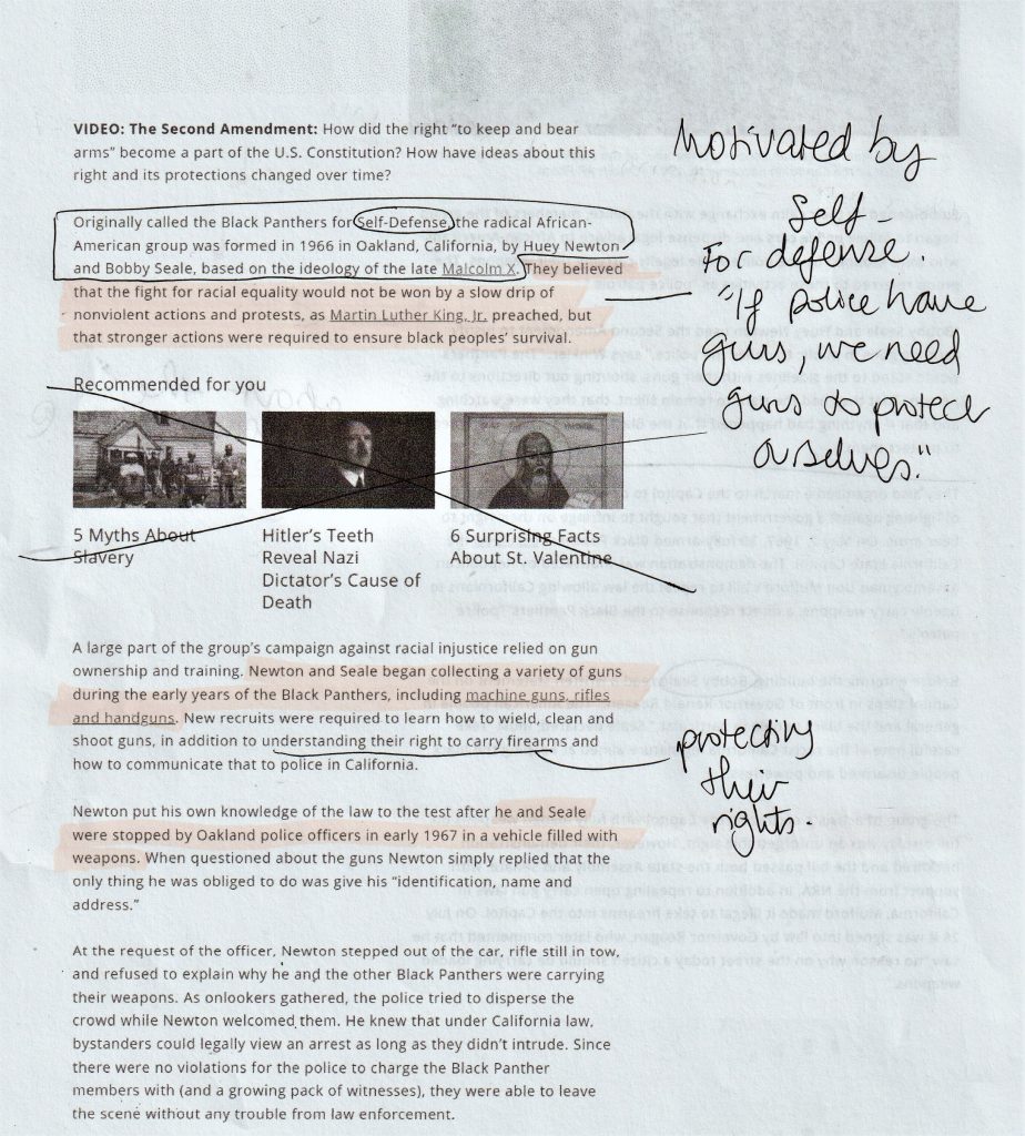
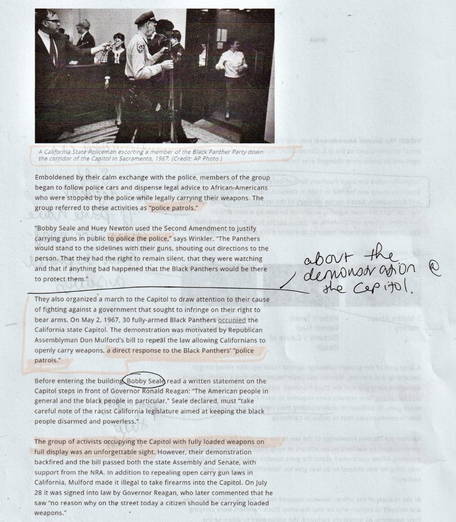
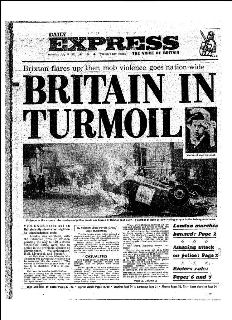
Examples of newspaper front pages
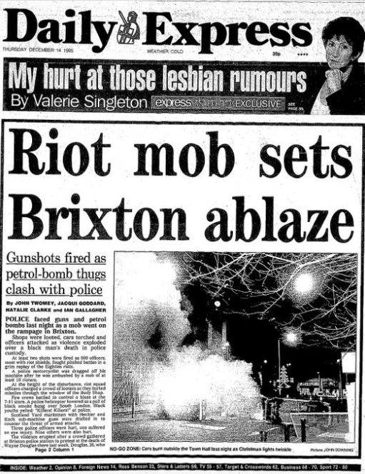
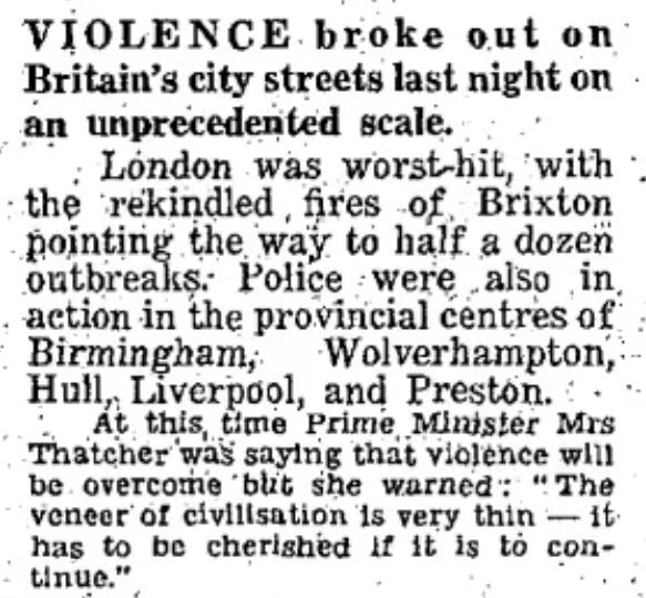
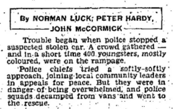
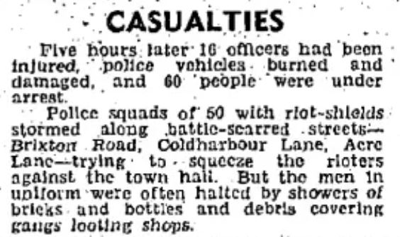
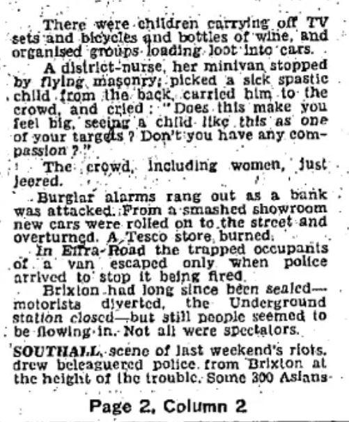
I looked at this example from 1995 riots, to see how a story is covered in a newspaper article.
‘Police faced guns and petrol bombs last night as a mob went on the rampage in Britain,’ is how the article opens. I was interested to see that the article is written from the perspective of the police.
‘Shops were looted and cars torched, and officers attacked as violence exploded over a black man’s death in police custody.’ is how it continues. Therefore, the reason for the riot is the last fact to be mentioned.
My Newspaper Front Page
