Luisa gave us some reflections on these slides, which I found helpful when thinking about my final presentation.
We then were asked to repeat the exercise, this time using images only.
I used different placements of the images to make the viewing more interesting. For example, placing the image at the centre of the slide, left, right or covering the slide completely.
I then went for the opposite effect and began by focusing on the details before walking away. I showed this by ending the slides with a far away image of the clock placed on the wall. This puts the clock in the context of the collection.
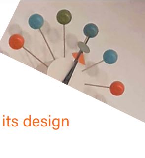
I cropped and altered the rotation of the image on the first slide. I chose this to reflect the ‘playful’ aspect of the message, expressed in the text.
For the second slide, I placed the text and image centrally to reflect the message. I drew lines across the image to highlight the spokes of the clock.
I left the line of ‘the hands frozen in time’ to its own slide. I did this to give the viewer a chance to pause and feel the stillness of the clock hands.
Collage artist based in Berlin. What I find interesting about her work is the variety of techniques she uses in her collages. Each collage is different and surprising. She experiments with the physical quality of the paper. Sometimes folding it like a fabric and other times cutting the paper with a scalpel.
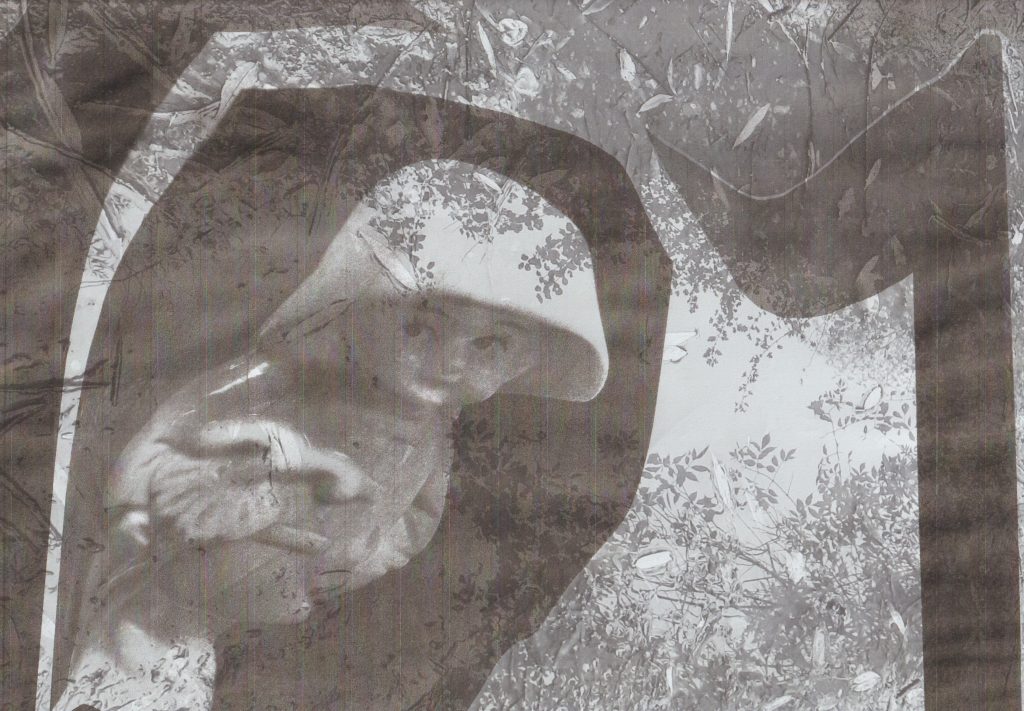
In this image, she has cut the paper carefully into a smooth curved line. The area of the face stands alone on the page. Cutting an area out is an other way of concealing an area, this adds mystery.
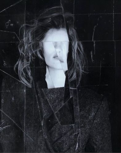
I like the choppy style of cutting within this collage. It reminds me of a smashed window. Some lines are parallel but the piece is asymmetrical.
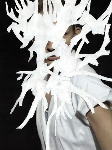
The white area hides the image behind. Because of its shape, we see glimpses of the figure between the branch-like shapes. The flat quality of the white area balances out the depth and blackness of the photograph.
Cutting out sections of an image means you can re-arrange them on the page to your liking. The medium of collage means you can be selective with what to include. In this image, I am drawn to the shape of the negative/white space.
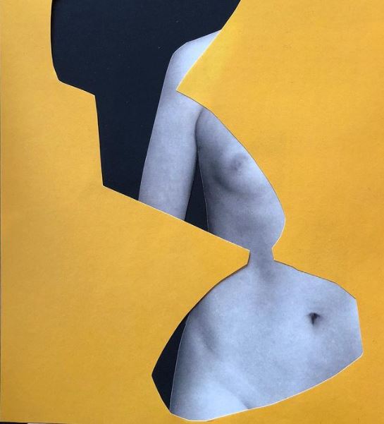
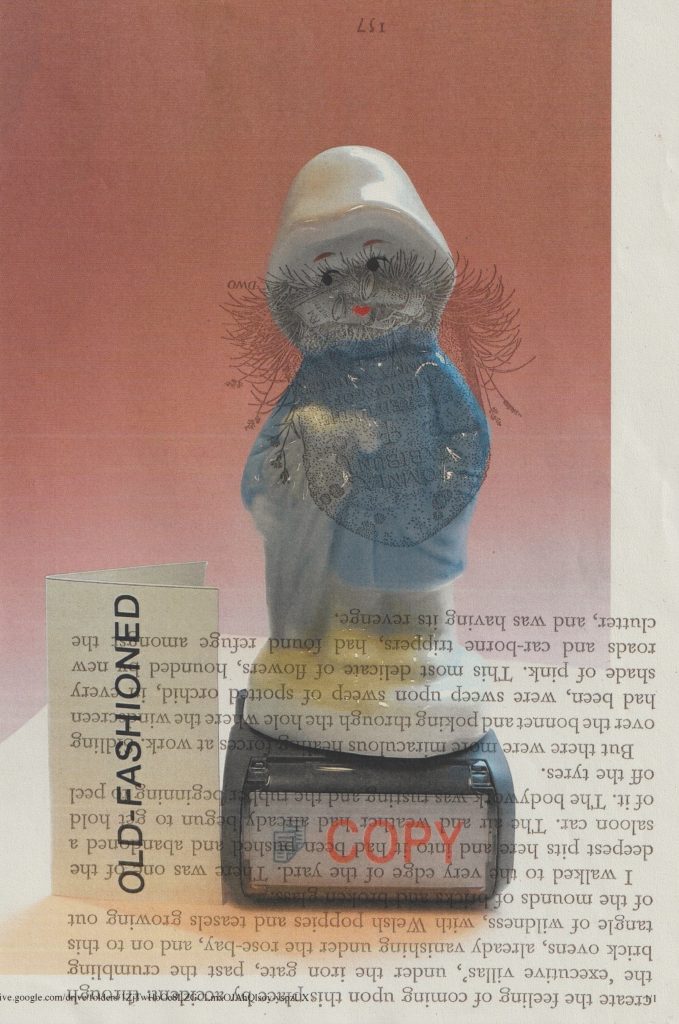
I like the way Reitemeyer plays with layers in this piece. The shape she has cut from the yellow paper acts as a frame for the image behind. The choice of plain yellow draws the focus to the figure. If she had used another image for this top layer, it might look confusing or flat.
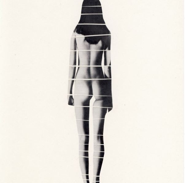
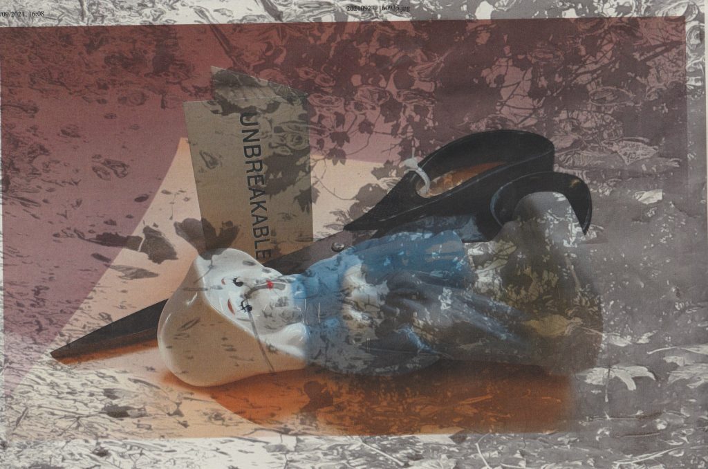
I like the way she has broken the image into sections. To me, this symbolises something broken or unsettled about the character or narrative.
When starting the project of making my final zine, I wasn’t quite sure where to start. I needed to generate more ideas about the context, layout and visual elements. Having experimented with format, I was happy I had 3 possible formats to work with.
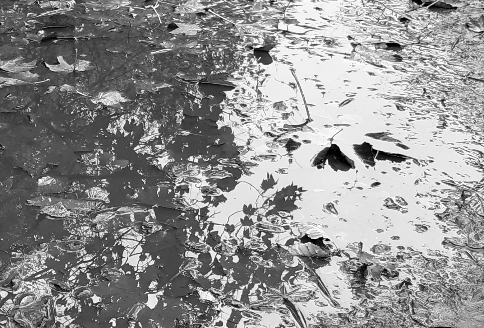
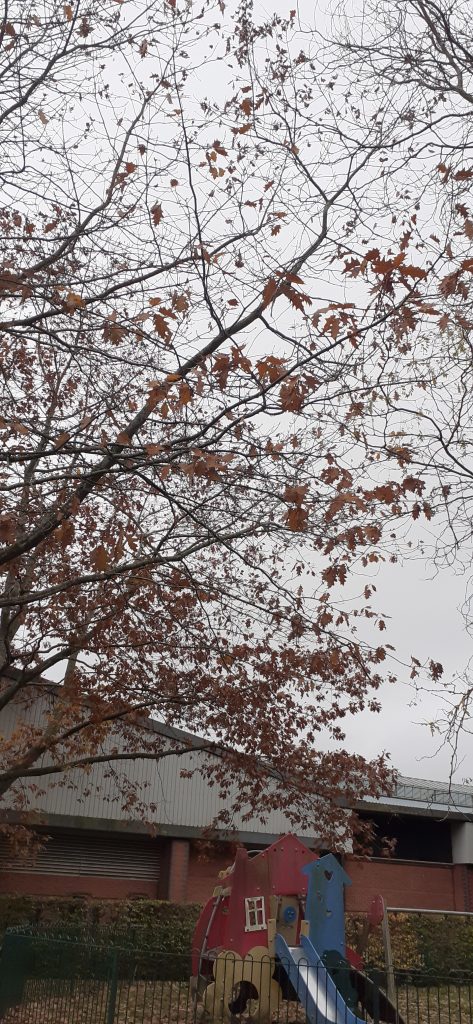
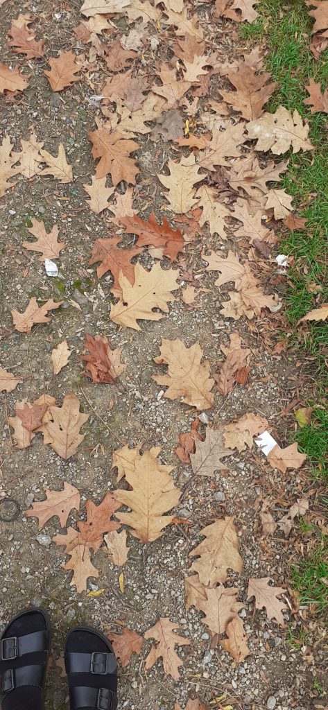
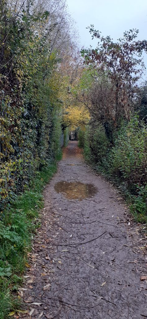
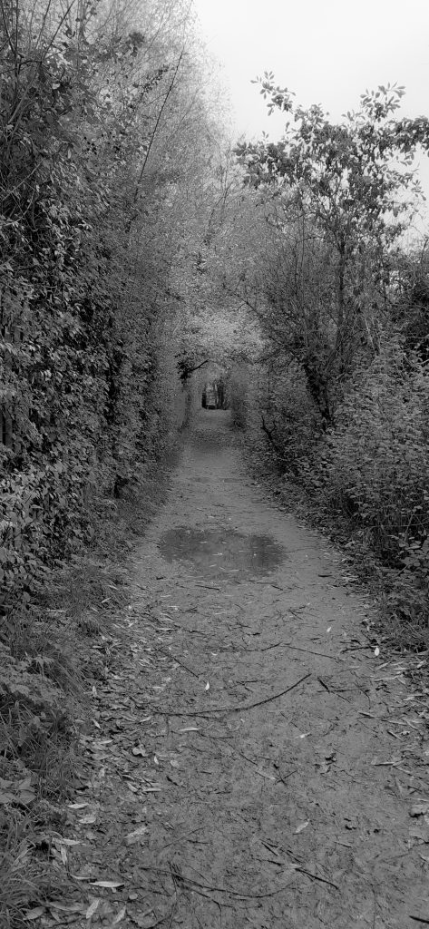
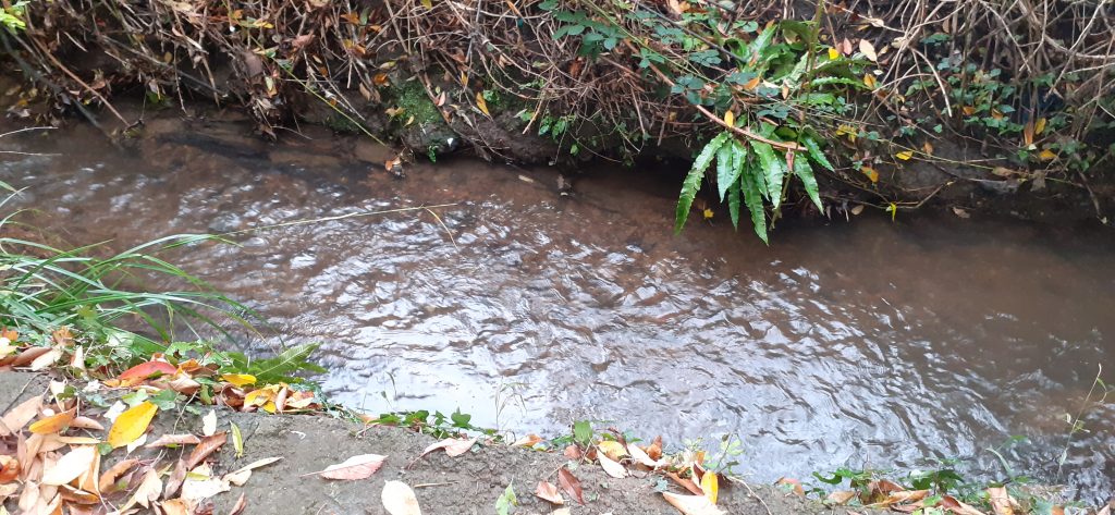
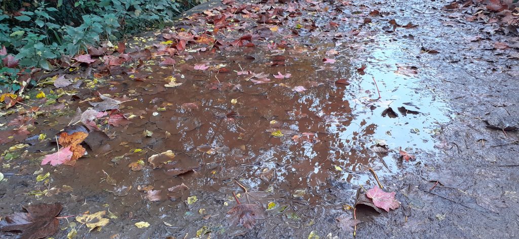
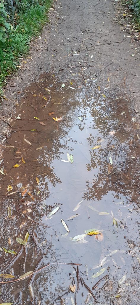
I began to take photos with my phone camera. I focused loosely on the themes of water, home, fragments and seasons. I took the following photos:
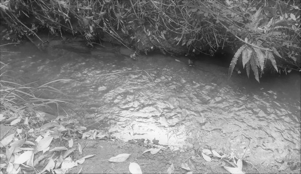
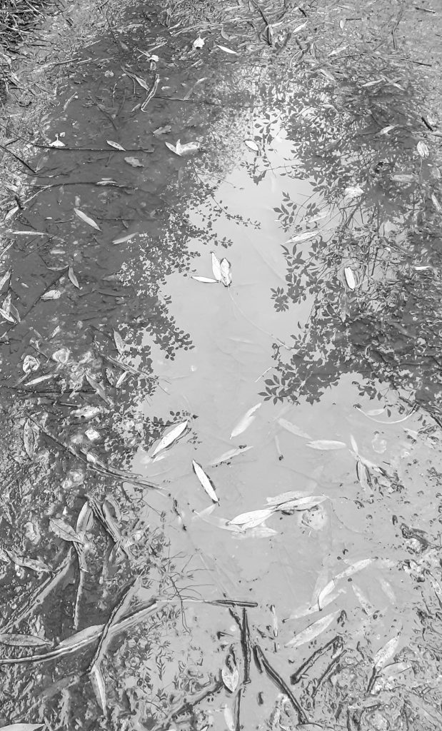
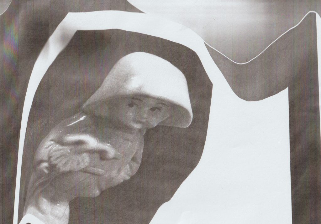
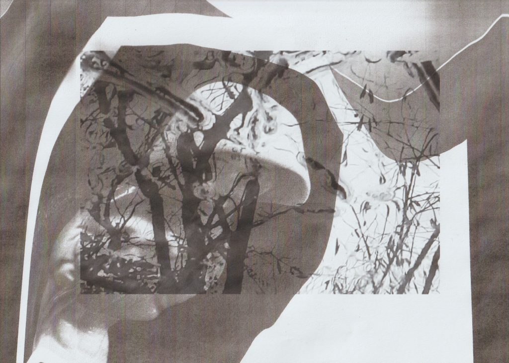
I converted some of the images into black and white before printing them. I used these photos as collage pieces to incorporate into my sketchbook along with the image of my chosen object, the raincoat girl.
Before & after photoshop/ camera RAW
I softened the image and turned down the saturation.Softening this image make the photo look smokey and dream-like.
Collage experimentation
Within my sketchbook, I began experimenting with collage as a way to play with ideas for the zine.
I printed the photo of the raincoat girl figure in black and white. I photocopied the photo while moving it around on the scanner. I liked the effect because it gave a wavy underwater feeling.
I placed the photo back into the paper compartment of the printer. I then printed the image of the puddle on top. I found that the combination of the dark areas and lighter image underneath worked well.
This experiment wasn’t as effective because the background is darker than the photo I printed on top of the background.
I printed this page from the book The Unofficial Countryside by Richard Mabey. I chose this text because of its reference to seasons and the idea of rebirth. I like the combination of colour with black and white.
The purpose of today’s lecture was to get us thinking first about the images we choose to present in the presentation and secondly, the order we place them in. To practice piecing together a presentation using InDesign, I chose to focus on my shoe as my object.
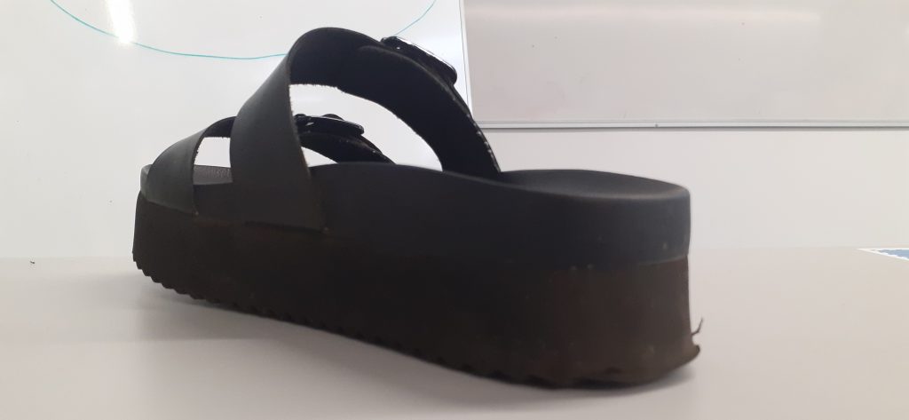
I took photos that showed off the aspects of the shoe I have experience since buying them last weekend: They are tall, they are comfortable to stand in, they can be unstable to walk fast in, the straps can be adjusted. Photographing the shoe on the carpet puts it in the context we would expect from a shoe, which is that it interacts with the ground we walk on.
I then needed to choose 6 of these photos and decide on the best order to present them in. I chose the ‘selling view’ because it shows the entire shoe. I came to realise, this was the exact reason I should not choose that picture to be placed first. Throughout the lecture, I saw that it was more important to leave some mystery for the viewer. If all the information is given away in the first slide, it leaves nothing to be revealed. Instead, it is important to grip the viewer. This is why I rearranged the image of the detail to start the presentation.
Luisa asked us to write 1 word to go with each picture. This was my original order and name for the images.
(selling) view
(wearing) it
seeing the (side)
it’s (comfortable)
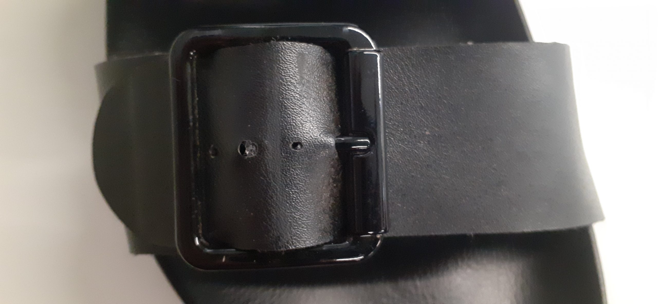
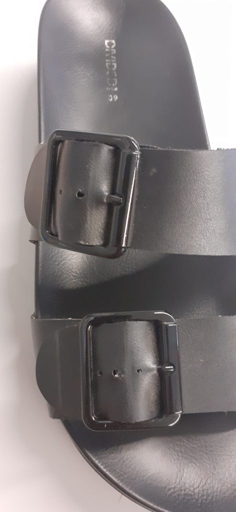
detail of the (buckle)
view from (above)
I approached this task by naming exactly what was in the picture. However, I found that it was more interesting to approach the words creatively. For example, picking out one detail within the image or maybe the material the object is made of. We worked as a group to brainstorm words that relate to each image.
The ‘selling’ and ‘wearing’ slides work together, because the viewer can compare seeing the shoe with and without the foot, since the shoe is placed in a similar position.
The ‘comfortable’ and ‘selling’ slides make sense together because they are both in portrait orientation.
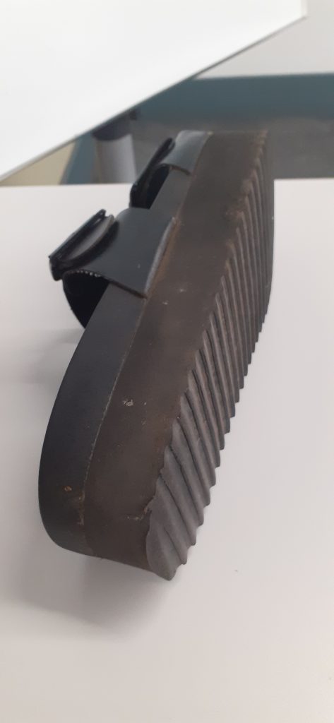
The photos I rejected:
Ball wall clock presentation
The essays by Roland Barthes introduced me to the idea of personifying an object. Often we give objects human qualities, and that is why we become attached to them.
In terms of my presentation, I want to consider the clock in this way? If it was a person, would it be friendly?
What makes a presentation visually ineffective?
Firstly, a presentation is to be seen from afar. There is no point to include graphs or images cannot be seen on the board from the back of the classroom.
Do not include pixelated images. Sometimes an image can become pixelated after you export it to a PDF.
Hierarchy is important. The viewer needs to be directed to the most important information on a page. We can do this by underlining words and adding titles. A text heavy slide is off-putting.
Other presentation tips…
It is a bad idea to be repetitive in a presentation. If an image says the same thing as another image, it is best to remove it. You do not want to bore the audience!
I could drawn my object if I feel it would help to tell the story.
Be playful, anticipate what is going to be in the next slide.
Not all the images need to contain the object. A photo of the building tells as much a story about my experience of the object.
I could include an image of the clock selling on a website. This is part of the story of the object’s value.
I can show the object in different contexts, for example in the museum or in a catalogue. This shows how the object appears in our world.
The final picture has to surprise the viewer and sumarise the object.
We use cookies on our website to give you the most relevant experience by remembering your preferences and repeat visits. By clicking “Accept All”, you consent to the use of ALL the cookies. However, you may visit "Cookie Settings" to provide a controlled consent.
This website uses cookies to improve your experience while you navigate through the website. Out of these, the cookies that are categorized as necessary are stored on your browser as they are essential for the working of basic functionalities of the website. We also use third-party cookies that help us analyze and understand how you use this website. These cookies will be stored in your browser only with your consent. You also have the option to opt-out of these cookies. But opting out of some of these cookies may affect your browsing experience.
Necessary cookies are absolutely essential for the website to function properly. These cookies ensure basic functionalities and security features of the website, anonymously.
Cookie
Duration
Description
cookielawinfo-checkbox-analytics
11 months
This cookie is set by GDPR Cookie Consent plugin. The cookie is used to store the user consent for the cookies in the category "Analytics".
cookielawinfo-checkbox-functional
11 months
The cookie is set by GDPR cookie consent to record the user consent for the cookies in the category "Functional".
cookielawinfo-checkbox-necessary
11 months
This cookie is set by GDPR Cookie Consent plugin. The cookies is used to store the user consent for the cookies in the category "Necessary".
cookielawinfo-checkbox-others
11 months
This cookie is set by GDPR Cookie Consent plugin. The cookie is used to store the user consent for the cookies in the category "Other.
cookielawinfo-checkbox-performance
11 months
This cookie is set by GDPR Cookie Consent plugin. The cookie is used to store the user consent for the cookies in the category "Performance".
viewed_cookie_policy
11 months
The cookie is set by the GDPR Cookie Consent plugin and is used to store whether or not user has consented to the use of cookies. It does not store any personal data.
Functional cookies help to perform certain functionalities like sharing the content of the website on social media platforms, collect feedbacks, and other third-party features.
Performance cookies are used to understand and analyze the key performance indexes of the website which helps in delivering a better user experience for the visitors.
Analytical cookies are used to understand how visitors interact with the website. These cookies help provide information on metrics the number of visitors, bounce rate, traffic source, etc.
Advertisement cookies are used to provide visitors with relevant ads and marketing campaigns. These cookies track visitors across websites and collect information to provide customized ads.