The last time I tried my hand at lino-printing, I was working on the FMP (final major project) of my Art & Design diploma. That was in summer 2021. One year later, I’m returning to lino. I missed the carving sensation and the satisfaction of building a work methodically- Something I only learnt to appreciate after working on screen-printing at Oxford Brookes.
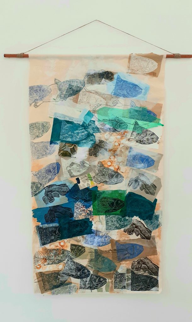
My final piece for the exhibition ‘Metamorphosis’ at City of Oxford College, June 2021. I used lino-printing for the image of the fish. This method allowed me to reproduce many copies of the image.
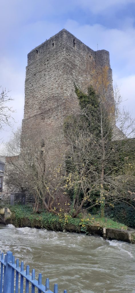
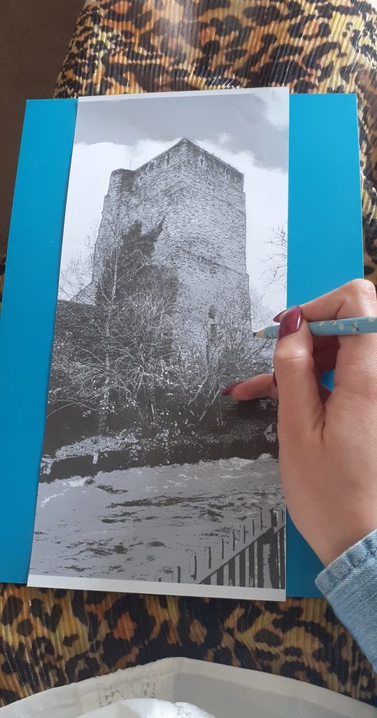
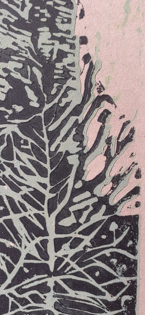
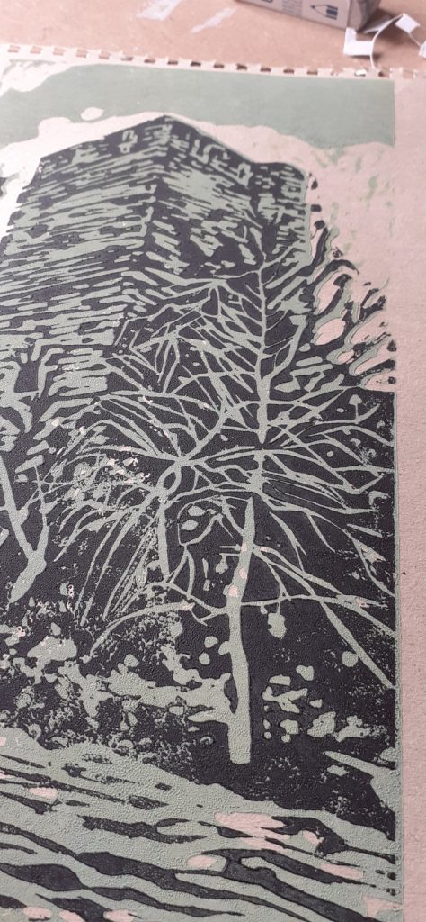
First I needed a subject. This wasn’t hard, I’ve had my mind on buildings recently. I found this photo I took of Oxford castle (below). I Like the variety of elements: soft sky, crumbling brick castle, rushing river.
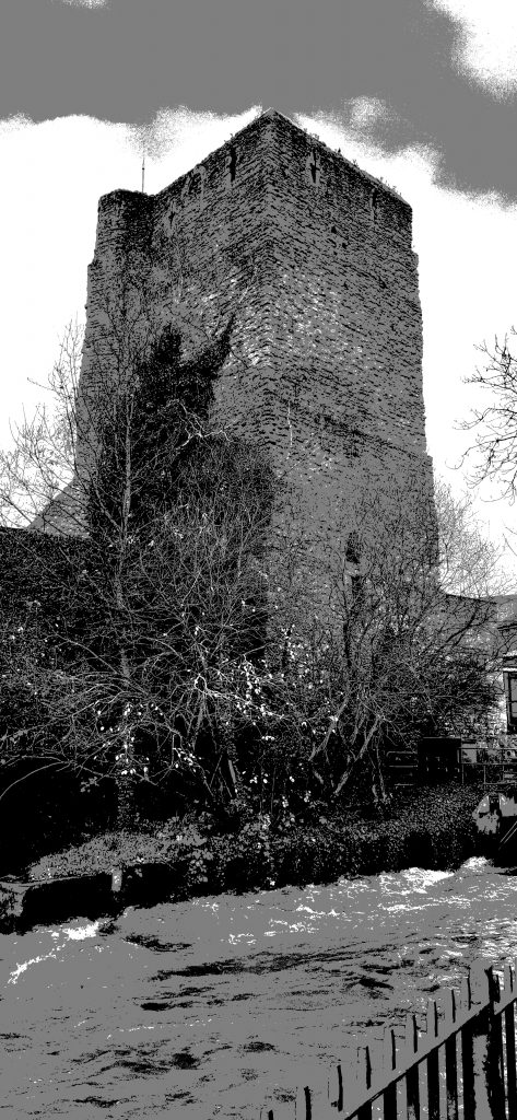
I reversed the image and posterised it using photoshop. Posterising the photo allowed me to view separate layers. Reversing it meant the print would end up the correct way around:
Then I got to work:
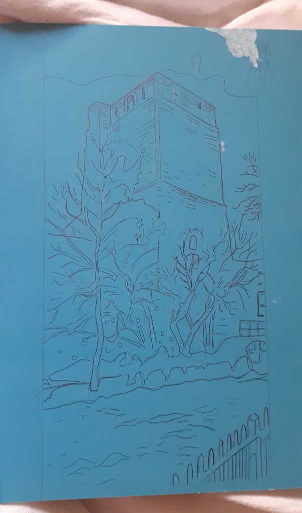
I printed the edited photo and used a biro pen to transfer the image onto the lino.
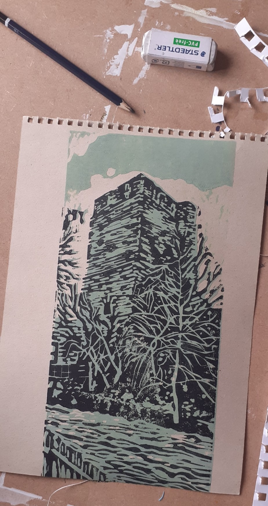
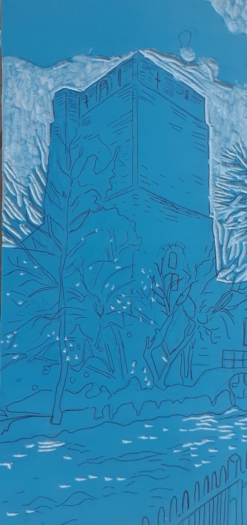
I chose the reduction technique to allow me to print more than one colour. I first carved the areas I wanted to stay white.
I then remembered to wash the lino with washing up liquid before printing with it.
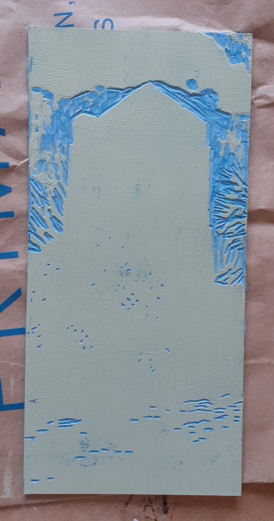
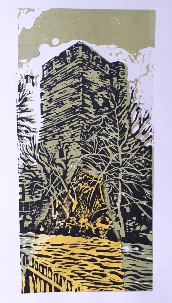
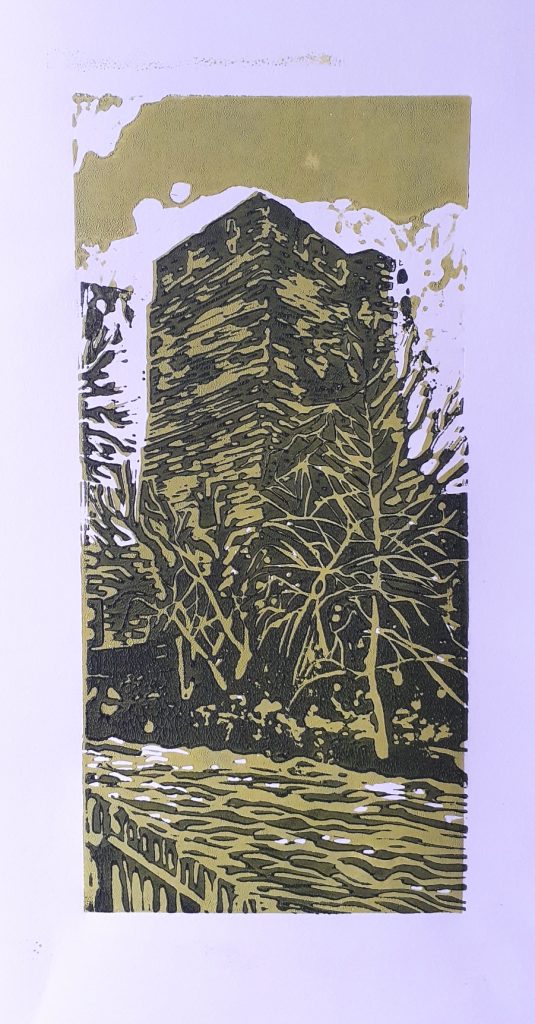
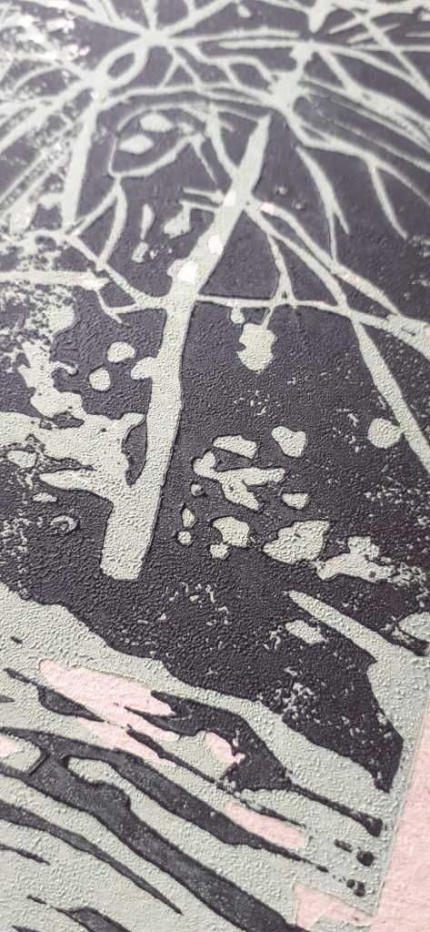
I mixed a cold-toned green for the castle and river. I kept the colour paler at this stage. I am using water-based block printing inks.
My first print. I can see I did not apply enough ink to the printing plate.
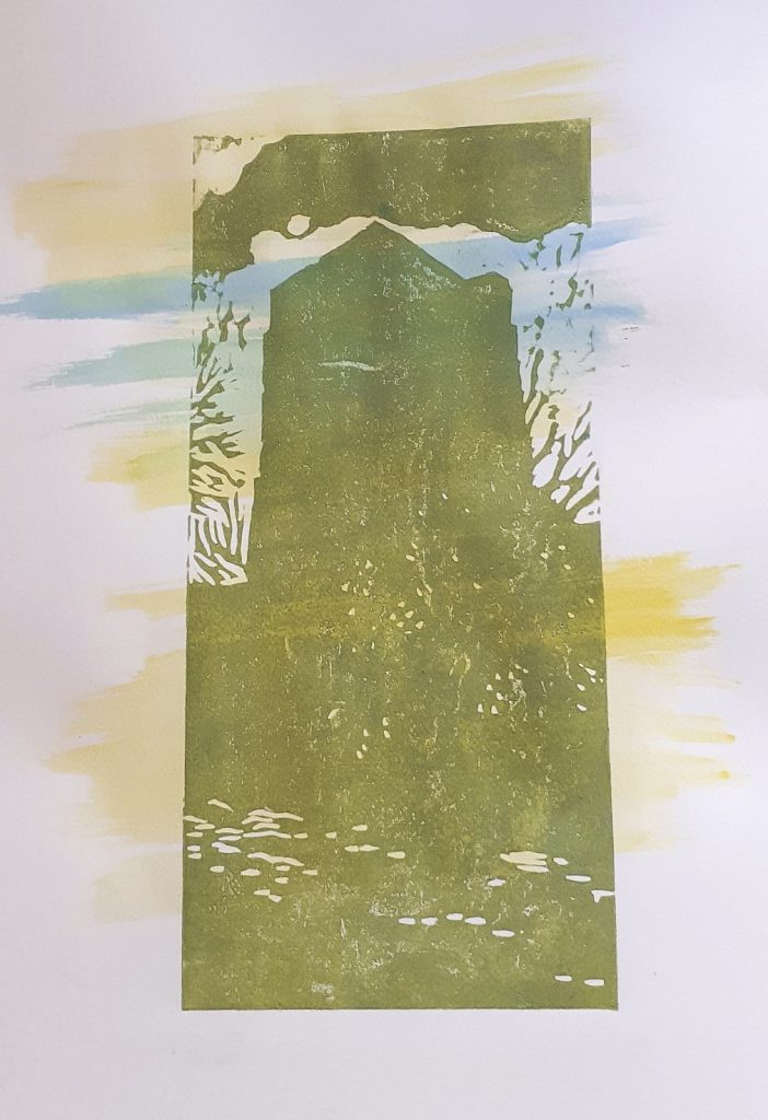
I made up a few different backgrounds with watercolour paint. I wanted to see how the colour/texture would come through.
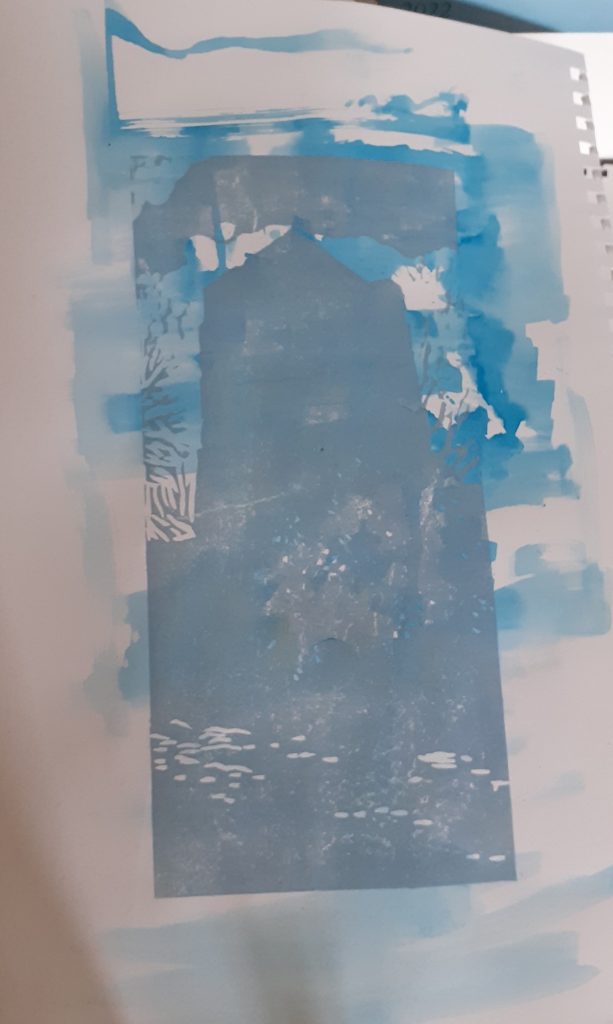
I left the first layers to dry for about 12 hours before printing the second layer.
(below) I did not align the 2 layers accurately.
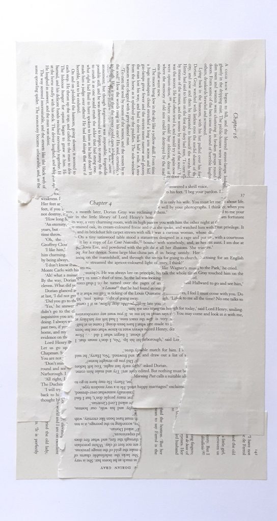
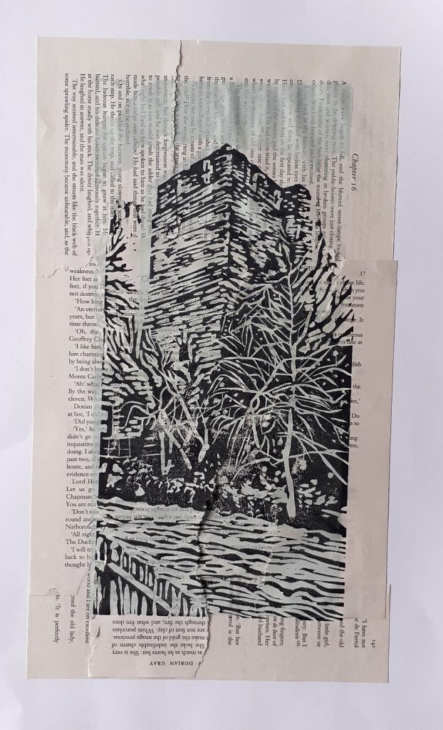
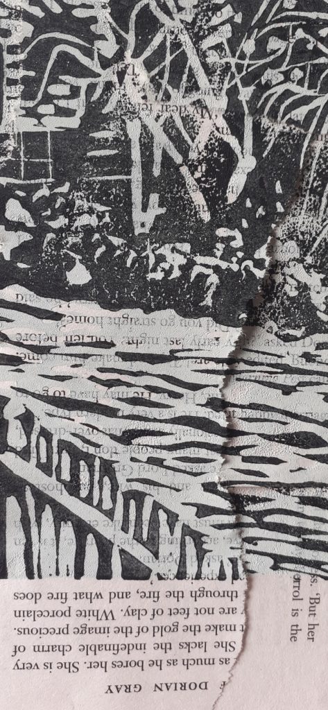
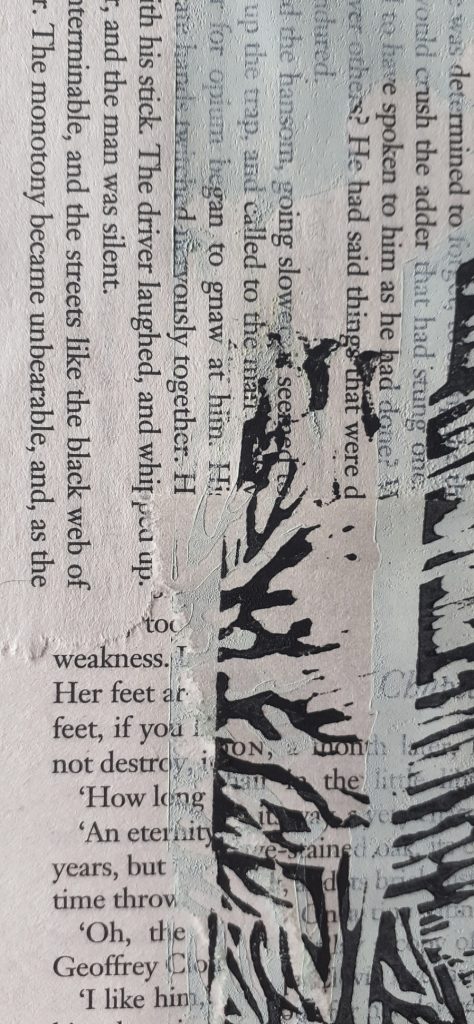
I made a collaged background for this print, using pages from a novel.
After printing the first layer, I glued a scrap of yellow card onto the print.
I mixed green into the ink for the darker layer, instead of the plain black used in other prints. I still wasn’t getting the alignment spot-on, and I could see the paper was shifting as I laid it down.
Applying less pressure onto the roller helped when transferring the ink from the plate to the lino.
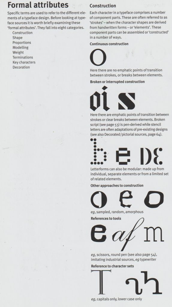
What worked and what didn’t?
I need more practice/ a different method for aligning the paper.
The colours expressed something earthly which I liked.
The cartridge paper worked well.
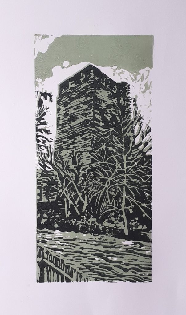
I don’t like the brick texture on the tower, I wasn’t careful enough with my mark-making.
The watercolour background worked well.
I could have glued the collage background a bit more carefully.
I could work on simplifying/ improvising the design instead of including every detail from the photo.
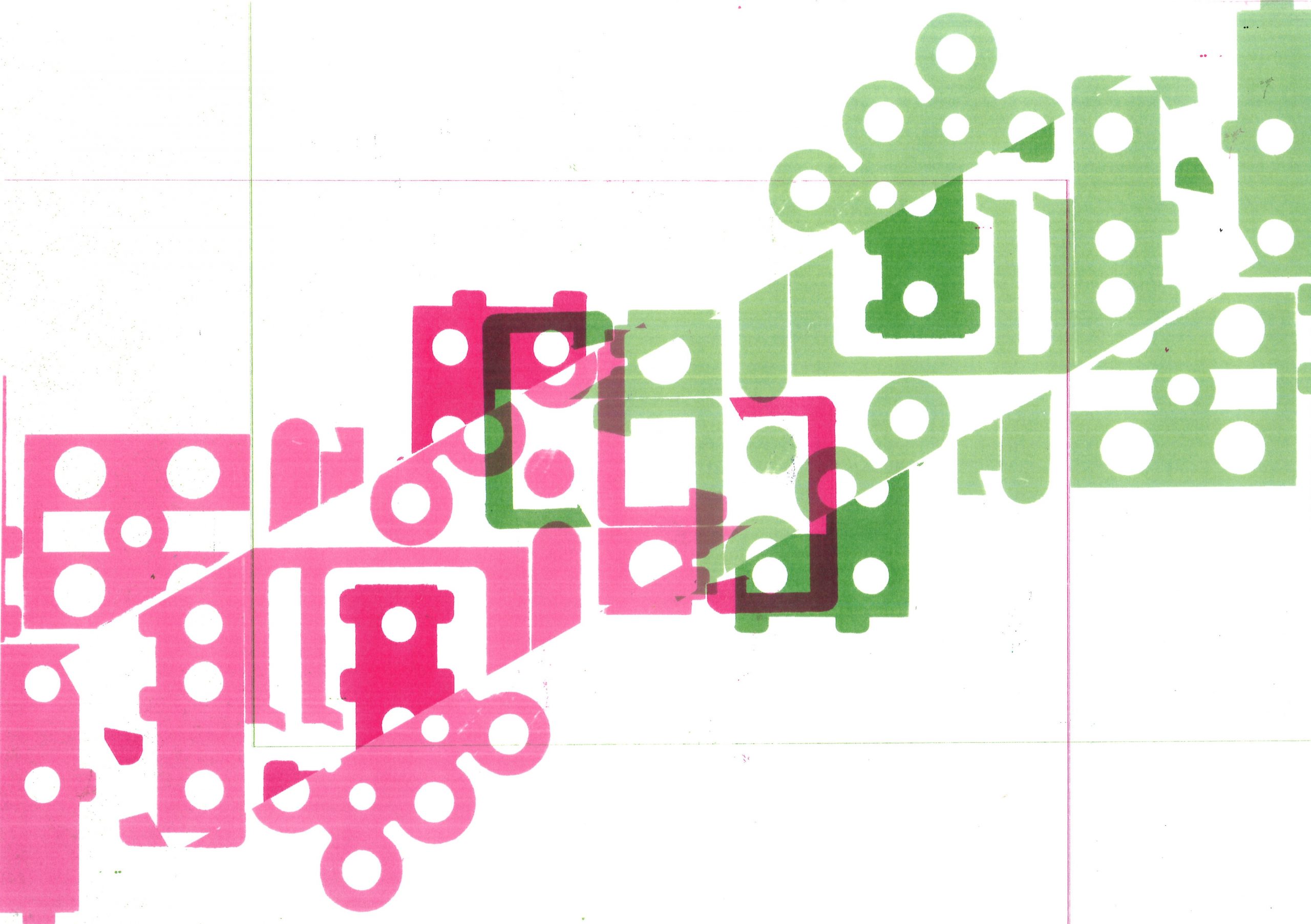
Produce your own speculative or ‘a-semic’ writing system – consisting of 10-20 pieces – using the skills that you have developed so far. You must then produce a series of prints using your writing system, which you are asked to cut out of found manufactured items such as cardboard packaging, instruction pamphlets, small and large manufactured objects found on campus or around the studio or at home. Think about how manufactured objects effectively lend partly ‘semic’ information that you can appropriate for your writing system.
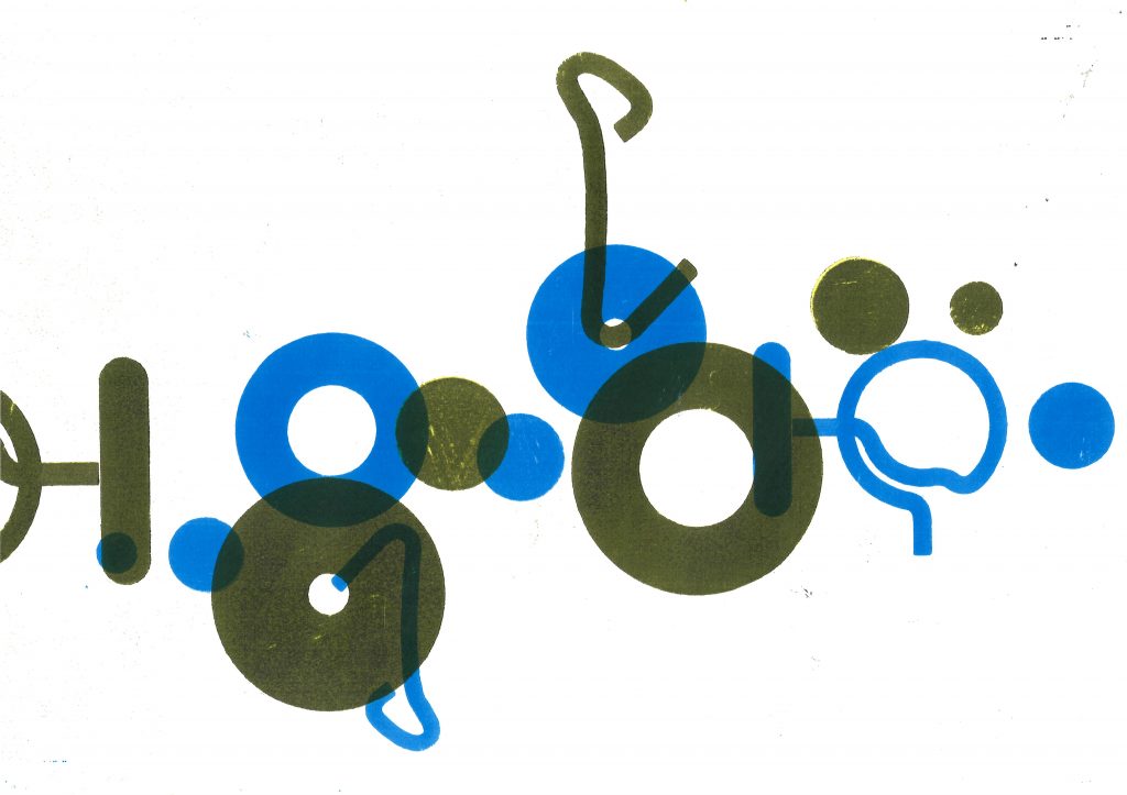
Where the prints overlap, the colour is darker and this gives the image some solidity.
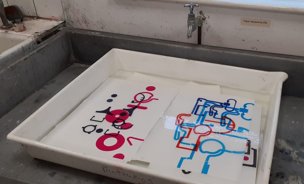
Week 4
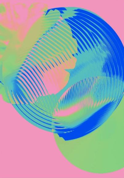
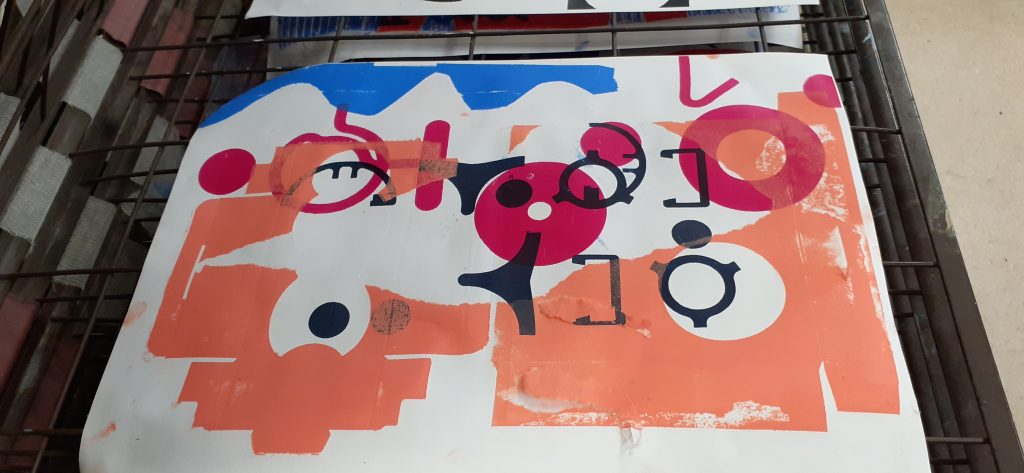
In today’s lecture, we were working with the prints from the previous ‘Speculative typography’ workshop. I printed the scans of these prints onto art paper. I had the option of printing these designs in different colours than the originals, by using the colour settings on the printer.
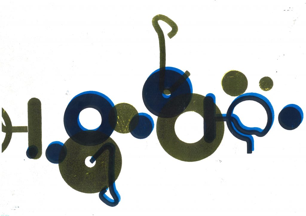
For example, in the below image I printed the design in its original colour (blue). I then replaced the paper into the paper tray, rotating it around. I placed the original print into the scanning bed and selected the 2 colour option, then selected yellow and black. This came out on the paper as a shade of green. I also resized the print by changing the percentage, and photocopied this onto the previous print.
I selected blue and yellow for these prints as I liked the way these colours merged when overlapping:
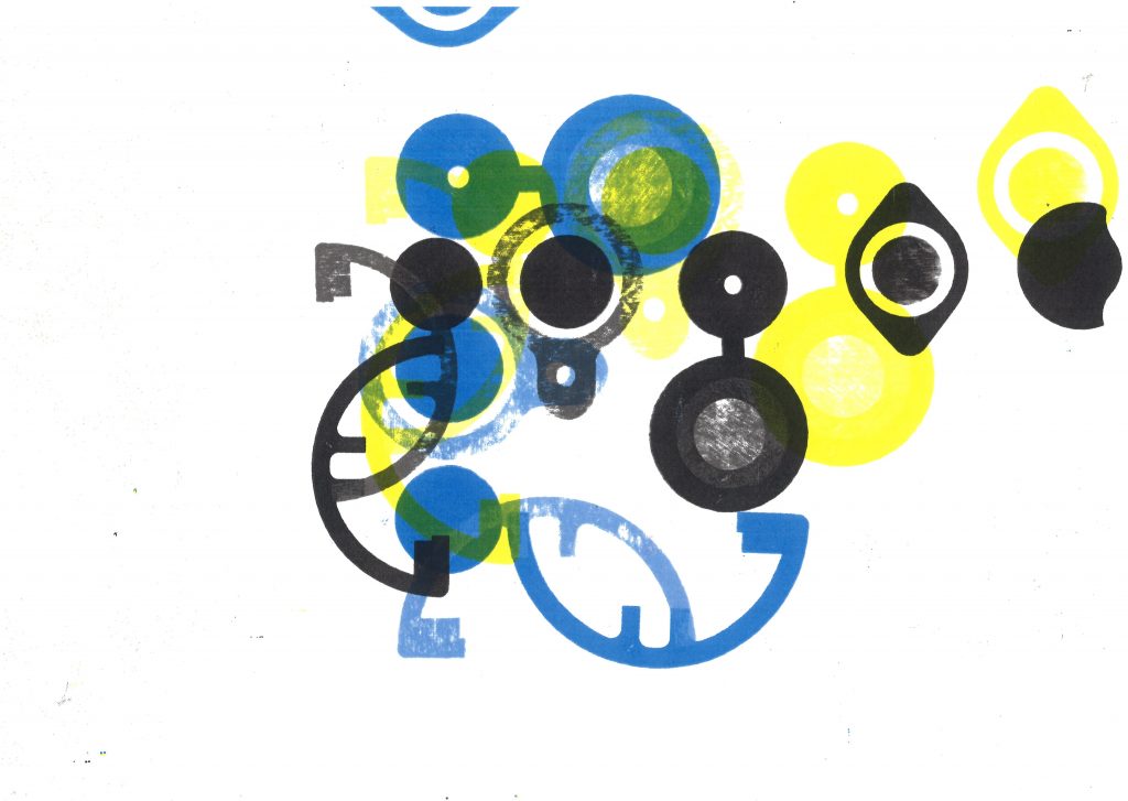
I creating this image from 2 photocopies. (green and magenta). I like the fine lines created by the edge of the paper.
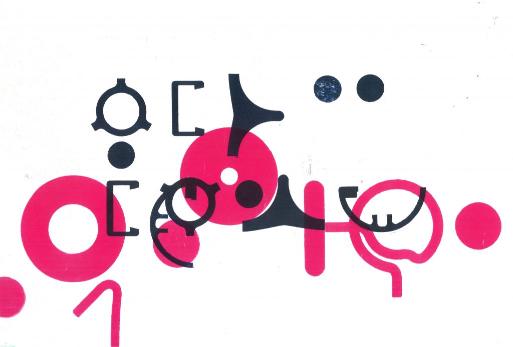
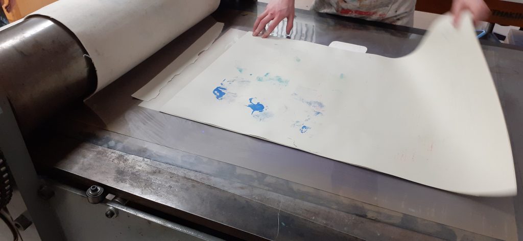
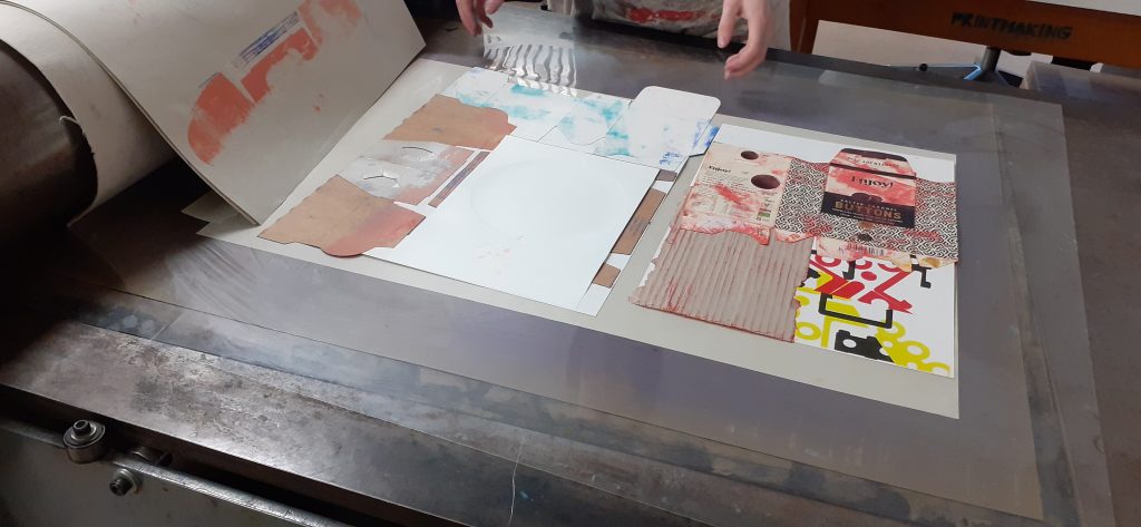
The main part of this workshop, was the relief printing technique.
I was not happy with most of the prints from this half of the workshop. I think this is because the method was new to me, I didn’t have the chance to practice and plan the pieces because of time restrictions. I found that my classmates took to the process and got on well with it, whereas I struggled. (This was also the case when I first screen-printed, at the beginning of semester 1. But with time and practice, I got more confident.)
I maybe rushed the process and didn’t anticipate what the outcome would be when I chose certain colours and placements. I could have slowed down and really thought about what would compliment the composition.
Step 1- Was to soak the paper in water, for about 5 minutes. This made the paper softer, more pliant so that it bends to the shapes of the materials used for printing on top. After soaking the paper, it needed to be sandwiched between blotting paper. This removes the excess water.
Step 2- was to ink up the materials used for printing. We used mainly carboard packaging for this purpose. The ink were rolled onto the worktop and I used a roller to transfer the ink onto the cardboard.
Step 3- I then carried the damp paper and inked up pieces over to the printing press. I arranged the pieces onto the paper, after placing these pieces, I did not have the option of removing and replacing the pieces. When I was satisfied, I laid a few sheets of paper over the top, followed by a couple of blankets.
Step 4- It was important that the blanket wouldn’t crease or fold. Therefore, we worked in pairs for the printing process. One person, held onto the blanket, pulling it straight and the other person turned the wheel. A swift action is best for this.
Step 5- After removing the blanket and paper, we could start removing the shapes from the print to see our results. Sometimes it was enough for the work to be pulled under the press once. It was at this point that I saw the paper had ripped in some parts. This is because the paper was too wet.
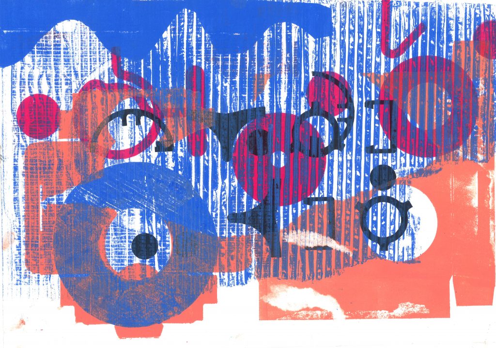
my work, rightmy first print was unsuccessful because there was no harmony or balance.
I tried to use the striped cardboard markings to unify the composition with blue ink. However, I felt the print still looked too busy:
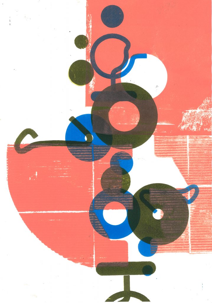
I liked this print because the peach colour was very different in tone and temperature to the mossy green. The circle in the cardboard worked well with the circles in the underlying print. I allowed white space.
In week 1, we had the opportunity to explore with wooden letter press. In week 3, we moved onto the metal version. These letters are smaller and it was a fiddly process.
Being introduced to this process, I was interested in researching designers who are using letterpress in the present day, as well as traditional uses of letterpress.
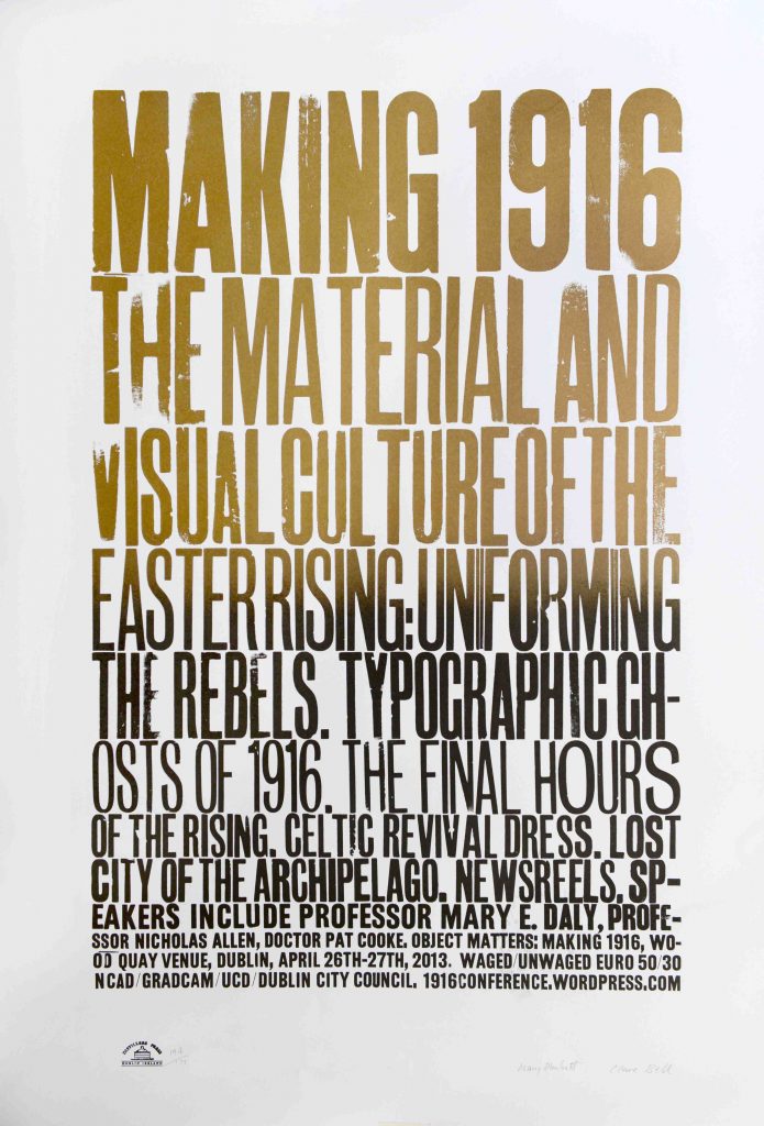
With this first example, Plunkett and Bell have used wooden letters to print these large posters:
Mary Plunkett & Clare Bell
‘On the occasion of the Object Matters: Making 1916 conference, a special limited edition poster was designed by Clare Bell (lecturer at the Dublin Institute of Technology) and Mary Plunkett (designer-in-residence at the National College of Art and Design) and printed by them with Sean Sills at Distillers Press, the letterpress studio at the National College of Art and Design.
Created with technologies in use in 1916– wood-block type and letterpress – the poster uses the visual vernacular of the time to suggest the era without veering into pastiche. Bell and Plunkett had to make do when they ran out of type and had to ad-lib, making letters such as an upper-case ‘I’ created from two pieces of lead rule set upright.
The poster is printed on two different stocks – newsprint to generally advertise the conference, and 155gsm Mellotex for the limited edition. The newsprint version is in black ink and printed off-centre, emphasising the immediacy of the message via the conditions of its production. The edition is in black and gold split duct, the movement from full gold in the header ‘Making 1916’ to black in the final lines suggestive of the shift from ordinariness to ceremony and in part a nod to the Irish lettering artist and stone carver Michael Biggs, who created the celebrated lettering on Dublin’s Garden of Remembrance. The poster proudly bears the marks of its making – the impression of the type and the grain of the wood-block is evident. Advertising and celebrating a conference on the spaces, objects and architecture of the 1916 Rising, the design and materiality of the poster communicates the importance of addressing the material culture of the past not in a reverie of imitation but in fresh, creative ways.’
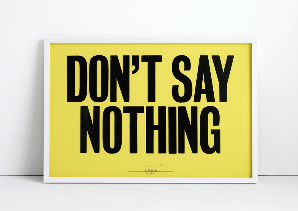
Anthony Burrill
British graphic designer Anthony Burrill, is famous for his bold posters that use letterpress type to make bold statements.
Lots of the material I’ve collected is now over 20 years old, it’s got an interesting quality, there’s a pre-digital feel to the material. It’s from a time when things were still made by hand, I like the individuality of it.
This letterpress was from the book ‘Design Genius’ by Gavin Ambrose. I like the way the designer has layered the letters and used a variety of sizes and colours.
Week 3- moving onto metal letterpress, we were given the task of using these phrases to practice the letterpress technique:
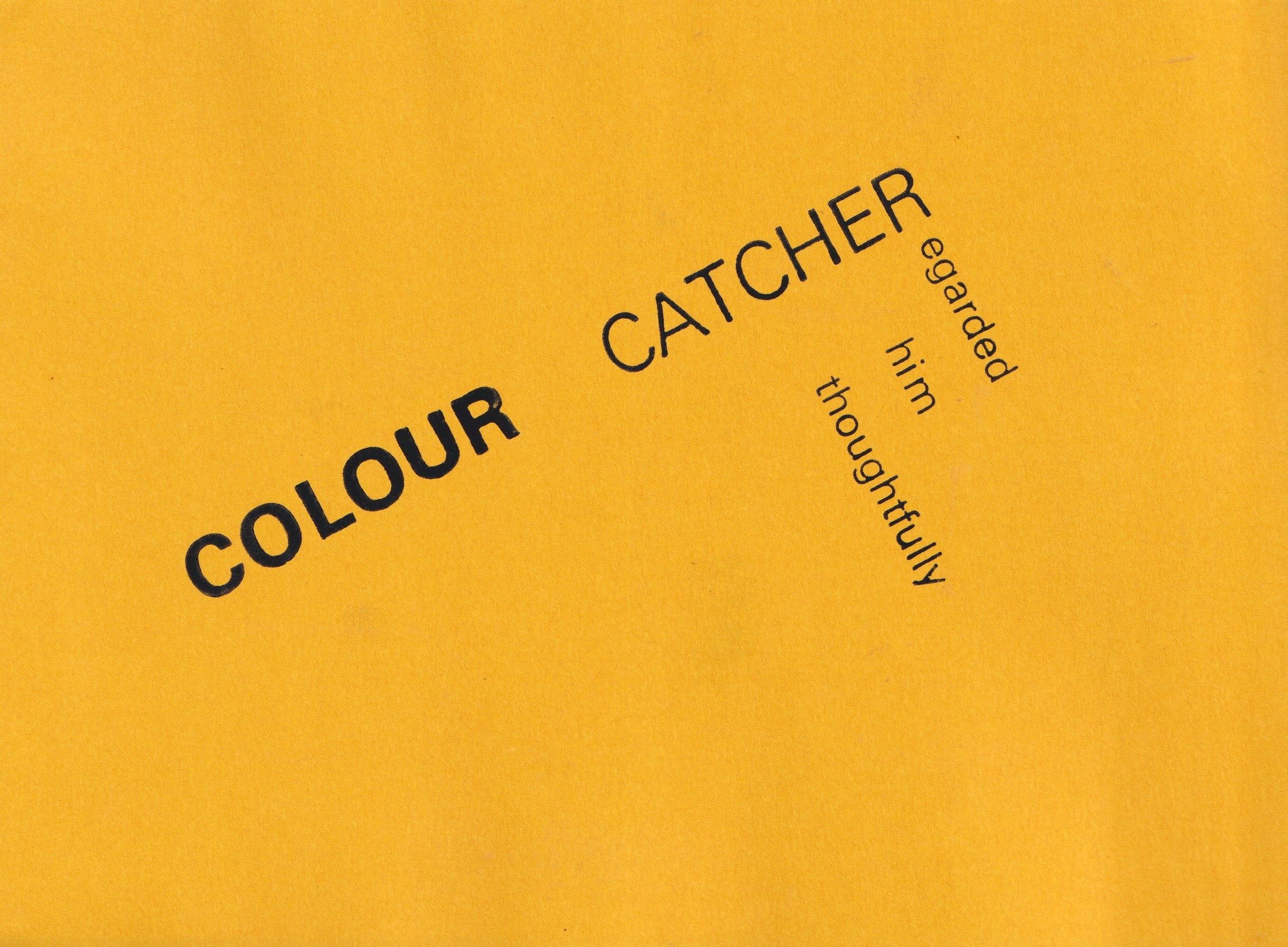
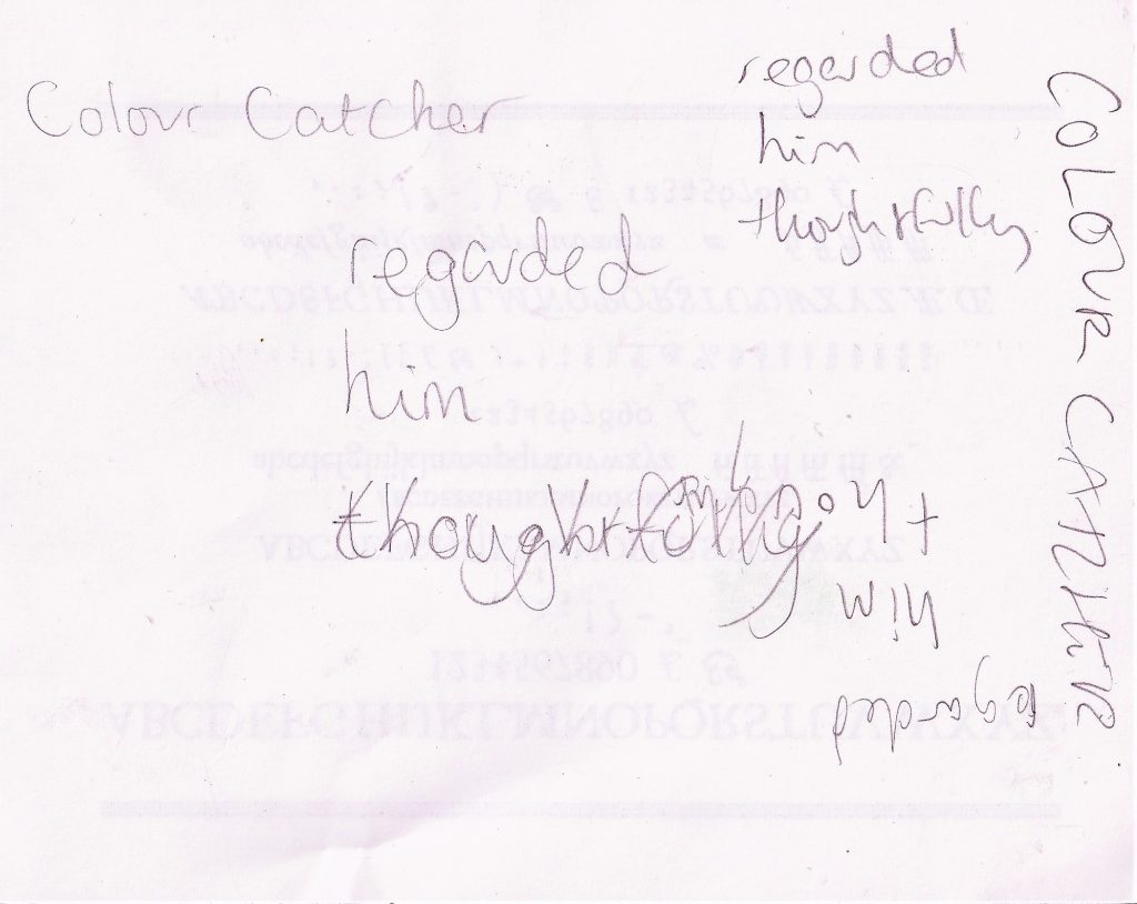
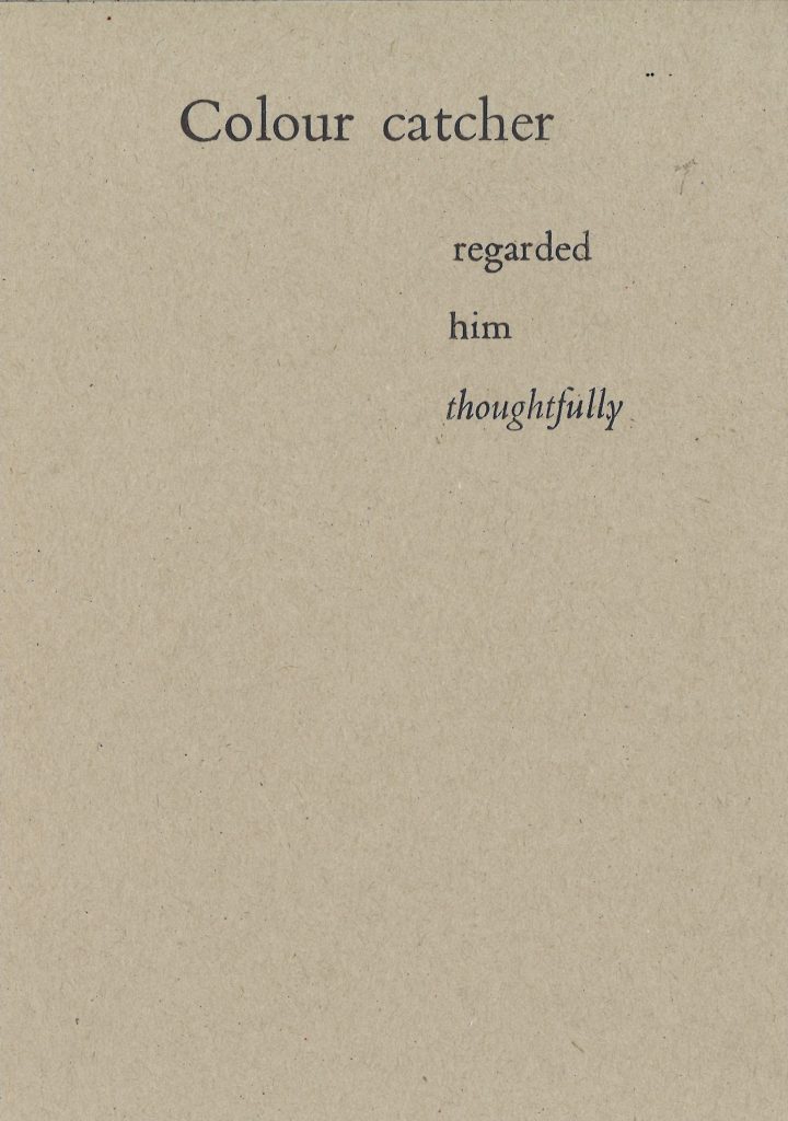
The first step was to decide on a sentence to depict using letterpress type. I chose Colour catcher regarded him thoughtfully, because The words are descriptive and conjure various movements and energy.
I needed to think about how I could express this meaning using the layout of the letters. I used a scrap piece of paper to sketch layout ideas:
Bembo
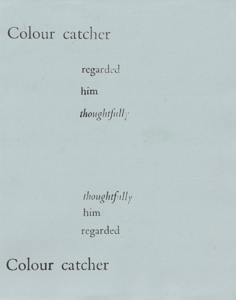
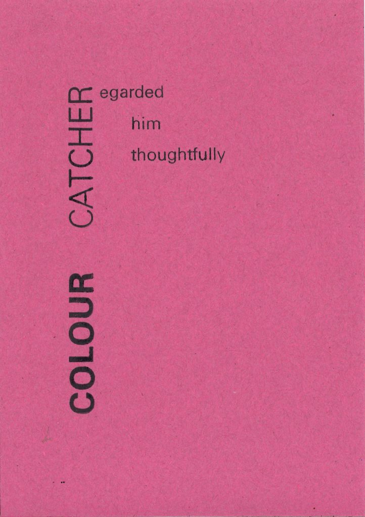
For the first print, I chose a serif font because I wanted to give the sense of the text within a novel. In this way, the text might read as in a piece of literature.
I chose the Bembo typeface for this first print. I used the larger point size for the top line to emphasise the character of the ‘Colour catcher’, by separating it from the rest of the text. I used Italic Bembo type for the word ‘thoughtfully’, to slow down the reader on this word and express the meaning of thoughtfulness.
I aligned the letters so the lines are ranged to the left. This was a confusing process because I needed to align them in a mirror image of where the letters will be printed on the paper.
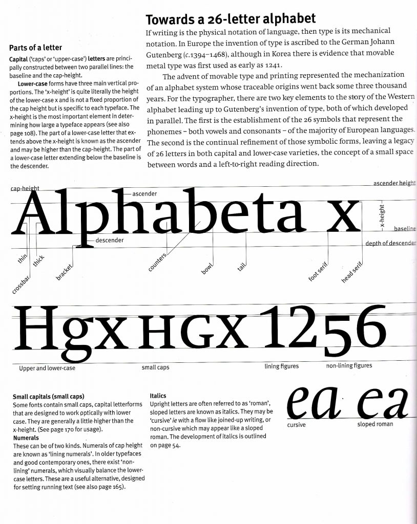
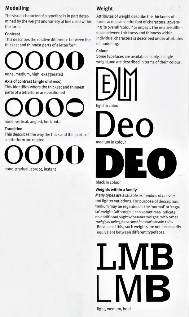
Letterspacing the addition of space between the letters of words to increase the line-length to a required width or to improve the appearance of a line.
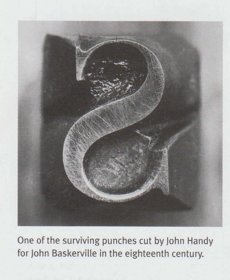
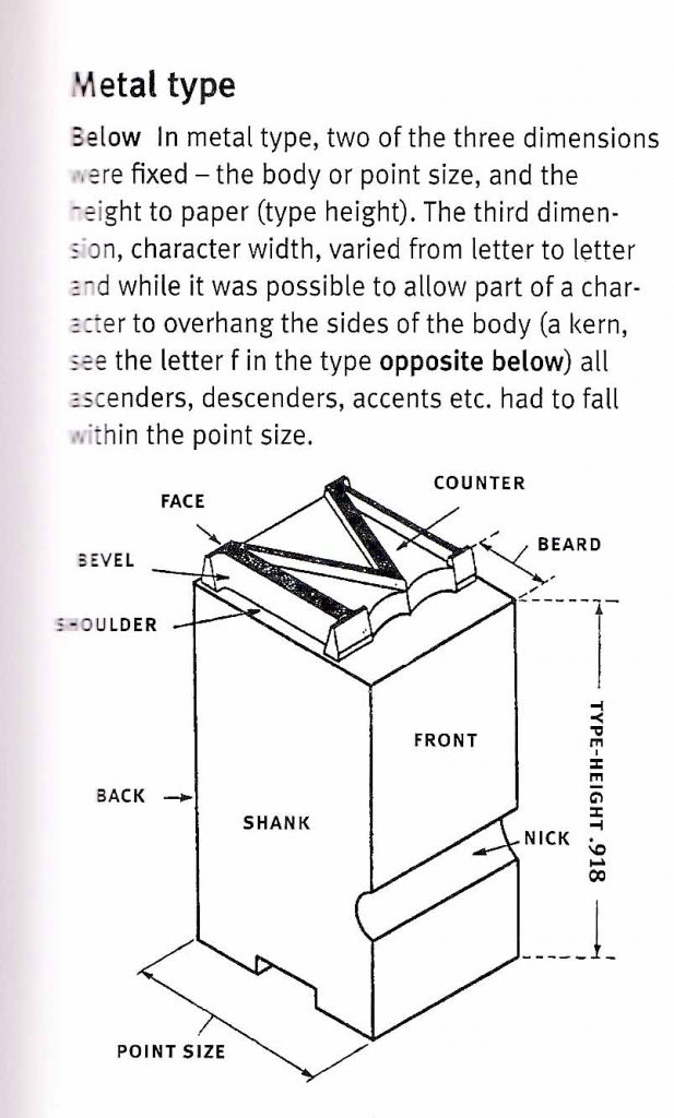
Typeface the raised surface carrying the image of a type character cast in metal. Also used to refer to a complete set of characters forming a family in a particular design or style.
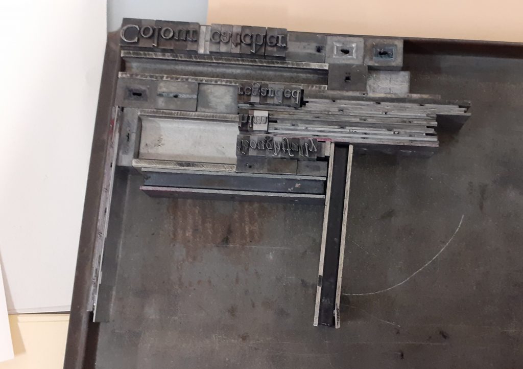
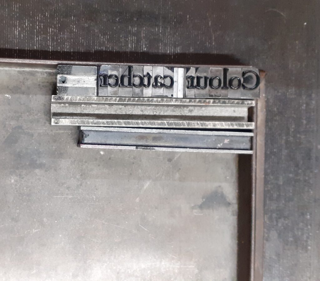
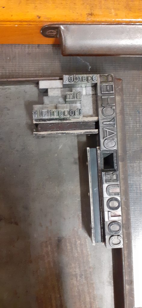
I needed to use metal ‘furniture’ and ‘leading’, to hold the type in place. Furniture is the name for the chunkier pieces and leading is the thinner pieces of metal.
Additionally, I used magnets to secure the pieces on the metal printing tray. I laid the letters in a block formation for the same reason.
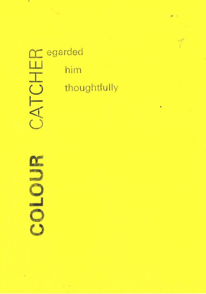
The first attempt was unsuccessful because I had accidently placed the lines of text in the wrong order. I then corrected this and printed the corrected type on the same grey piece of card. The result is a symmetrical, mirror-like sentence, which although not making sense to read, does look interesting visually:
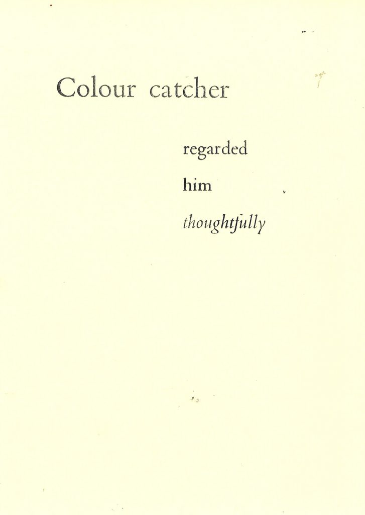
After correcting the mistake, I was able to print the sentence as it was originally intended:
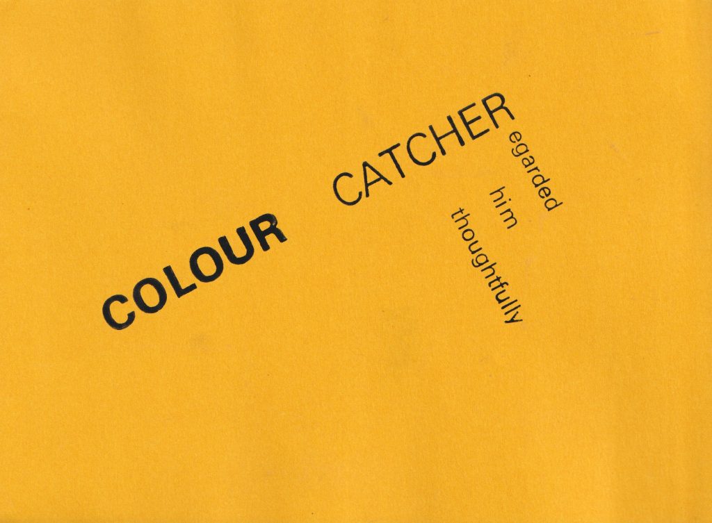
Choosing to rotate part of the phrase meant that I would need to put the paper through the press in 2 separate goes. I removed the second part of the phrase and printed just the ‘Colour catcher’ onto a page. I then turned the printing tray so it sat at an angle. When I returned the paper to the press, I was able to print the words at a slight diagonal. This might imply that the narrative is taking a turn. I chose the bright green paper to create a stronger energy, compared to the subdued traditional brown paper from previous prints.
Univers
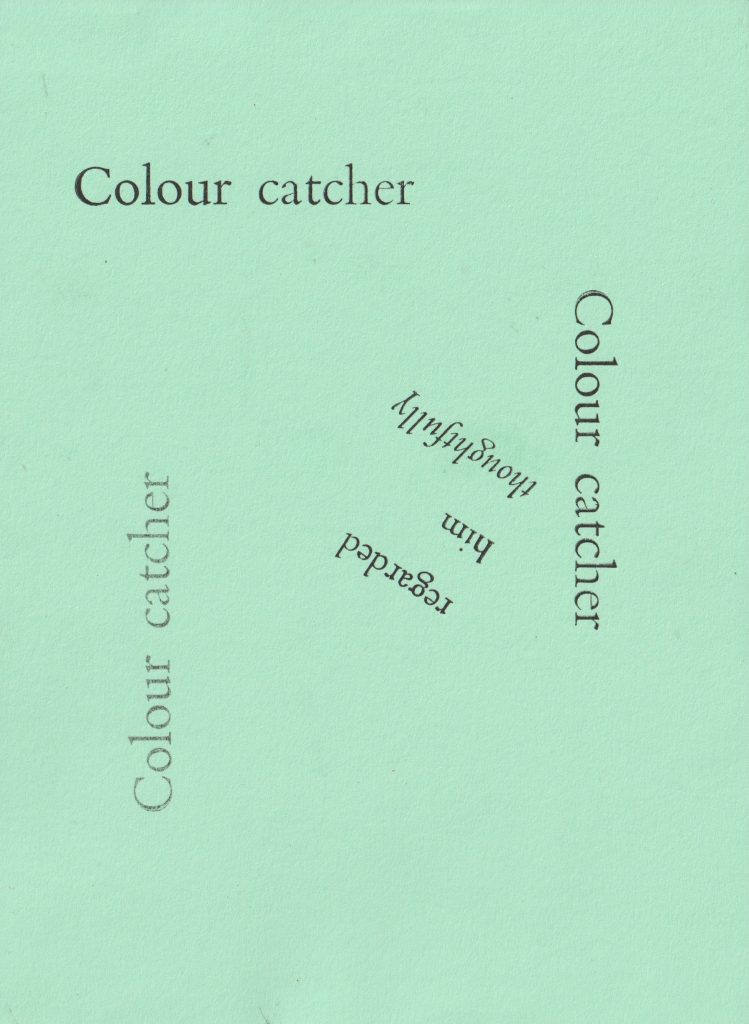
I wanted to try the other typeface available, which is a sans-serif font called Univers. I chose the 36 point letters for the start of the sentence. I chose a bolder letter for ‘Colour’ and the thinner version for ‘catcher’, to suggest many colours, or a bright colour quality and to make ‘catcher’ secondary.
I used the smaller, 24pt Univers type for the rest of the sentence to create more of a hierarchy.
I used 2 different orientations to play with the ‘R’ being a shared letter.
I stepped the words so that the first letter of ‘him’ and ‘thoughtfully’ were roughly in line. They needed to be far enough from the word ‘Catcher’ that there would be space to read the words clearly.
I used less ink for this print below. I like the texture created by using less ink. This is seen particularly in the word ‘Colour’.
(below) I rotated the paper to create diagonal leading lines across the page.
For this print, I repeated the first line around the page. I like the spiral effect this has. By scattering the words around, I have created a print that feels dynamic and playful.
We use cookies on our website to give you the most relevant experience by remembering your preferences and repeat visits. By clicking “Accept All”, you consent to the use of ALL the cookies. However, you may visit "Cookie Settings" to provide a controlled consent.
This website uses cookies to improve your experience while you navigate through the website. Out of these, the cookies that are categorized as necessary are stored on your browser as they are essential for the working of basic functionalities of the website. We also use third-party cookies that help us analyze and understand how you use this website. These cookies will be stored in your browser only with your consent. You also have the option to opt-out of these cookies. But opting out of some of these cookies may affect your browsing experience.
Necessary cookies are absolutely essential for the website to function properly. These cookies ensure basic functionalities and security features of the website, anonymously.
Cookie
Duration
Description
cookielawinfo-checkbox-analytics
11 months
This cookie is set by GDPR Cookie Consent plugin. The cookie is used to store the user consent for the cookies in the category "Analytics".
cookielawinfo-checkbox-functional
11 months
The cookie is set by GDPR cookie consent to record the user consent for the cookies in the category "Functional".
cookielawinfo-checkbox-necessary
11 months
This cookie is set by GDPR Cookie Consent plugin. The cookies is used to store the user consent for the cookies in the category "Necessary".
cookielawinfo-checkbox-others
11 months
This cookie is set by GDPR Cookie Consent plugin. The cookie is used to store the user consent for the cookies in the category "Other.
cookielawinfo-checkbox-performance
11 months
This cookie is set by GDPR Cookie Consent plugin. The cookie is used to store the user consent for the cookies in the category "Performance".
viewed_cookie_policy
11 months
The cookie is set by the GDPR Cookie Consent plugin and is used to store whether or not user has consented to the use of cookies. It does not store any personal data.
Functional cookies help to perform certain functionalities like sharing the content of the website on social media platforms, collect feedbacks, and other third-party features.
Performance cookies are used to understand and analyze the key performance indexes of the website which helps in delivering a better user experience for the visitors.
Analytical cookies are used to understand how visitors interact with the website. These cookies help provide information on metrics the number of visitors, bounce rate, traffic source, etc.
Advertisement cookies are used to provide visitors with relevant ads and marketing campaigns. These cookies track visitors across websites and collect information to provide customized ads.