Gender & design

Week 4- Gender

All categories we have explored are connected! (race, class, nature and gender) The issues don’t exist as separate experiences. This has become clear in our 4th week of exploring these categories. We should touch on this fact in our final presentations.

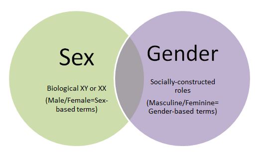
We first looked at the difference between sex and gender:
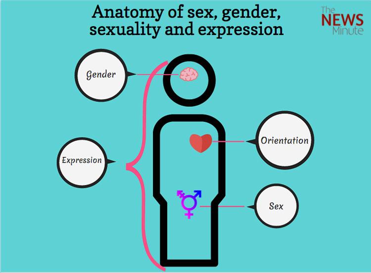
https://www.thenewsminute.com/article/understanding-sex-and-gender-they-are-connected-not-interdependent-44437

sex, being the biological difference between men and women. and

gender being a social construct, in people’s perception, people’s experience of themselves. These are the accepted rules and traditions; social norms.

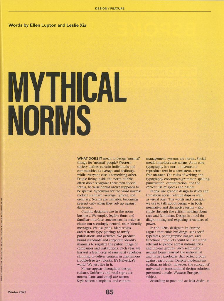
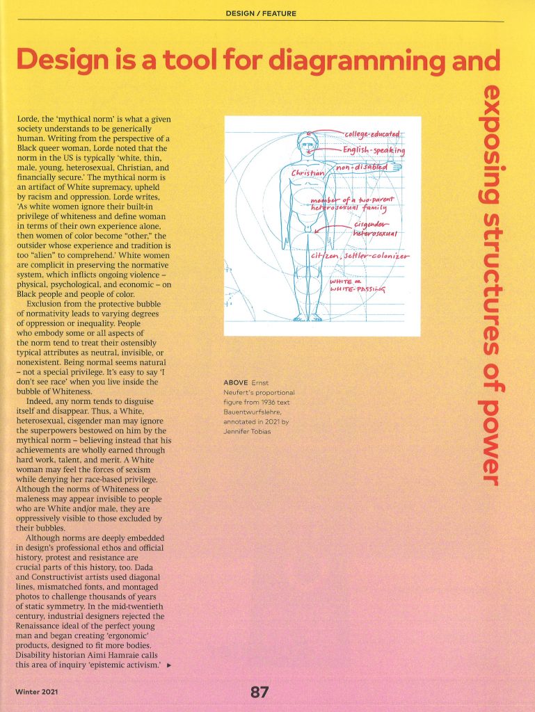
I then read this article about social norms, from ICON magazine:
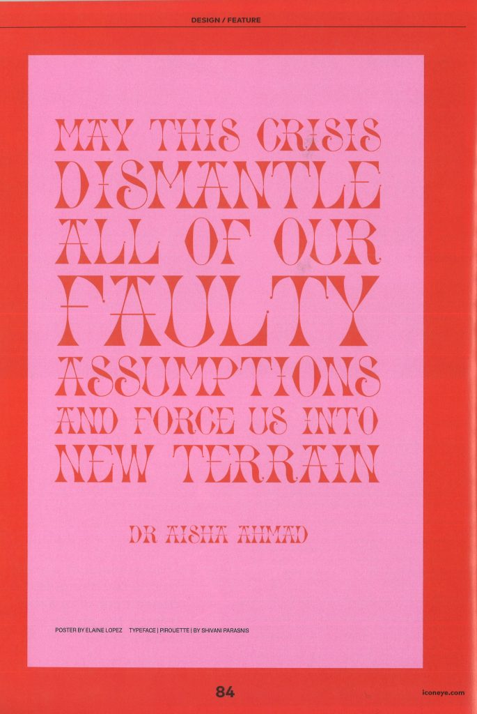
How does gender relate to design?

  • design has been a male dominated industry
  • semiotics of objects: products are designed with masculine and feminine qualities in mind. Packaging colour for example, is targeted to males or females, for example children’s toys and clothing. Baby dolls and ovens for girls and cars for boys.
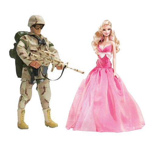
Over-determination = adding an extra layer/ forcibly attributing meaning to an object.

Commodities = objects bought and sold as part of the global, capitalist system. Has a price/ an exchange value.

Gender branding

Toys “used to police the training of the young into assuming the ‘correct’ gender.”

(Not natural but historical.)

“patriarchal society benefits greatly from encouraging gender roles.”

This perpetuates a divided and rigid society. It might be profitable to keep things divided?

Gender price gap

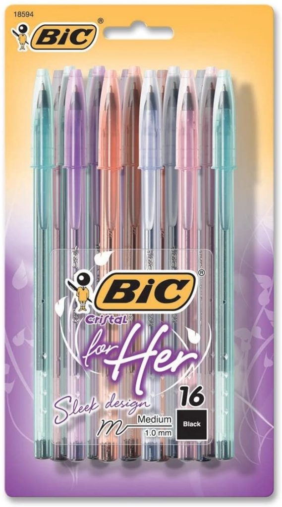
Pink objects or women’s jeans cost more than men’s objects. It’s not rational- it doesn’t cost more to colour something pink.(It’s not to do with the quality of the object.)

Gender division = profitable. It allows them to over-price objects- particularly pink e.g. Bic biros for women. Not natural but social. (not just about colours)
The Fawcett Society is a membership charity in the United Kingdom which campaigns for women’s rights. The organisation dates back to 1866, when Millicent Garrett Fawcett dedicated her life to the peaceful campaign for women’s suffrage.

De-gendering and Re-gendering

There are now gender neutral collections from different companies, this wasn’t around 5 years ago for example.

What does De gendering mean?verb (used with object), de·gen·der·ized, de·gen·der·iz·ing. to free from any association with or dependence on gender: to degenderize employment policies. to rid of unnecessary reference to gender or of prejudice toward a specific sex: to degenderize textbooks; to degenderize one’s vocabulary.

regender (third-person singular simple present regenderspresent participle regenderingsimple past and past participle regendered)

  1. To gender anew (and differently).
    1. To cause (a person) to be seen to have a (new, different) gender identity or role. quotations ▼
    2. To cause (a thing or subject) to be gendered in a new or different way; to be associated with a new gender or with new genders. 
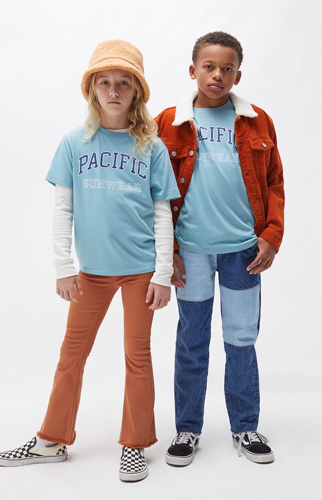
Pacsun launched its first kids label, Pacsun Kids, with a gender neutral collection. 

Last week, JCPenney became the latest retailer to debut an inclusive apparel line that features gender neutral options.

JCPenney is joining the ranks of other retailers, including Gap and Pacsun, in building out more inclusive fashion lines. The growing trend among major retailers shows the category is becoming more mainstream.

Similarly, Eric Archibald, creative director of streetwear brand Diplomacy, told Modern Retail that major apparel retailers launching gender neutral lines was a long time coming. Brands are launching these new lines because more consumers are expecting these types of items. At the end of the day, he said, “it’s all about the money.”

Beyond joining a global style trend, Archibald said there were “obvious benefits” to developing gender neutral lines. “For instance, you’re only creating one collection, so development costs are going to be lower than if you were designing multiple, more gender-specific collections.” 

Pointlessly gendered products

Explain why and how the objects bear a gender connotation. (Not only colour, but other features too.)

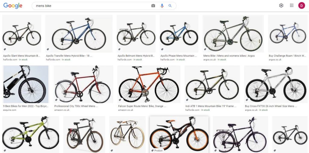
Object 1: the bicycle
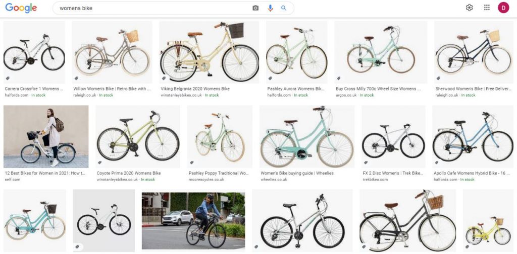
Looking at women’s bikes, they are mainly pastel coloured, sometimes with white wheels, have a lowered cross bar and are sold with an attached basket. Men’s bikes are bolder in colour, have black wheels, a straight across cross bar and no baskets in sight.

The designers expect the woman to need a basket. Perhaps for shopping, a handbag or a small dog (as seen in one advert).Maybe a woman would want the colours of the bike to match her outfit. The implication is that women are expected to be fashion- conscious and men to be practical.

As for the crossbar, something I’ve often wondered about, a quick google search gave me this explanation. The crossbar provides extra strength to the bike’s structure. Why would only men need this extra structure? Does this imply that men are heavier than women? This isn’t always the case. The lowered cross bar historically was made for women, due to the wearing of skirts and dresses. Women wouldn’t need to raise their leg as high and so risk being indecent.

The question is, why does the women’s style of bike remain the norm in the present day when women often wear trousers? How high you can comfortably raise your leg is not dependent on your gender but on the individual’s flexibility. To me, it seems like tradition and accepted norms keeps these designs in place.

Object 2: the razor

men’s razors, gillette

Razors do the same job: remove hair. But the designs for men’s and women’s razors are noticeably different. The men’s razor looks more robust and stronger physically. The colours reflect masculinity. The part you hold is heavier, but this isn’t necessary for the shaving process The shape and metallic colour of the razor overall,  implies sharpness and strength in tackling hair. This is to appeal to a masculine straight-forward approach. The women’s razor has a light-weight handle and rounder, curved shape. The pastel colours express a pleasant shaving process that is gentle for the skin.

Other objects our classmates thought of: pens/ stationary, football shirts (lower neckline, tighter fit), kinder surprise chocolate, perfume and aftershave, Kleenex man size tissues, Yorkie bars, clothing (men’s jumpers are warmer).

1st wave feminism

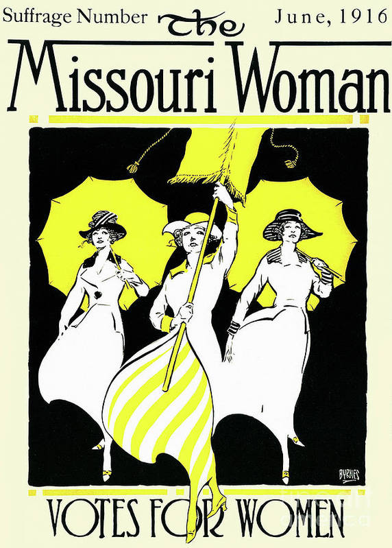
Suffragettes were the first feminists. They were fighting for the women’s right to vote. This was in the 19th century. The suffragettes were middle class, white and educated. Because of this, their movement did not include all women.

Switzerland was the last European country to allow women to vote.
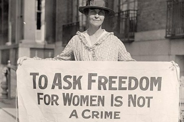
The Missouri Woman from June 1916, the Suffrage issue Poster

2nd wave feminism

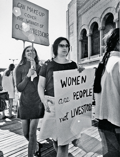
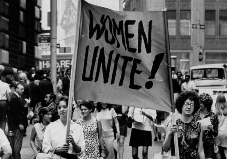
Occurred between the 1960’s and 1980’s. (although this is debated).

The issues they were campaigning about was :

  • pay equality
  • reproductive rights
  • female sexuality
  • domestic violence

Class-wise, this movement included women from a different demographic. (Broader groups of women not only well dressed bourgeois women.)

In the 1970s, feminists began to fight for the right to abortion.

They were questioning housework for the first time. Linocut illustrations were used for these campaigns. In this era, women didn’t get pensions or help from welfare. They were dependent on their husbands, so in a way, marriage for a woman, could be seen as a form of slavery.
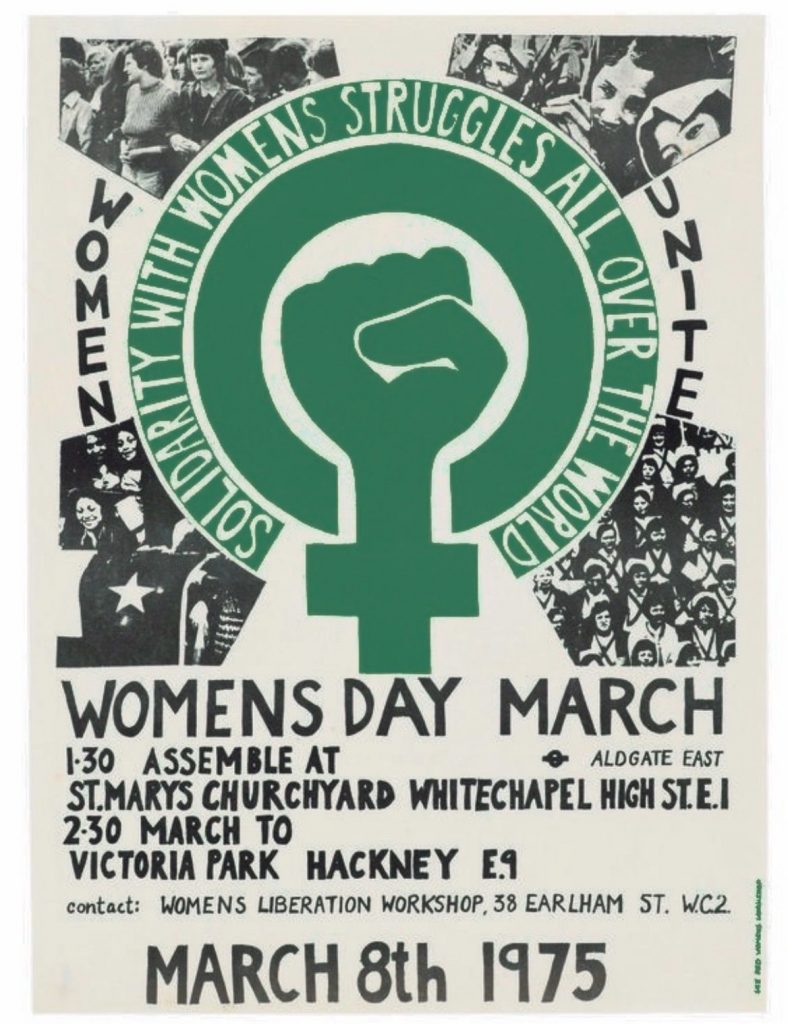
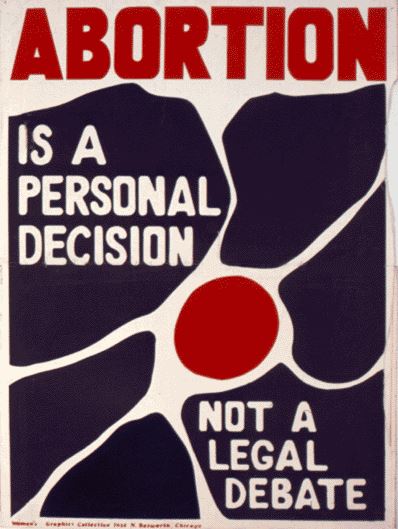
3rd wave feminism

In the mid 1990’s, the movement was explosive. They celebrated the differences across race, class and sexual orientation. It wasn’t a mass/widespread movement, but an academic discourse, involving artists and underground scenes- transgressing traditional representations. The feminists expressed androgynous femininity and gender bending, as seen in the photography by Nan Goldin.
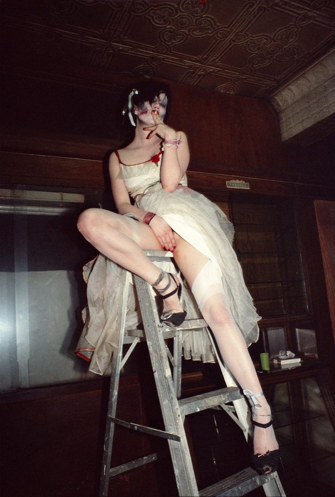
“Trixie on the Ladder, NYC” (1979): Goldin “showed life as it was happening.”Photograph by Nan Goldin / Courtesy Matthew Marks Gallery

Nan Goldin’s “The Ballad of Sexual Dependency” (1986) was Goldin’s first book and remains her best known, a benchmark for photographers who believe, as she does, in the narrative of the self, the private and public exhibition we call “being.” In the hundred and twenty-seven images that make up the volume proper, we watch as relationships between men and women, men and men, women and women, and women and themselves play out in bedrooms, bars, pensiones, bordellos, automobiles, and beaches in Provincetown, Boston, New York, Berlin, and Mexico—the places where Goldin, who left home at fourteen, lived as she recorded her life and the lives of her friends.

4th wave feminism

Modern day-

Concerned with:

  • trans inclusivity
  • body positivity
  • me too movement
  • trans black lives matter group
  • identity blending
  • interest in ecological issues (more than in the past)

Feminist Interrupted, Lola Olufemi

“Separating feminist history into waves, ignores the invisible struggles that haven’t been recorded.” e.g. the women from Suffragette movement had slaves who would have been women of colour. This history must also be written.

Women living under colonial rule had different struggles than the 1st wave feminists had.

OWAAD -London- 1970’s

Black women in Britain: Organisation of Women of Asian and African Descent

‘The rise of Black feminism in the UK can be traced to Black women migrants from the Caribbean, Africa and the Indian subcontinent, who came to Britain after World War II. The emergence of the Black Women’s movement had its roots in post-colonial activism and the Civil Rights struggles of the 1960s and 1970s. It sought to give voice to the specific issues that affected them including race, gender, class and sexuality, and how they intersect.’
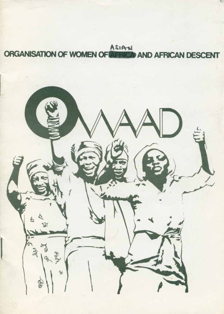
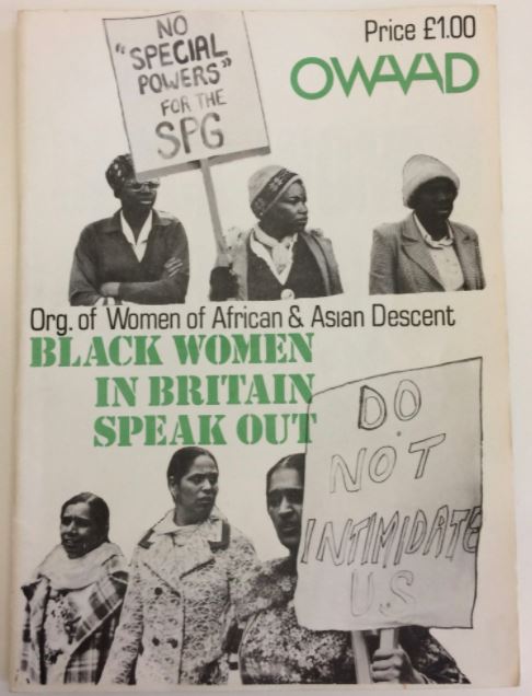
3 kinds of type: handwritten, sans serif, green serif type.

FOWAAD!

Organised activities, produced printed matters.

‘The focus of OWAAD’s campaigns centred around health, education, employment, immigration policy and the police. Their newsletter, FOWAAD!, was used to communicate with larger numbers of Black women across the UK.’
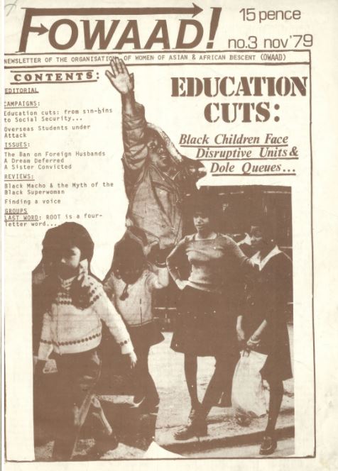
cutting around image silhouettes, underlining type, interesting title of publication using arrows.

Intersectionality

Methodology to address social problems. (Kimberle Crenshaw coined the phrase in 1989)

‘Kimberlé W. Crenshaw is a pioneering scholar and writer on civil rights, critical race theory, Black feminist legal theory, and race, racism and the law. In addition to her position at Columbia Law School, she is a Distinguished Professor of Law at the University of California, Los Angeles.’ 
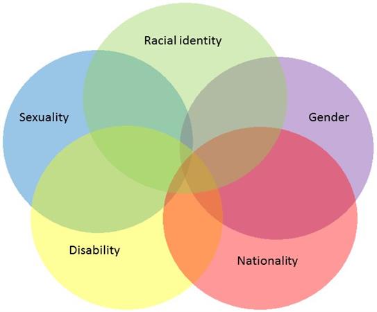
Identifies multiple factors of advantage and disadvantage e.g. one category not represented in the workplace. Black women not treated as well as white women or black men. Look at cases through the lens of more than one category e.g. caste, disability, gender, class, when we judge cases of discrimination.

Movements are not all good or bad. They can have progressive elements and problematic elements.

Neo-liberal feminism

Neo-liberal= last phase of capital development.

Models that question the welfare state. Hyper capitalistic economic model. Low taxes, support of private investment.

Defunding of the welfare state. Benefits some demographics.

Neo-liberal feminism-

‘inequality’ is a state that can be overcome (a matter of will) without overhauling the system.

Ivanka Trump Women who work is an example of this. (being an entrepreneur- ideology of self-empowering.)

Queer, trans, drag and gender neutral

Travis Alabanza TED Talk

artist, performer, writer

  • Different kinds of warrior
  • acceptance of self- compassionate. Reassuring others who feel the same (transgender or gender non-conforming).
  • We’ve each been told what we are at birth ‘you’re a boy or girl’. Trans people declare ‘that’s not who I am, that doesn’t fit.’
  • Can look many ways
  • ‘going outside, we experience this differently- public transport. Being thrown objects at, called names. 150 people saw this and no one did a thing. Violence in silence. Active choice to say nothing. Normalised attacks on gender non-conforming and trans people.
  • Every time they step outside!
  • Difference in how violence is perceived, whether it’s towards cis or trans gender people.
  • Delivery- poetic to listen to. Change in rhythm = enjoyable.
  • Storytelling rather than lecturing, asking audience to respond.

Exercise 2: Cultural jamming

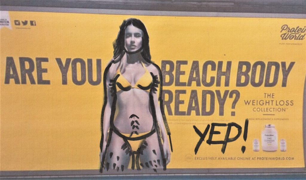
Identify a contemporary ad which is gender biased. How would I amend it?

Print it and use a pen to indicate where I would intervene.

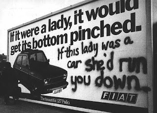
For example, Jill Posener: erase, ridicule, interrupt. (Image or the text)

It could be a still from a video or a poster image.
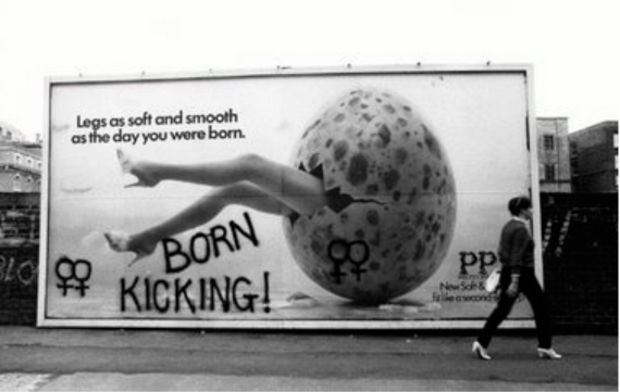
Jill Posener
Jill Posener

My response:
Critical Thinking: Theory & Practice Part 2

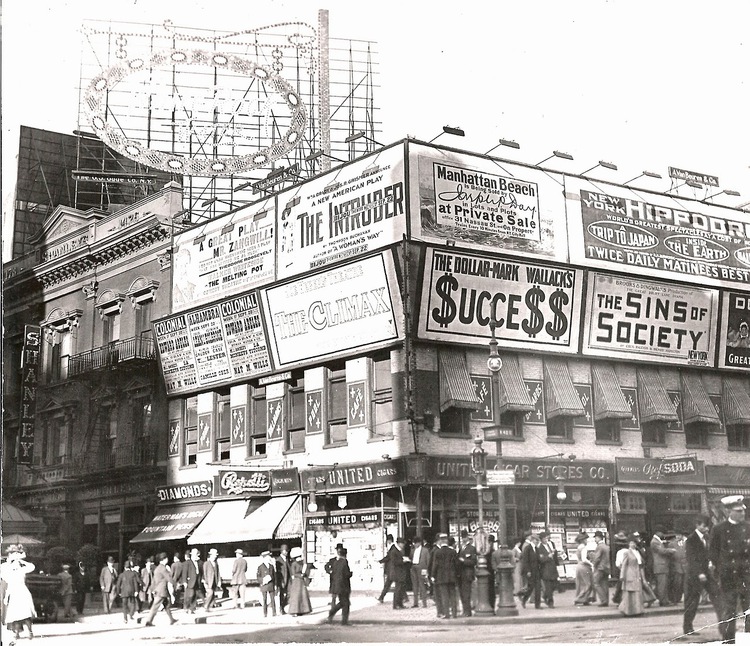
https://viewing.nyc/vintage-photograph-of-broadway-advertising-in-times-square-circa-1909/

In today’s lecture, we began by considering the themes for this new module.

  1. The history and theory of visual culture. How are images produced? How are images consumed? Visual artifacts: graphic design, poster, film, advertising.

2. Reflect on ethical & political implications of graphic design. What does graphic design have to say about race, gender and ecology? How does graphic design make these matters visible?

Blockbuster culture delivers mainstream ideas to the masses. This is found in the free press you find on the train. It is easily accessed everywhere. How can graphic design counter mainstream culture?

Novara Media are an organisation who challenge the mainstream media.

Ash Sarkar uses humour as a way of presenting the topic. She delivers the message with energy and the fast pace keeps the audience engaged. I like the way she uses rhetorical questions to include the audience and place them in a hypothetical experience.

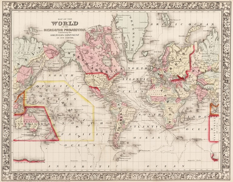
‘The Most Popular Map Of The World Is Highly Misleading’

The Mercator Projection, created by Flemish cartographer Gerardus Mercator in 1569, shows the northern hemisphere enlarged in size with North America and Europe larger than South America and Africa.

https://metro.co.uk/2017/03/21/heres-what-the-map-of-the-world-actually-looks-like-6523105/

Maps were designed from the point of view of the coloniser, according to their own parameters. They placed themselves at the centre of the world according to how they saw themselves (powerful). The global south became independent of the colonies.

Gall Peters projection, 1970 (How the world really is)

Are maps really objective?

They can be designed to deliberately mislead us. We need to look with a critical eye: Who made it? Why? What does it actually tell us?

Design & Politics

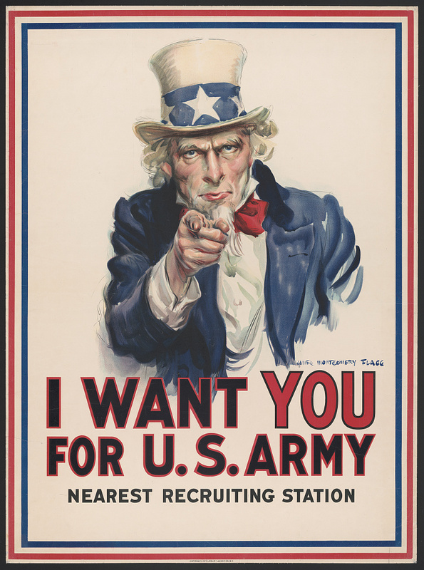
Propaganda such as this poster was produced during the 20th century. It was often used to recruit people in the army using bold and forceful language and imagery.

(image from:

https://library.ccsu.edu/dighistFall16/exhibits/show/music-as-propaganda-in-world-w/music-as-propaganda)

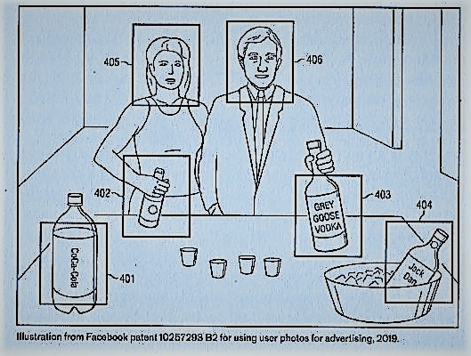
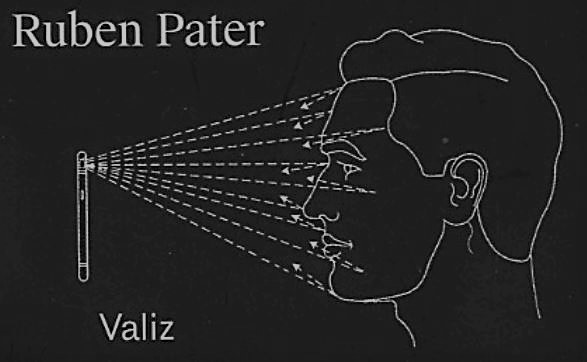
Politics in design can be subtle, not just propaganda. And persuasion can be sinister, even if it’s subtle. For example, surveillance advertising and micro targeting occur today. Companies collect data on us without our knowledge. By collecting this knowledge, they are able to profile and target ads to certain audiences. This can be subliminal and sent through social media.

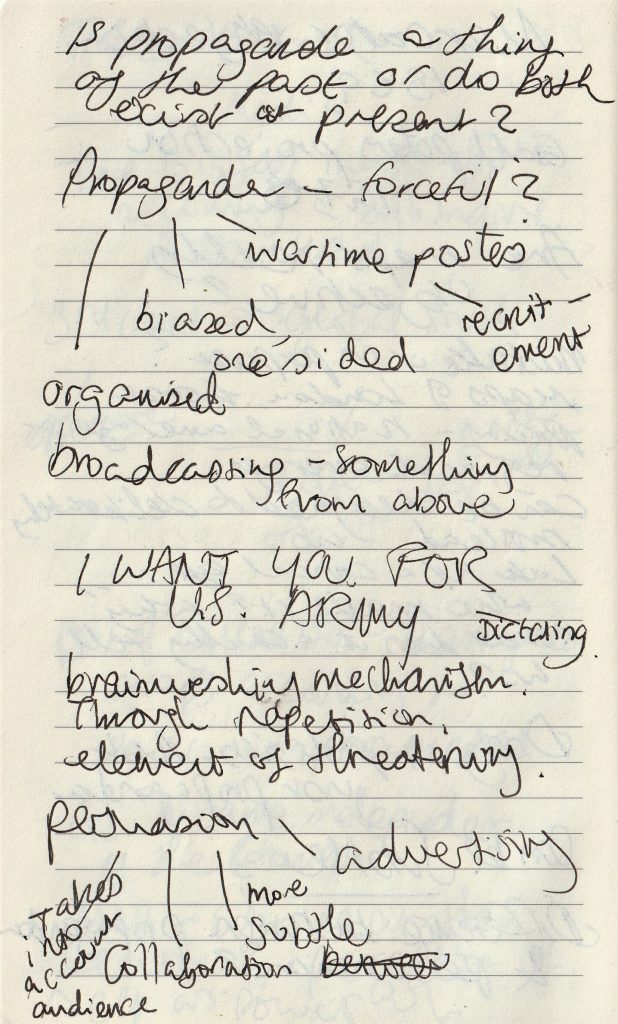
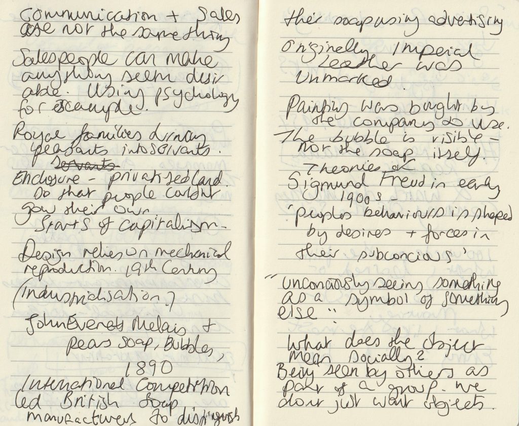
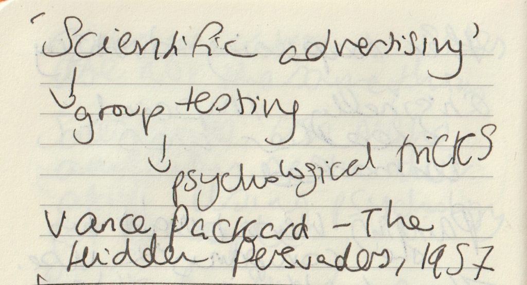
my lecture notes.

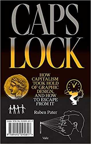
Caps Lock – Ruben Pater

The cover of this book is contemporary, by the images are historical. They are from several decades but no image newer than 5 years.

On skimming through the pages, the pull out quotations stand out to me. They do not look too different to the rest of the text, but are in a serif typeface and slightly larger. From reading them, I am given the basic theme of the book. There is a negative view of materialistic culture and the images support this view:

https://www.saatchiart.com/print/Photography-Zara-s-home/277628/1885457/view

Not all graphic designers are against advertising.

Banana Republic‘ from Caps Lock

Chiquita Banana The Original Commercial

The example of United Fruit illustrates that cheap products cannot be produced ethically under capitalism, but require aggressive advertising, political meddling, dispossession of common lands, exploitation and violence.

Ruben Pater

This chapter of Caps Lock, explains how advertising can be used to ‘hide violence and exploitation in pursuit of profit.’ The Chiquita Banana advert was made to educate and persuade people to start buying bananas from the United Fruits company. At the time, in the 1940’s, bananas were a fruit growing in New Guinea and Malaysia and no one had heard of them. The company therefore needed to convince people to make bananas a new part of their diet.

They did this by using the symbol Chiquita Banana, a sexualised cartoon banana based on the Latino actress Carmen Miranda.

Land was stolen from indigenous people to grow bananas in Honduras, South America. The workers were exploited, paid in vouchers instead of money and killed when they demanded fair pay and working hours. (Which is the short version of events).

“If advertising would be banned from public space everywhere, it would certainly be a blow to a system of consumption that relies on constant seduction.”

“In a timespan of two centuries, society has been commodified bit by bit through enclosure of free and public spaces.”

Century of the Self

The words of Paul Mazur, a leading Wall Street banker working for Lehman Brothers in 1927, are cited: “We must shift America from a needs- to a desires-culture. People must be trained to desire, to want new things, even before the old have been entirely consumed. Man’s desires must overshadow his needs.”

The film starts with a black and white image of Sigmund Freud. We hear playful and nostalgic music from a past era as the narrator talks about Freud’s theory of ‘primitive forces’ within humans. There is a sudden change to the red image of a woman screaming. The words ‘chaos and destruction’. There is horror-film organ music, all feels frantic. Then suddenly the footage returns to black and white with nostalgic old-fashioned singing, while we see footage of a man on a staircase, perhaps Freud’s nephew ‘Edward Bernays’ who we are introduced to.

The organ music again strikes us as the titles appear.

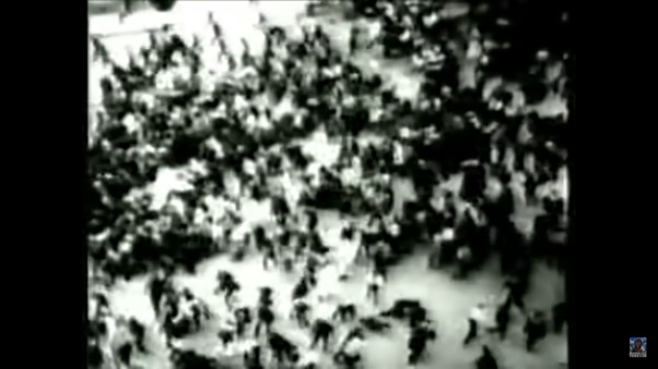
Images of advertisements appear dreamlike, between black and white images from real scenes of crowds, possibly from news footage- a harsh reality. Crowd footage appears throughout the film, possibly to signify the masses who were the focus of the advertising campaigns.

This introduction sets us up, much like a warning as to what is to come later. We may not know who Freud or Bernays is, but we have no doubt there is something sinister about to be revealed.

The pace and unexpected change in tone, keeps us on our toes. The theatrical pairing of images and music contribute to an atmosphere of dread.  Moments of quiet suspense are sandwiched between images of chaos. This expresses the emergence of Bernays and his work in mass manipulation. The change from buying to meet our needs and buying to fulfil endless desires.

Classical music is playing as we are shown footage of higher-class events. This sets up the world Bernays was a part of. Music plays with our emotions throughout the film, giving us an idea of how it is to be easily manipulated.

We are shown images of chandeliers whilst hearing about the necessity of civilisation and inevitability of dissatisfaction. This creates a contrast and makes us questions the worth of the finer things.

“Bernays was the first person to take Freud’s ideas about human beings and use them to manipulate the masses.”

Century of the Self

Today’s lecture introduced me to the sinister truth hidden beneath the shiny surface of everything we know.

Century of the self discussed the shift from smoking being unfashionable for women, to the way women were persuaded to smoke. This was a carefully calculated shift. Actresses were hired to pose with cigarettes. The companies knew they could double their customers by setting up this marketing strategy. That is something I had never considered before.

In the Banana Republic article, the way people have been treated to allow companies to increased profits, is shocking and appalling. The only thing worse is the way it has been covered up for decades.

This discussion has lead me to wonder, what else will I be discovering next?

Critical Thinking

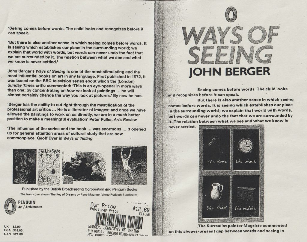
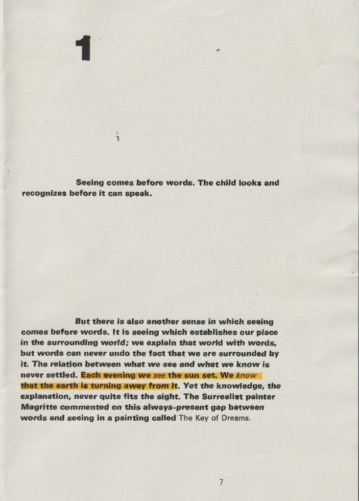
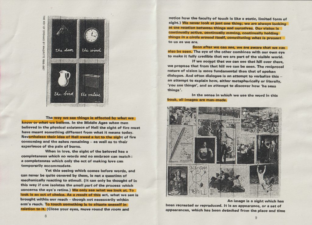
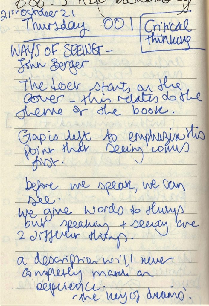
We began this week’s lecture, by reading the beginning of the book Ways of Seeing by John Berger. I have read the book earlier in the week but found it far more helpful to read it as a group. Our lecturer Luisa pushed us to find the meaning in each sentence. This was not an easy task as there was a lot of information squashed into the first few pages. Luisa drew our attention to the fact that the text of the first chapter begins on the front cover. I have never seen this in a book design.

back and front cover of Ways of Seeing

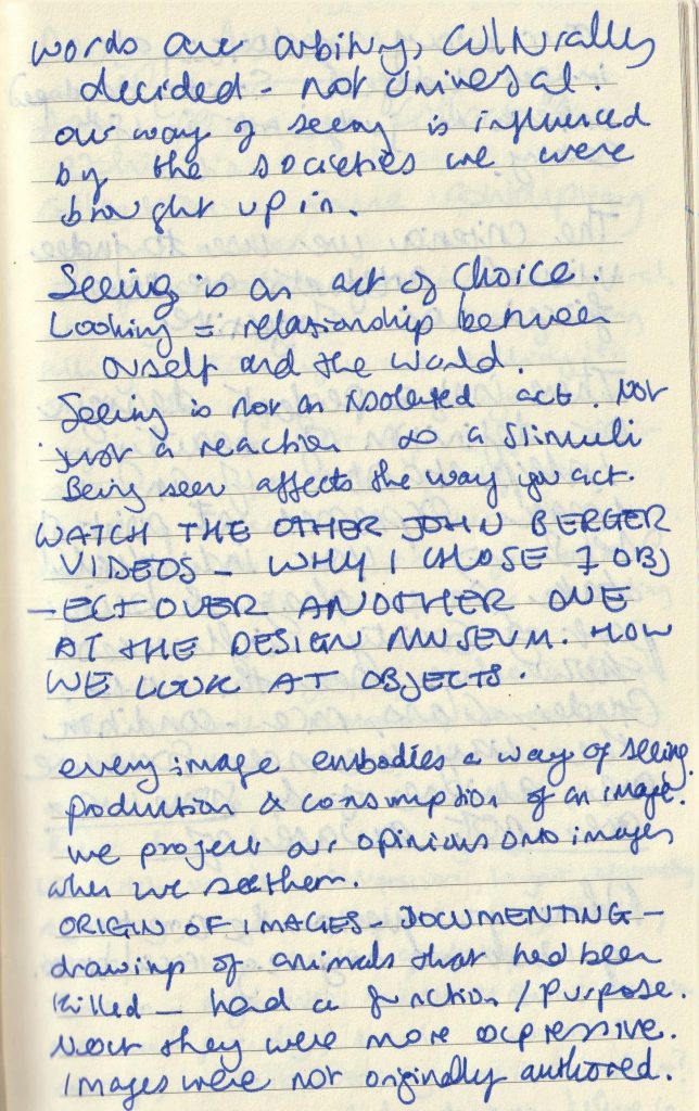
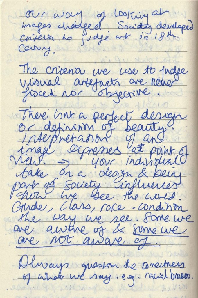
I made notes throughout the process of analysing the book:

I went away and watched the rest of the series on YouTube.com. (parts 1,2 &3)

Each episode expresses a different point.

Episode 1
  • In the series- questioning the tradition of European painting (1400-1900) not focusing on the paintings themselves but the way we see them.
  • A large part of seeing depends upon habit and convention.
  • All the paintings of the tradition used the convention of perspective, which is unique to European art. Perspective centres everything on the eye of the beholder. Appearances travel into the eye. Perspective makes the eye the centre of the visible world, but the human eye can only be in one place at a time, it takes its visible world with it as it walks.
  • The invention of the camera has changed not only what we see, but how we see it. The painting on the wall, like the human eye, can only be in one place at one time. The camera reproduces it, making it available in any size and anywhere, for any purpose.
  • Venus and mars used to be a unique image, which it was only possible to see in the room where it was actually hanging. Now its image, or a detail of it can be seen in a million different places at the same time. As you look at the images now, your wallpaper is around them, your window is opposite them, your carpet is below them. At this same moment, they are on many screens, surrounded by different colours, different objects and different sounds. You are seeing them in the context of your own life. They are surrounded not by gilt frames, but by the familiarity of the room you are in and the people around you.
  • The paintings are part of the history of the building it is in. for example, the church or chapel.
  • Now the images come to you, you do not go to them. It is the image of the painting which travels now.
  • The faces of paintings become messages. Pieces of information to be used, even used to persuade us to help purchase more originals, which these very reproductions have in many ways replaced.
  • A reproduction does not have the same feeling of authenticity as the original artwork
  • The pages of a book and a screen is never still. The lines are slightly moving. With a genuine original painting, there is a moment of stillness you have with the painting in a museum that cannot be replicated.
  • Words you notice consciously. Music is subtler. It can work almost without you noticing it. However, music changes the meaning of a painting when it is played over the top. Words around it and music played over it changes the meaning of a painting.
  • When paintings are reproduced, they have to hold their own against all the other information jostling around them to appear on the same page or the same screen.
  • The meaning of an image can be changed according to what you see beside it or what comes after it.
  • When you turn from one channel to another on television, this affects the next image you see on your screen. It alters the impact of an image in different ways.
  • It means: reproductions of works of art can be used by anybody for their own purposes.
  • Images can be used like words, we can talk with them. Reproduction should make it easier to connect our experience of art directly with other experiences.
  • Reproductions make the paintings easily accessible, however the context they appear in can oppose this. The example Berger gives is the old paintings reproduced in an art book. The language used in the book, which surrounds the image, can inhibit the accessibility. Because of the use of difficult language. (mystification)
  • Children connect images directly with their own experience.
  • On television programmes, we receive images and meanings which have been arranged. Be skeptical of what a programme arranges for us to see.
Episode 2
  • ‘Men dream of women, women dream of themselves being dreamt of.’ There is a focus on what women look like. They are looked at by men. How they look or how they should look. Behind every glance is a judgement. A woman is always accompanied by an image of herself
  • The video switches between footage of working women in a lab, models, classical paintings of women and old and young women, plain and glamourous women.
  • ‘From earliest childhood she is taught and persuaded to survey herself continually. She has to survey everything she is and everything she does because how she appears to others and particularly how she appears to men is of crucial importance for it is normally thought of as the success of her life.’
  • In the average European oil painting, there were portraits of women as well as men but in one category, they were an ever occurring subject. That category was the nude. In the nudes of European painting, we can discover some of the criteria and conventions of which women were judged. We can see how women were seen.
  • What is a nude?
  • Different views on what a nude is: 1) to be without clothes- a form of art 2)to be naked is to be one’s self. To be nude is to be seen naked by others and yet not recognized for one’s self.  A nude has to be seen as an object in order to be a nude.
  • In the bible- Adam and Eve. The woman is blamed and punished by being made subservient to the man. In relation to the woman, the man becomes the agent of God. Moment of shame. It is the spectator’s looking which shames them (covering up with a leaf or hand)
  • The nude implies an awareness of being seen by the spectator.
  • Men looking at naked women and judging them is a theme in European art. They even call the women Vanity, thus repeating the story of Adam and Eve where the woman is blamed/shamed.
  • ‘We are not discounting the role seeing plays in sexuality but there is a different between being seen as one’s self naked or seeing another in that way, and a body being put on display. To be naked is to be without disguise. To be on display is to have the surface of one’s own skin, the hairs of ones own body, turned into a disguise, a disguise which cannot be discarded.’
  • It is possible to tell when the artist has actually seen the woman he has painted. There are not many examples if this in European art.
  • Most of the nudes in oil paintings have been lined up and painted for the pleasure of the male spectator owner who will assess and judge them as sights. Their nudity is another form of dress . they are condemned to never being naked.
  • ‘The painting is made to appeal to the sexuality of the male spectator, it has nothing to do with her sexuality. The convention of not painting the hair on a woman’s body helps towards the same end. Hair is associated with sexual power and passion. The women’s sexual passion needs to be minimized so that the spectator may feel he has the monopoly of such passion. The expressions on the women’s faces are responding with calculated charm to the man who she knows is looking at her although she doesn’t know him. The woman’s attention is directed at the spectator owner of the painting. Women are seldom shown dancing, they have to be shown languid, exhibiting a minimum energy. They are there to feed an appetite, not to have any of their own.’
  • Absurdity! The only images we were seeing of women were them silent, mute.
  • How men see women, or how they saw them in the past and how this influences how women see themselves today.

Berger asks women from the general public their thoughts about these paintings:

‘Paintings idealized and therefore unreal in any connection I might have of an image of myself. They don’t mean human beings to me.’

‘I compare myself to photographs more than paintings.’

‘Manet painting- the women aware of being humiliated.’

‘Women are always dressing as a part, to show the kind of character they want to be.’

‘Concept of availability = passivity. Opposite of action.’

‘Women’s sense of identity is based on what others think of them. But a man’s identity is based on his interaction with the world.’

Episode 3
  • The beginning of the video shows footage of apples and fish at a market are interspersed with fish and apples in oil paintings. Playing over the top of the video is the sound from a modern day marketplace. Berger shows us people buying from the market. The exchange of money for these fresh products.
  • ‘We buy, we consume, ours to give away, or more often, to keep.’
  • The focus of the footage is not on the people’s faces or their identity, but on the act of handling goods, valuing them and buying them. Jewellery. Buying valuable objects.
  • The most valuable object of all has become the oil painting. Oil paintings depict things. Buying the painting is almost like buying the object within the painting. Paintings often show treasures, but paintings have become treasures themselves
  • A love of art= a sublime human experience
  • What are these paintings? They are objects which can be bought and owned. Unique objects. A patron cannot be surrounded by music or poems as he can by pictures. They show him sights and many subjects. The only thing the paintings have in common : oil paints.
  • The scenes that are depicted show wealth. Implicit in the wealth of European cultures, was the destruction of other cultures. But the Europeans believed their civilization was more advanced than any other.
  • Paintings have symbolised wealth and power for centuries in different cultures, but they showed an order , European paintings showed a different kind of wealth. Their paintings glorified the ability to buy and furnish and to own.
  • The paintings show the owner’s social status. Exaggerated claims. It is their clothes, not faces that dazzle. Oil paint allowed the subjects to be painted and look tangible. Privileged minority. Making a record of themselves.
  • A painting gave the owner the pleasure of seeing themselves as the owner of their land.
  • ‘The sight of it, makes us want to possess it.’ Publicity has taken the place of oil paintings in this way. (paintings were a place to show off our possessions)

Hella Jongerius                                           

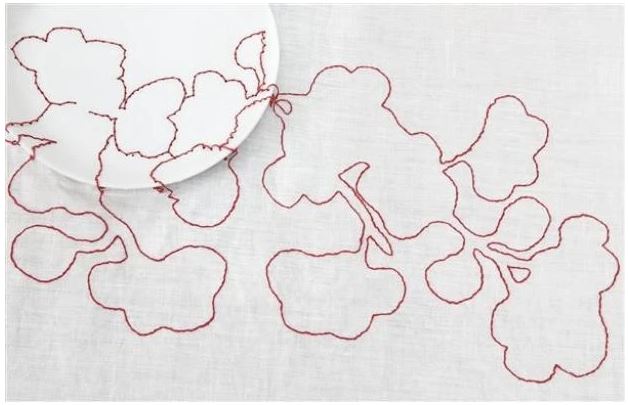
In class, we were shown 2 images and ask to write 100 words on each. I felt there was a connection between the 2 images, but did not guess that they were made by the same designer, Hella Jongerius. For the first image, I decided to write a creative response to the image. Luisa has told us that writing creatively and telling a story is part of a graphic designer’s skills. This piece was called Red Flower. When I first saw the image, I did not notice the plate until my classmate pointed it out. Then I saw the plate and the table as a setting for the artwork.  I could not see how the stitches were attached to the plate. Only now, can I see the holes made in the plate to thread the thread through. (I could have got closer to the screen in the classroom and I may have been able to see the holes in the ceramic plate.)


Hella Jongerius | Red Flower Embroidered Tablecloth (Circa 1999) | MutualArt

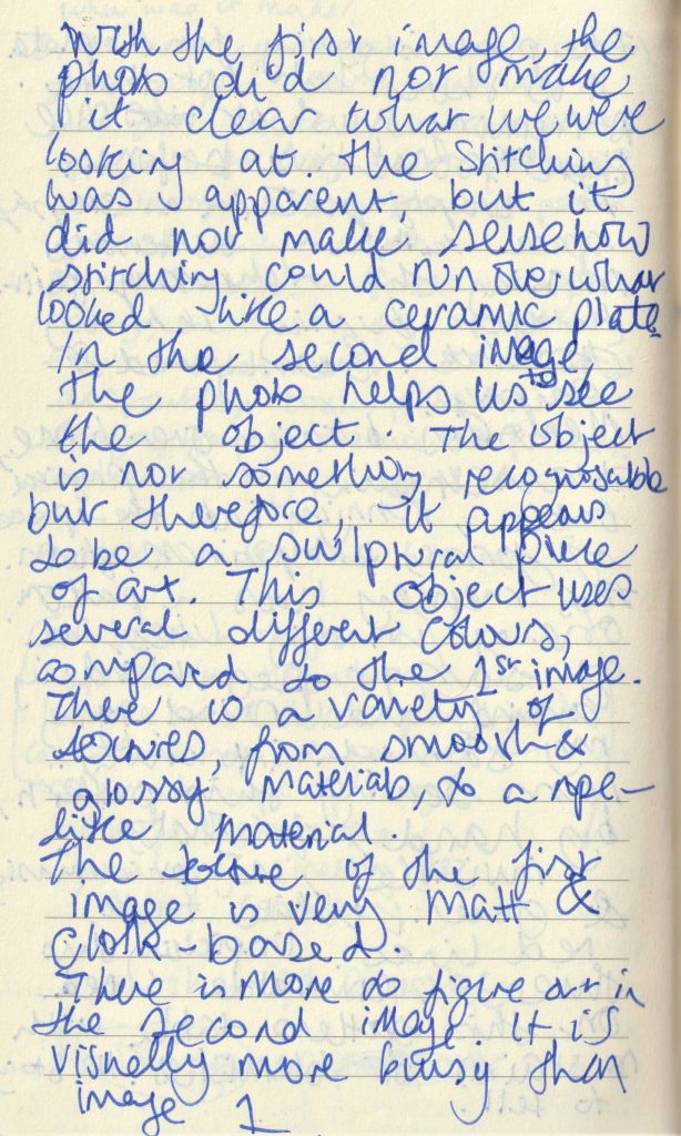
My response to the image:

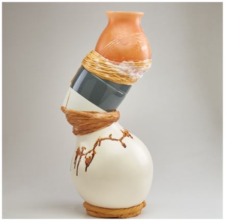
For the second image, we were asked to write about how it compares to the first. This image is called Stacked vase sculpture:

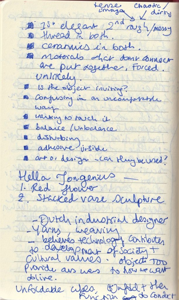
It was really interesting to hear my classmate’s views on the same images. I agreed with their points.

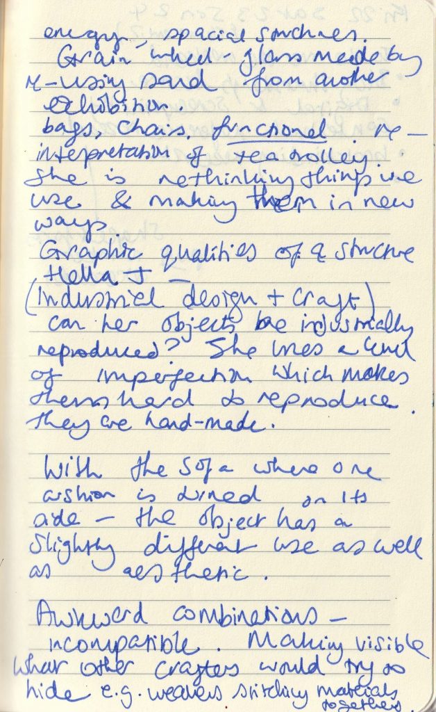
I quickly searched the designer and mainly looked at her other artworks. This helped me gain an understanding of the pieces we were shown and how they link.

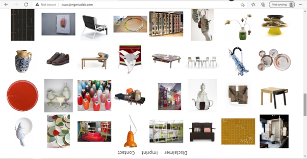
Jongeriuslab design studio

At the end of the lecture, Luisa introduced us to the next brief, which is the presentation based on our chosen object. She explained that InDesign is a good programme to use for making presentation slides. I have only ever used Microsoft powerpoint, so this will be a new task for me.  It was good to have an idea of what our aim is for the trip on Monday. This will help me to prepare, for example, I can take a sheet of questions written down to act as pointers to guide me. Going to London might be busy and hectic, so having these questions or bullet points can help me stay focused.

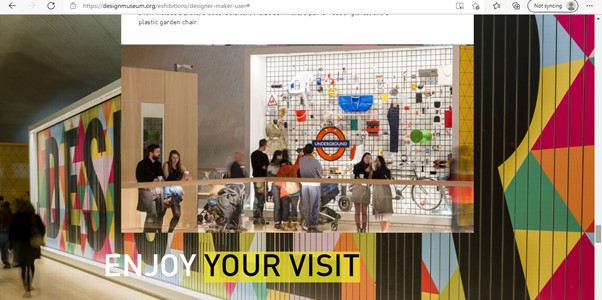
Looking at The Design Museum website helped us to get an idea of what to expect on our visit.

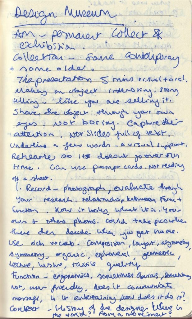
DESIGN MUSEUM POINTERS

  • Relationship between form and function
  • How it looks, what it is, your photos and other’s photos
  • Use rich vocab: composition, layout, asymmetry, symmetry, organic, ephemeral, geometric, texture, luster, tactile quality
  • Function- ergonomics, sometimes obvious, sometimes not, user friendly, does it communicate a message, is it entertaining? How does it do it?
  • Context- history of the designer- where in the world? From a movement? When was it made?
  • Was it successful for its purpose? Bear in mind when it was made. Did it discriminate people? Appropriate for design needs? Problematic? It may be successful in 1 aspect but problematic in another aspect.
  • Emotional needs- functional but boring, emotionally dry, entertaining, environmental needs- 80s object may be disposable, toxic plastics, no thought for environmental problem.
  • Gut reaction – what is your initial mood about the object?
  • The presentation runs for 5 minutes. You will need to make it interesting and tell a story about your object, could be the story of you encountering the object. Take photos of the building.